Pastoral Landscape Junk Journal
Hey, everyone! Sharon Hoerth of The Journalocity Shop, one of our amazing NEW Junk Journal Design Team Members, created a fabulous Pastoral Landscape Junk Journal for us this week. As you know, we feature one new Junk Journal project each week created by one of our creative team of artists. Our Design Team Members select from the 100’s of Vintage Image Bundles on our Premium Membership Site, for their creations, in order to show you beautiful ways to use those images. We hope you will be totally inspired by this series!
Therefore, please make sure you check out the video tour at the bottom of the page…please scroll all the way down to see it. Are you ready to be inspired? I will step out of the way and let Sharon introduce herself, and tell you all about her incredible project…
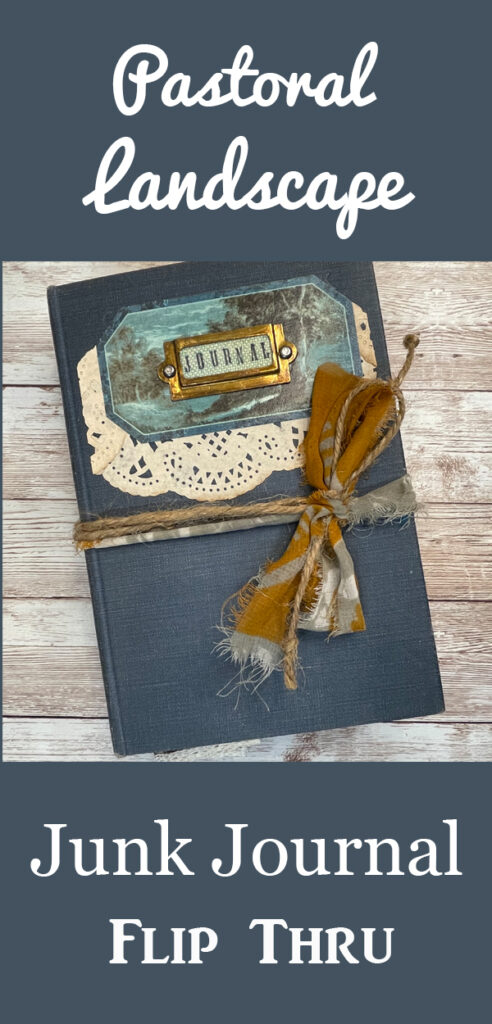 Hi everyone! I am Sharon Hoerth and I live in rural Wisconsin, USA. When you live many, many miles from the nearest large city, you need hobbies! LOL I stumbled into the world of handmade journal-making about two years ago and have never looked back. I am constantly dreaming about the next journal I will create.
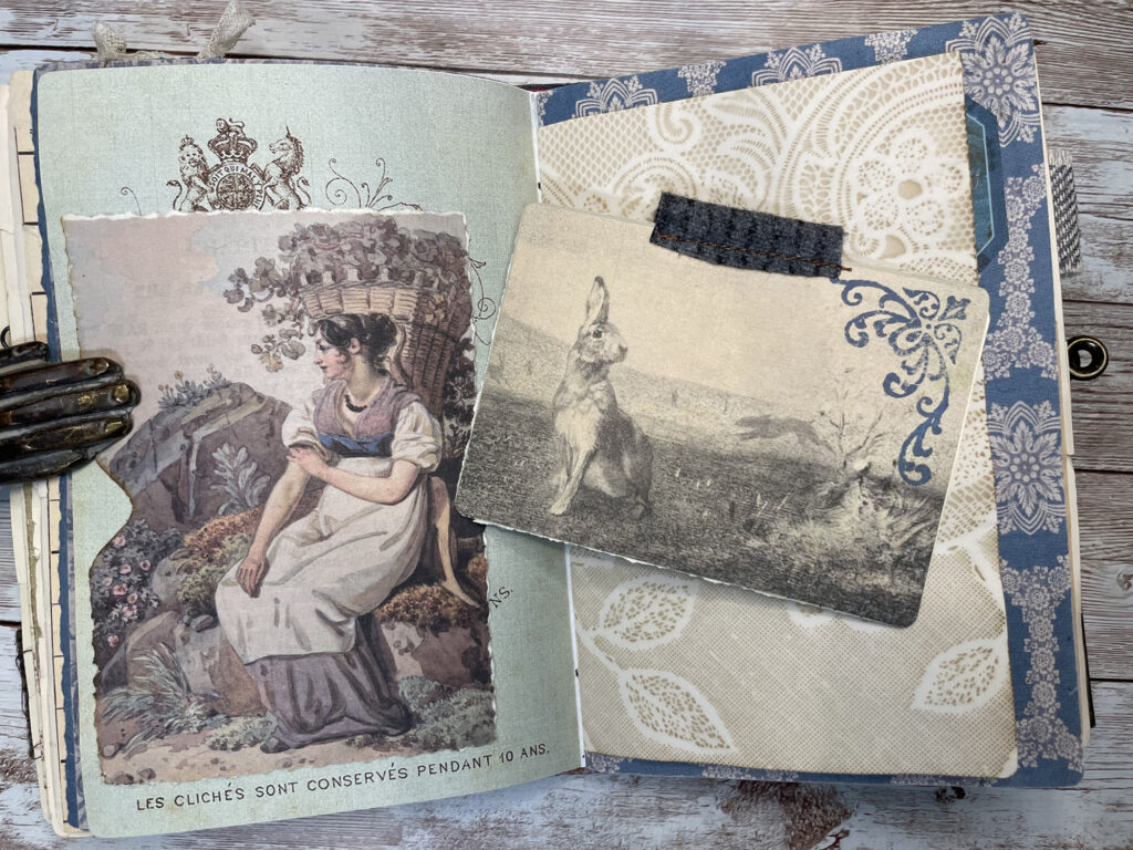
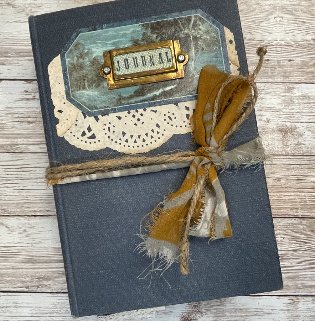
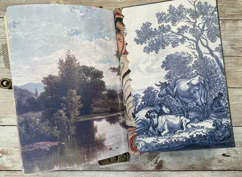
For my first Design Team Project for The Graphics Fairy, I repurposed an old book cover and created a journal with a pastoral landscape theme. I want readers to feel as if they are on an adventure on foot in the countryside and around every corner a delightful surprise appears. I used the Delft Blue Ephemera Bundle as a jumping off point. To compliment those images, I used the search tool on the premium membership site to find a host of landscape and wallpaper images that I used for my page backgrounds.
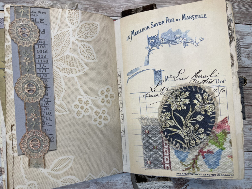
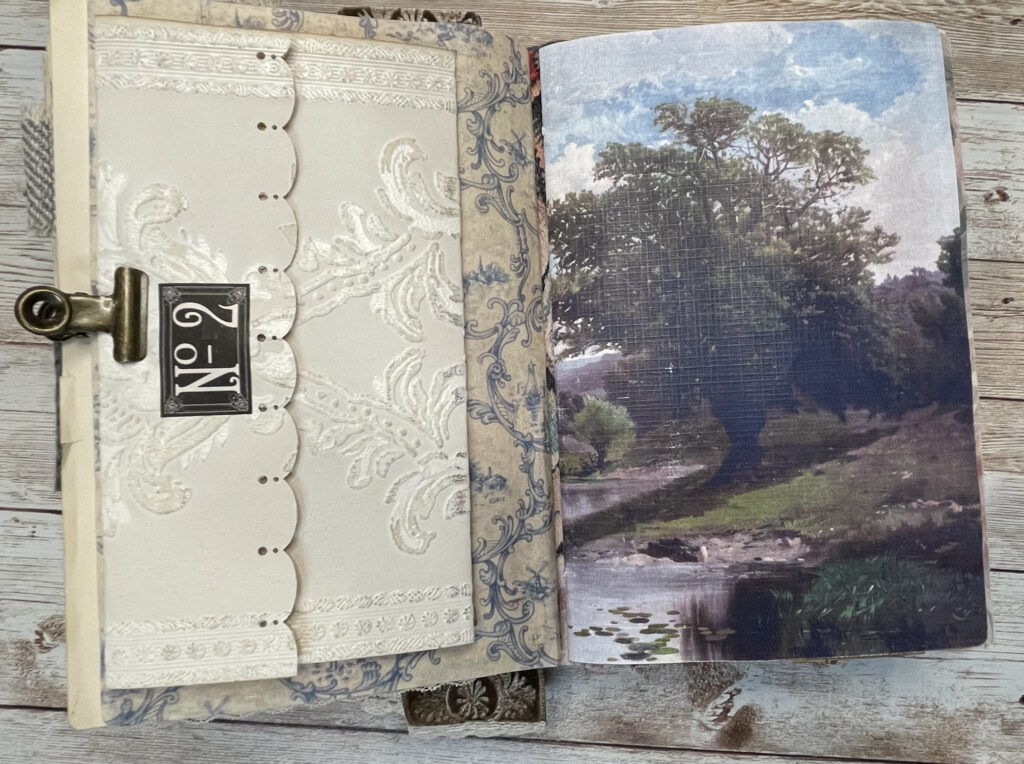
I love pairing a landscape image with a wallpaper image in the same spread. To achieve cohesiveness, I incorporate similar elements on both pages, such as the same fabric or lace.
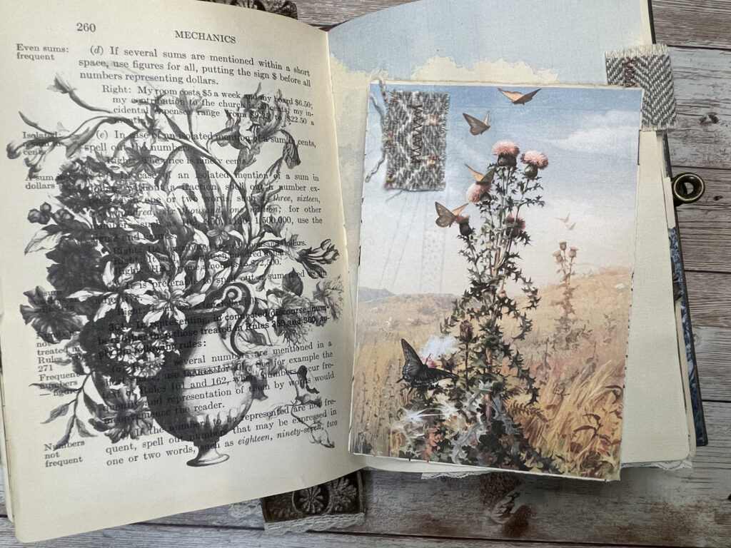
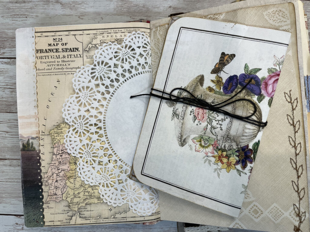
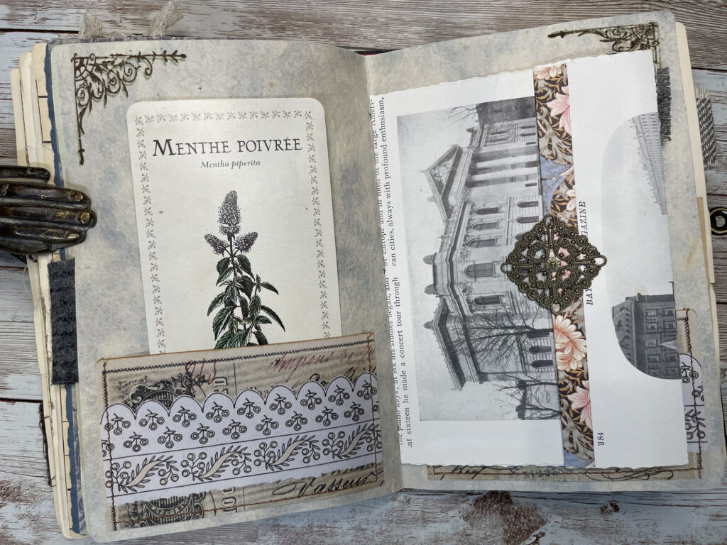
When repurposing an old book, I always incorporate some of the original book pages into the journal to give it authenticity. They work well with printables and other vintage papers. I even print images directly onto the book pages like I did with the floral images in this journal.
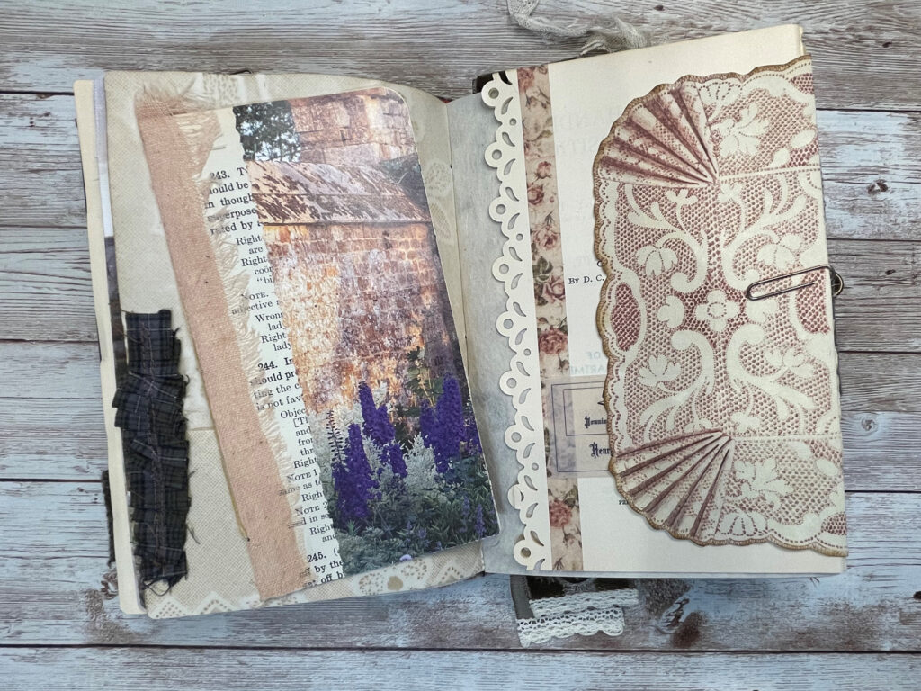
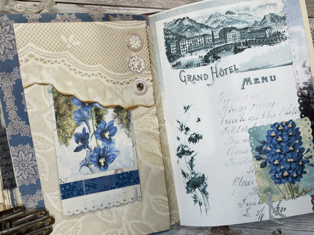
Coffee dyed papers are a staple in most of my journals as well. My favorites are the ones I imprint with lacy doilies. Fussy cutting around the lace imprint results in a pretty and unique edge to a tuck spot. Further embellishing with paper buttons adds the finishing touch. As much as I love using real buttons vs paper ones, sometimes you have to compromise to reduce bulkiness.
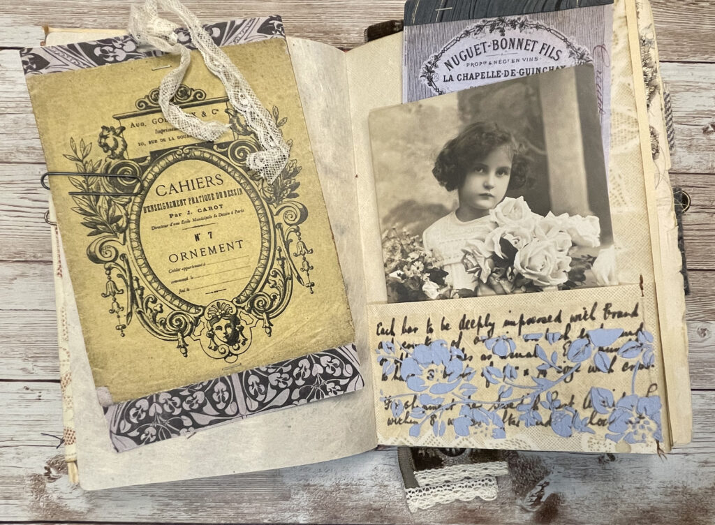 I think both machine stitching and slow stitching add that extra something to a journal. You can add a simple blanket stitch to almost any page, card or tag and it takes it to a different level. Introducing different textures to pages and ephemera pieces is key to me. I like to achieve this by adding fabric and lace. In this journal, I created page and tag tabs from several types of wool textiles and used a small piece of bark cloth to make a pocket. A little goes a long way!
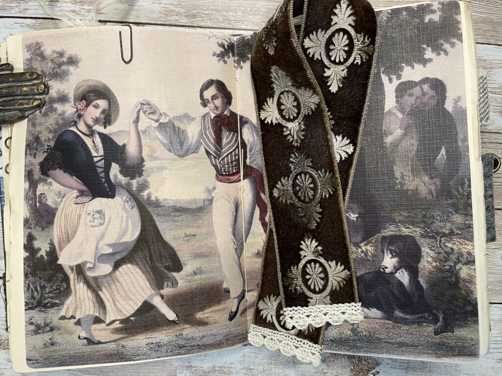 One of my favorite elements in this journal is the velvet bookmark I made. I first saw this embossing technique demonstrated by Martha Stewart years ago. All it requires is a piece of velvet, a rubber stamp and an iron. The simpler your stamp image, the better the resulA fun element to add in the center of a signature is an envelope. I created an envelope in this journal from an antique book page and embellished the flap with a metal filigree piece. I left the sides of the envelope open until after I sewed in the signatures. Gluing the sides shut after sewing nicely hides the binding threads. Another way I like to create faux envelopes is using real wallpaper as the outside. I adhere one or more pages for writing to the inside, but leave the sides open so everything can be unfolded and written on. These work best as free-floating elements that can be clipped to a page for extra writing space.
For me, one of the most exciting parts to creating a journal is deciding which fabric to use on the inside of the spine. I love to pick a pretty coordinating fabric that peeks through between the signatures and the inside covers. In this journal, I punched a scalloped edge on my inside cover sheets to provide a softer transition between the fabric and paper pieces.
 PASTORAL LANDSCAPE JUNK JOURNAL SHOW & TELL VIDEO TOUR
Let’s take a tour of it together:
Bundles Used:
- Delft Blue Ephemera
- European Maps
- The Winery
- French Floral Engravings
- Mini French Ephemera
- French Paperie Collection
- French Frames
- French Ephemera
- French Attic Ephemera
- Emma
- Jane Austen
- Bibliophile Ephemera
- Favorite French Things
- Cottage Wallpaper
- Wallpaper Samples
- Wallpapers
- Provence
- Artistic Landscapes
- Fairy Landscapes
- The Secret Garden
- Le Chien-Dogs
- Realm of the Blue Fairy
- Chelsea Flower Show
- Endless Skies
- Country Lane
- Aeronautical Adventure
- Pink & Red Ephemera
- Vintage Gypsy Style
I hope this journal has given you inspiration on how to incorporate many different bundles into one project.
This journal is for sale in my Etsy Shop
You can also follow me on Instagram
Thanks so much!
Sharon Hoerth
Check out the Graphics Fairy Premium Membership Site HERE!


Lynne Hughes says
You did beautiful work on the journal.
graphicsfairy says
Thanks so much Lynne, we agree Sharon did such a fantastic job!!