Hey, everyone! Danielle Robotham, one of our amazing Junk Journal Design Team Members, created a fabulous Rosebud Junk Journal for us this week. As you know, we feature one new Junk Journal project each week created by one of our creative team of artists. Our Design Team Members select from the 100’s of Vintage Image Bundles on our Premium Membership Site, for their creations, in order to show you beautiful ways to use those images. We hope you will be totally inspired by this series!
Therefore, please make sure you check out the video tour at the bottom of the page…please scroll all the way down to see it. Are you ready to be inspired? I will step out of the way and let Danielle tell you all about her incredible project…
Hello lovelies, my name is Danielle of Fill A Space and I’m thrilled to be back to share another journal project for The Graphics Fairy! I named this Journal ‘Rose Bud’, as I’ve found myself drawn to rose imagery of late and couldn’t resist making this the theme of my next journal. A moment of giddiness overcome me as I remembered a bundle I had come across in the past that would be perfect for this journal. The bundle that sparked the boost of inspiration was the ‘Victorian Scrap Roses’ kit, a beautiful selection of roses that almost look as if they have been delicately trimmed from Victorian calling cards. Knowing I wanted to use the Pink roses from the bundle, I decided to browse through the abundance of Rose imagery The Graphics Fairy has to choose from, I was spoilt for choice. I narrowed my search by using the key words ‘Pink Roses’.
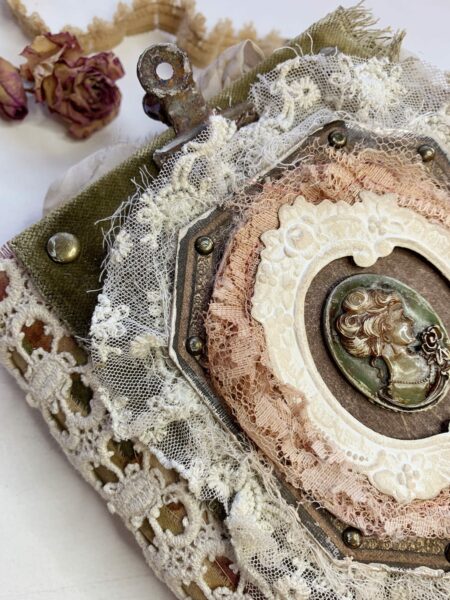
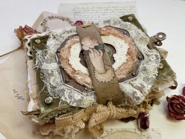
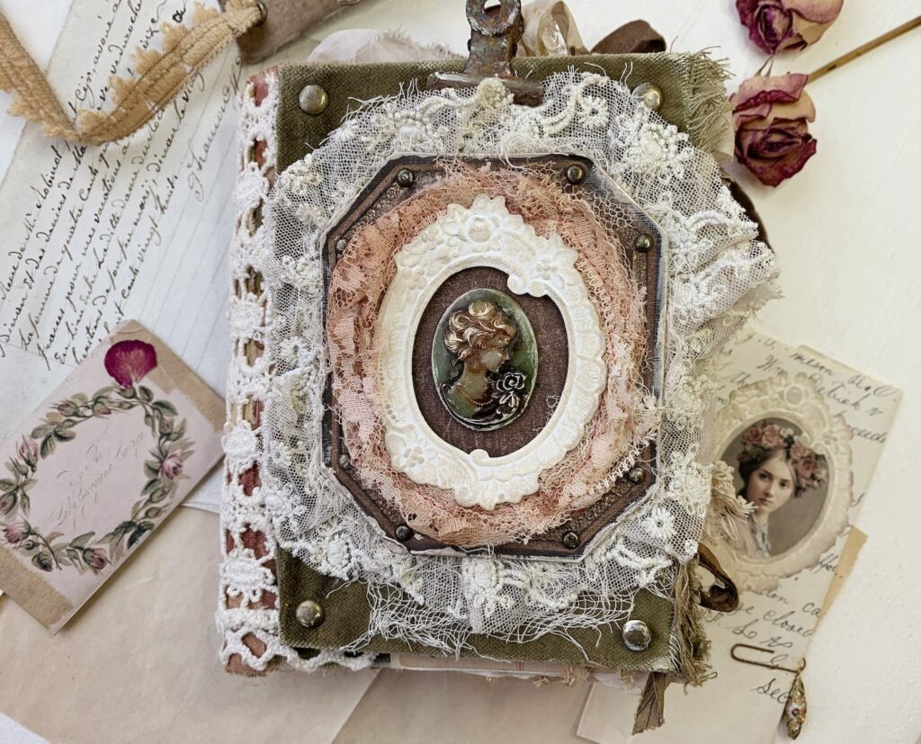
I began selecting fabrics that complimented the tones within the images I had chosen, which led me to use the earthy Green velvet you can see on the covers. As I often do, I created and finalised the cover first, I find this sets the tone for the rest of the journal and acts as a guide to ensure everything is cohesive. The cover base of the cover is constructed of thick card (the kind you would find at the back of a paper pad), I then simply wrapped the card in Velvet and added some brads for decoration. I was fixated on a rose sitting in the centre of a frame, as the focal point of the cover, to achieve this I searched for ‘Frame’ on the Premium Website and tried out a few, resizing them to suit. After choosing my ideal frame and Rose, it was all looking quite flat, you know when the idea you had in your mind, that you were all excited about, doesn’t quite come to life…it was just that!
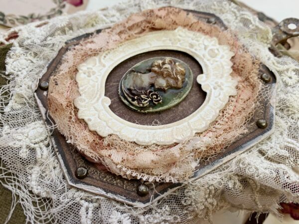
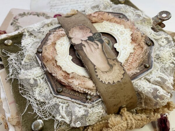
Not to fear, after a moment away from my creative space it hit me, layers Danielle, layers! Of course, I needed to create some dimension to help bring the cover to life. I decided to back the printable frame with some delicate Cream lace, which helped elevate the image and break up the similar dark tones of the velvet and frame, which was causing the flat appearance. I built upon the idea of dimension and added another layer of Pink lace on top of the printable frame, this time. Which I messily stitched around and later distressed with a stitch picker to create a shabby look. I didn’t stop there, what really brought everything together was the Tim Holtz frame die cut as my final layer. I then left the centre of the frame empty until I had finished the remainder of the journal.
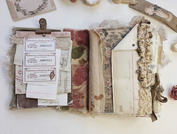
Wanting to try out a new method of adding signatures, I tea dyed some plain linen, something with a little thickness for strength, yet not too bulky. I then cut the linen into multiple strips, around 2in wide and a few mm higher than my journal cover. I believe I used 10 of these strips to later adhere my journal pages to, 20 pages in total (2 to each strip of linen).
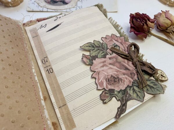
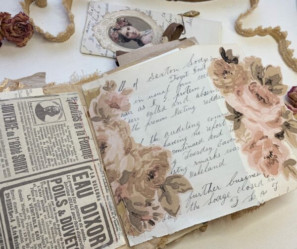
I chose a mix of neutral vintage papers, Graphics Fairy wallpapers and music sheets for the pages, digitally altering the printable images to achieve the muted tone I desired for my signatures. I then distressed the edges of each page, added the ruffles and pockets, prior to adhering the pages to the linen strips. This not only made it easy to sew ruffles but also gave flexibility if I wanted to reorder the pages.
To bring a few of the pages to life, whilst maintaining the neutral feeling. I fussy cut florals from some of the aforementioned muted wallpaper prints, then glued them to decorate some of the pages. My favourite was a floral Rose wallpaper from the ‘Garden Club Tour’ bundle.
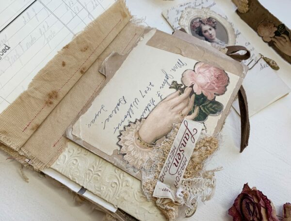
Once satisfied with decoration and order, I simply sewed the pages to each side of a linen strip, using a straight stitch and contrasting Pink thread. Alternately you could use your fabric glue of choice to adhere the pages to the fabric strips. Ta-da, you have your journal pages to bind to your journal cover which ever way you please, in this case I just used a 3-hole pamphlet stitch.
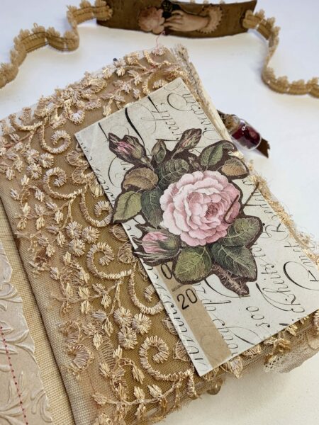
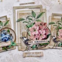
To achieve the tags, I generally used the ‘rule of 3’ within this journal. Collaging three pieces; a printable script, wallpaper print and fussy cut focal image. Prior to printing the Victorian Roses I had selected, I digitally laid them on top of a plain brown background. This meant that when I came to fussy cut them out I would have a brown background that helped everything blend nicely rather than a white background around each image.
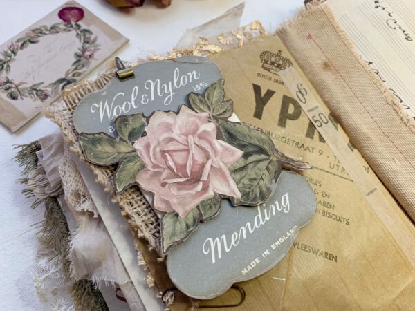
I wanted to avoid bulk, due to the size of this journal. So, I kept tag embellishments to a minimal which in the end, let the Rose imagery shine. The recipient of this journal, then also has more freedom to embellish the floating tags and pockets as they desire.
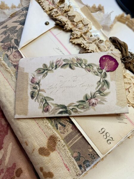
Sometimes it’s the simple ideas that shine, for me this mini envelope steals the show. Created in minutes from journal card backs available in the ‘Rose Is A Rose’ bundle. Once folded, glued, and distressed, for an extra dose of pretty, I glued a dried rose petal to the front of the envelope…precious right?!
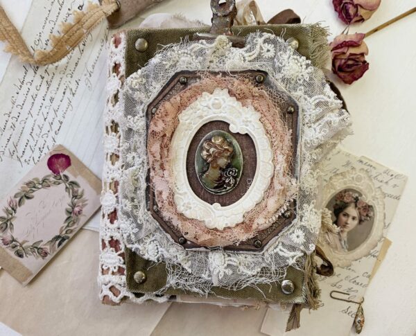
Once I was happy with the contents, I was able to decide the finishing touches for the cover. I almost decided to leave the centre of the frame blank for the recipient to add something of their own until, a moment of inspiration hit. I rummaged through my trinket collection to find a piece of costume jewellery which was almost perfect. A silhouette of a lady holding a Rose…I had to use it! I decided to transform it with some Tim Holtz alcohol ink and a touch of acrylic paint and just like that…perfect!
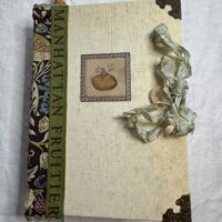
Finally, I came full circle and decided to use the Rose image, that I had originally wanted to sit in the centre of the frame remember, on the closure band instead. Keeping things simple, I adhered the image to a book spine, added two eyelets and threaded through some trim and there you have it Rose Bud is born. I’m thrilled with how this simple idea blossomed, resulting in a lovely little journal. I hope you enjoy it too!
Let’s take a tour of the journal:
ROSEBUD JUNK JOURNAL SHOW & TELL VIDEO TOUR
Premium Membership Bundles I used:
A Rose Is A Rose
Autumn Song
Cream And Green
Emma
Fall Wallpapers
Garden Club Tour
Sheet Music
Victorian Scrap Roses
Mocha Java
Tattered Treasures
You can find me here:
Danielle’s YouTube
Danielle’s Etsy
Danielle’s Patreon
Thank You So Much!
Danielle
Check out the Graphics Fairy Premium Membership Site HERE!
