DIY Fall Gift Tags
Hello Graphics Fairy friends! I’m Diana from Dreams Factory and I’m happy to be here again to share another DIY project with you! Today I will show you how to make these super chic DIY Fall Gift Tags, that can be easily integrated into all sorts of seasonal projects. We will only use a handful of supplies to make these beauties so they can be ready in no time!
You can choose to use the tags as they are, I feel that they are beautiful enough to make a statement on their own! But of course, if you want to give the paper even more of a vintage vibe, you can further distress them using your favorite aging technique. You might even want to add some gold here and there, just to give them a lovely metallic shimmer.
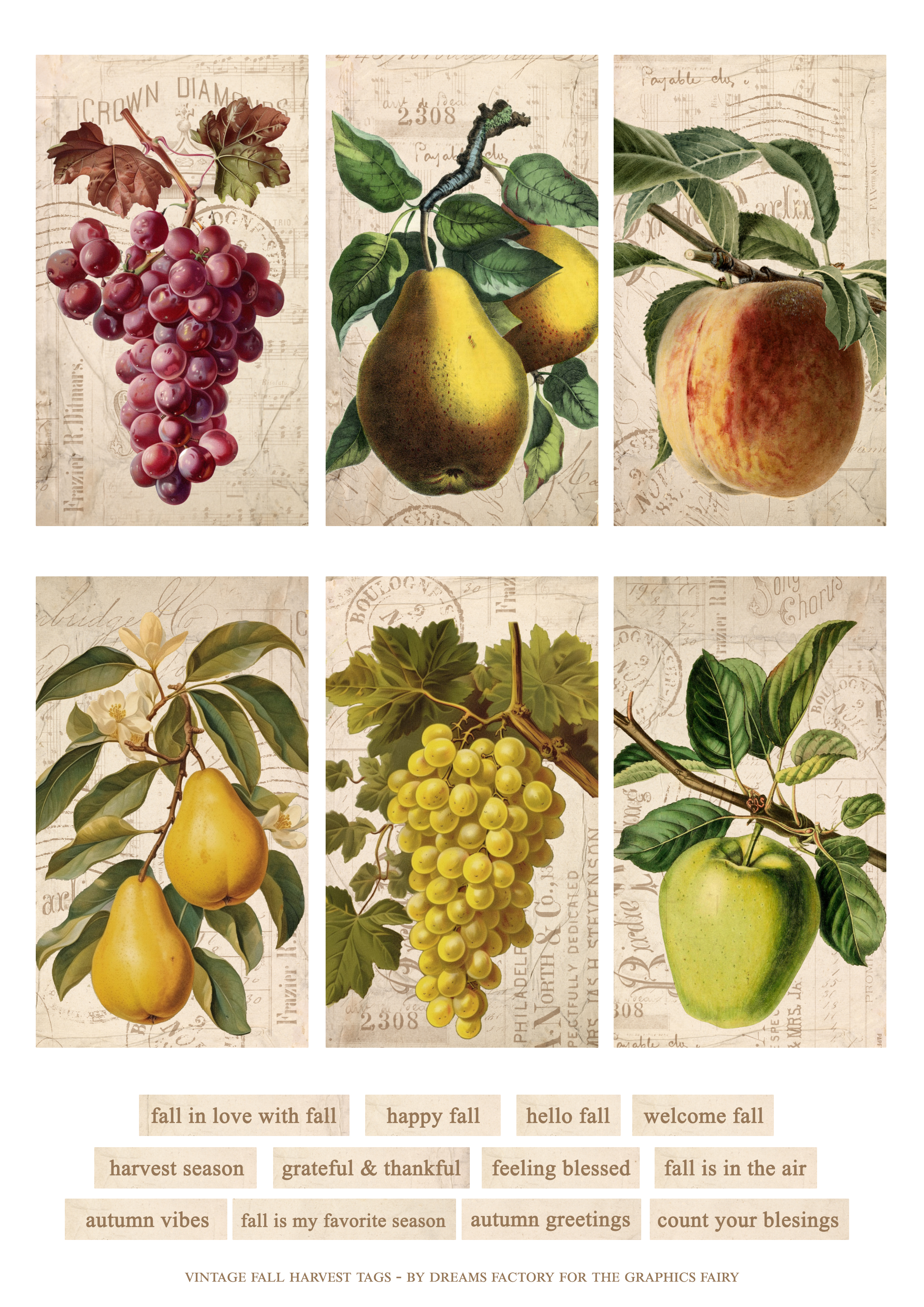
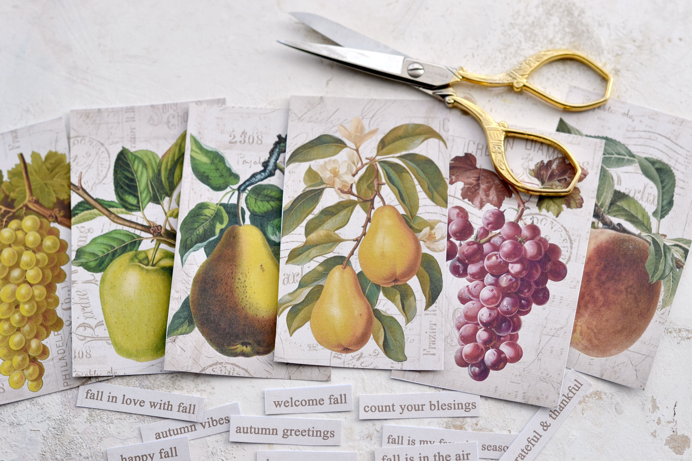
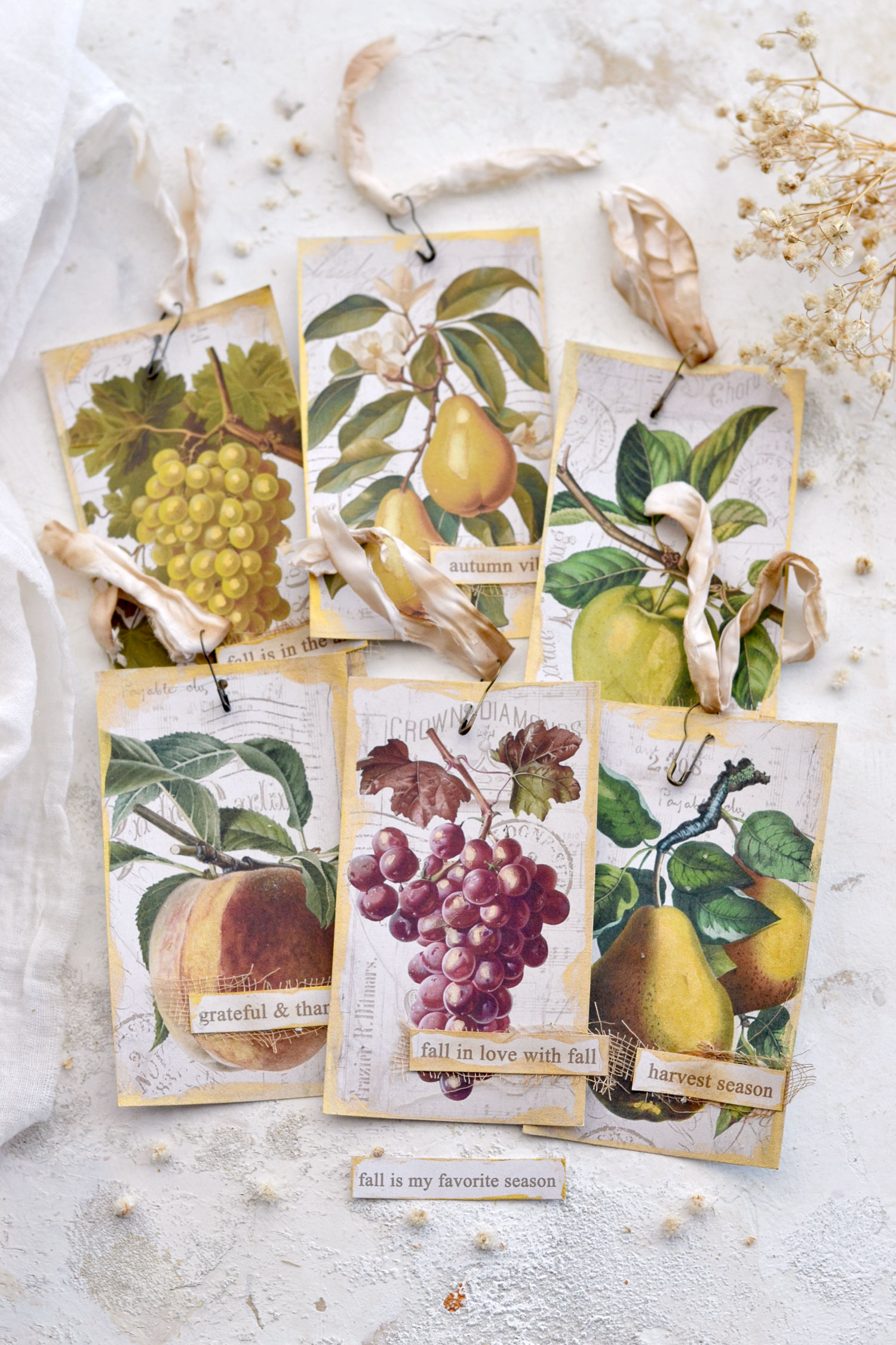
Here is the free printable that I created for this project, I included a few of my favorite fall fruit images from The Graphics Fairy. You will find grapes in two different colors, pears, peaches and apples, one more beautiful than the other! The tags have a simple rectangular shape and a super chic vintage ephemera background that adds even more charm to these beauties. I also included a few fall sayings, you can pick and use your favorites!
Free Printable:
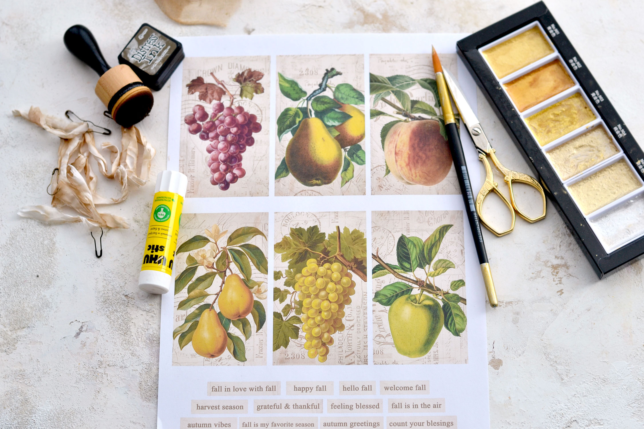
Supplies:
- white cardstock paper
- home printer
- scissors
- mini distress inks
- blending tool with foams
- gold watercolors – I used my favorite Kuretake Gansai Tambi Starry Colors
- small brush
- gourd pins – gold or bronze
- scrap pieces of gauze or cheesecloth
- crinkle ribbon
- craft glue
Full Step by Step Tutorial:
Start by printing your printable on cardstock paper and then use your scissors to cut out each tag and all the other elements.
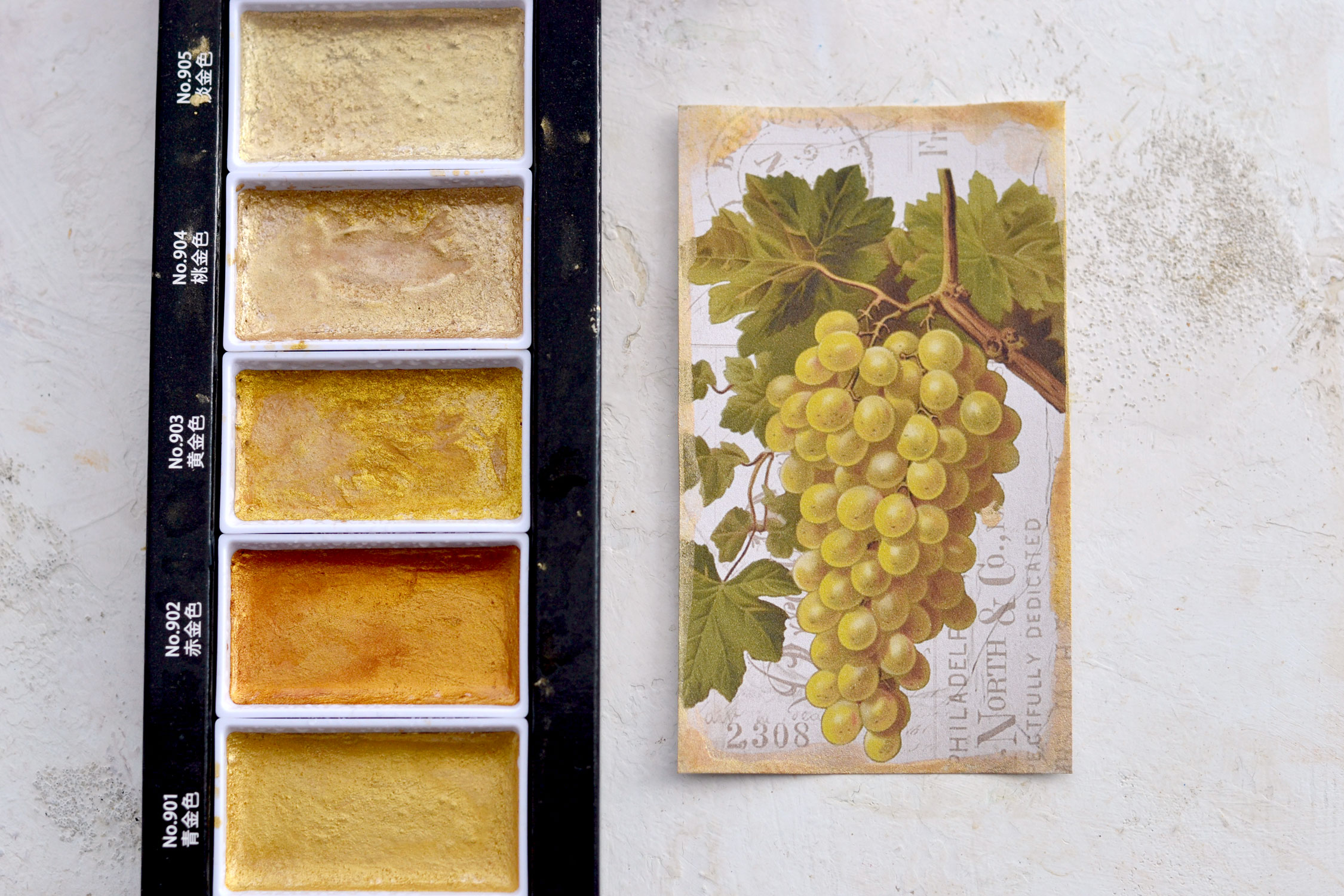
You can then decide the direction you want to take with these, I decided to use gold watercolors to create some simple, but super chic gilded edges. Use a small spray bottle to wake up your watercolors, then use your index finger to pick up some paint and start painting the edges. If you don’t want to use your finger, you can try using a small brush or even some crumpled paper towels. Try not to think too much and just go with the flow, you will see the gilded edges will turn out so much better if you don’t overthink the process too much. I added more gold paint on the corners to create a lovely vignette effect.
Don’t add too much water while painting the edges, you don’t want to wet your paper too much so it still holds its shape. If you want, you can try using some gold wax instead, you will get similar results.
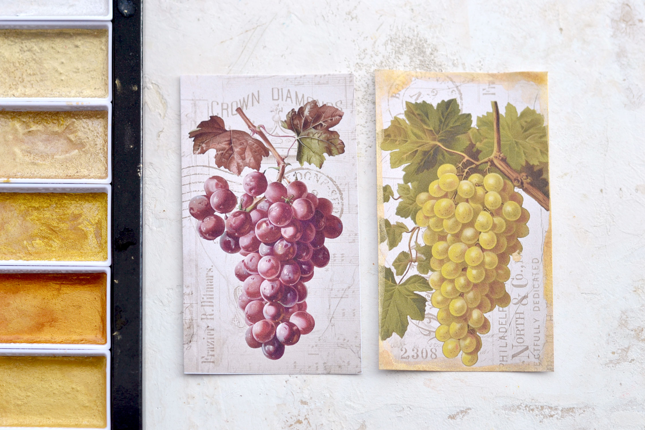
You can see below a side-by-side comparison between a non-gilded and an already-gilded tag, I think the gold watercolor can add so much chicness to these beauties!
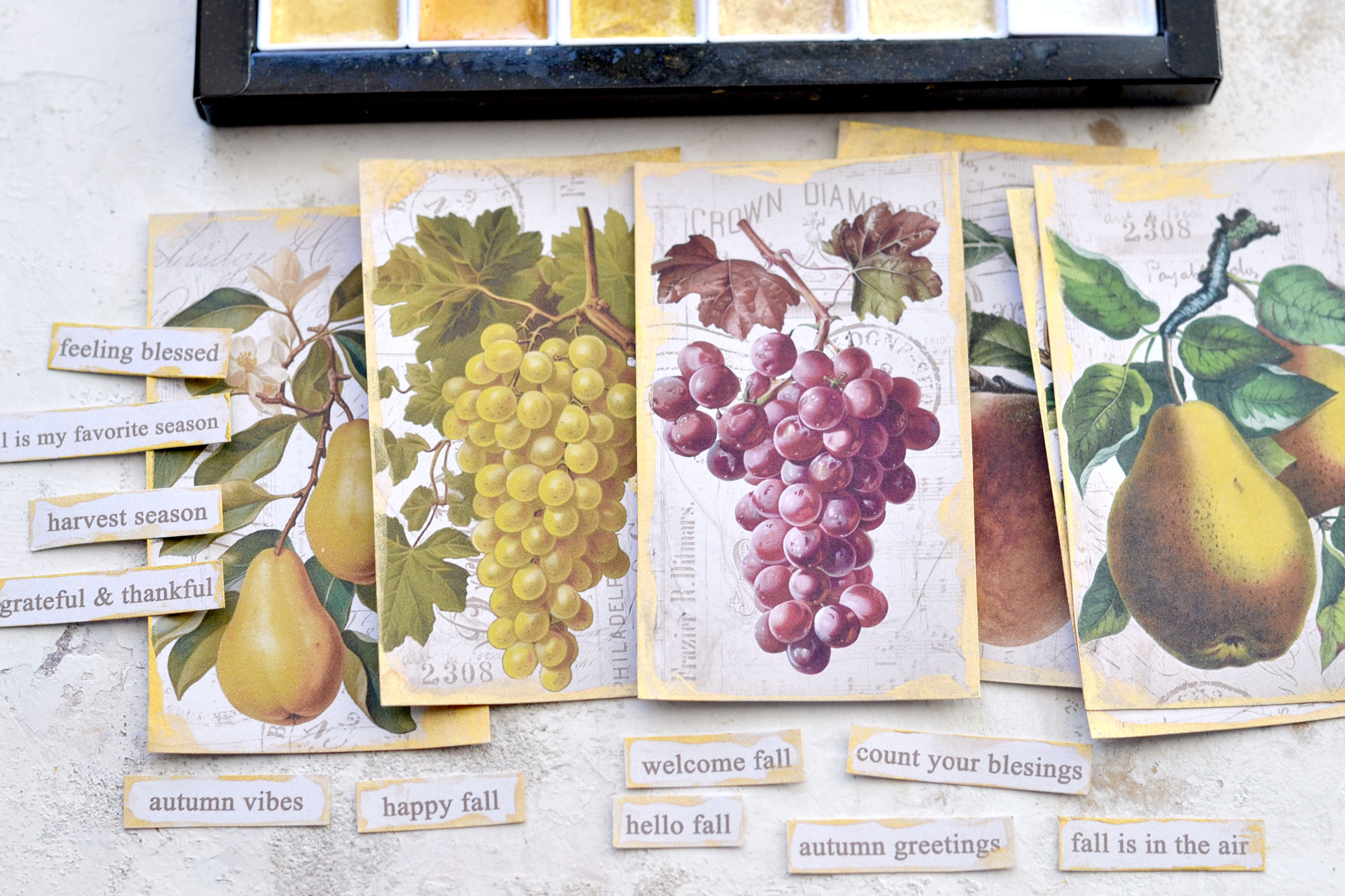
Creating a gilded edge effect turned out to be such a fun process! A little bit messy, I know, but my only regret was that I hadn’t printed another copy to make some more! Don’t forget about your small cutouts for fall too, add some gold to those if you want!
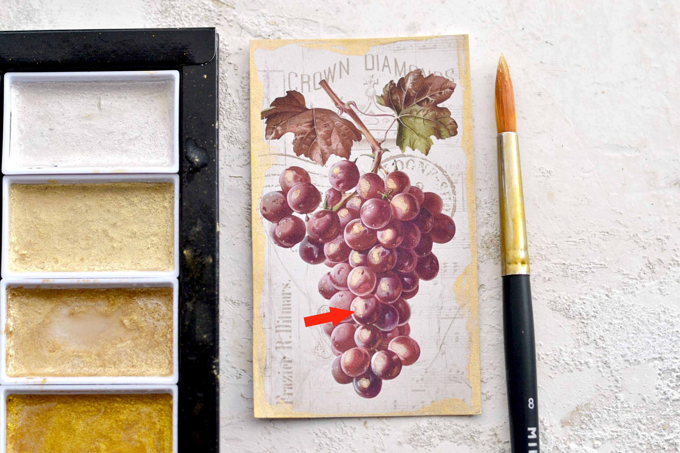
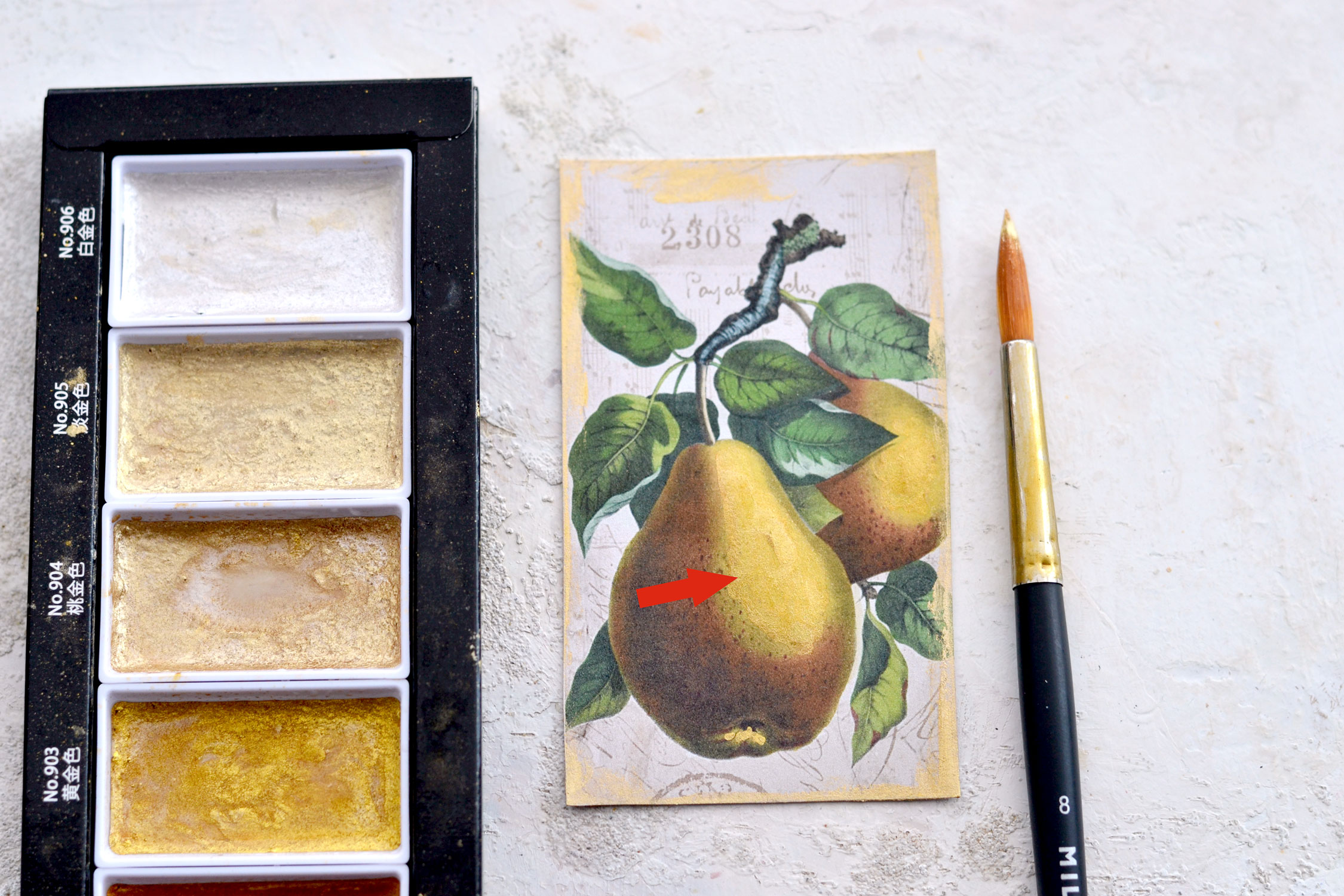
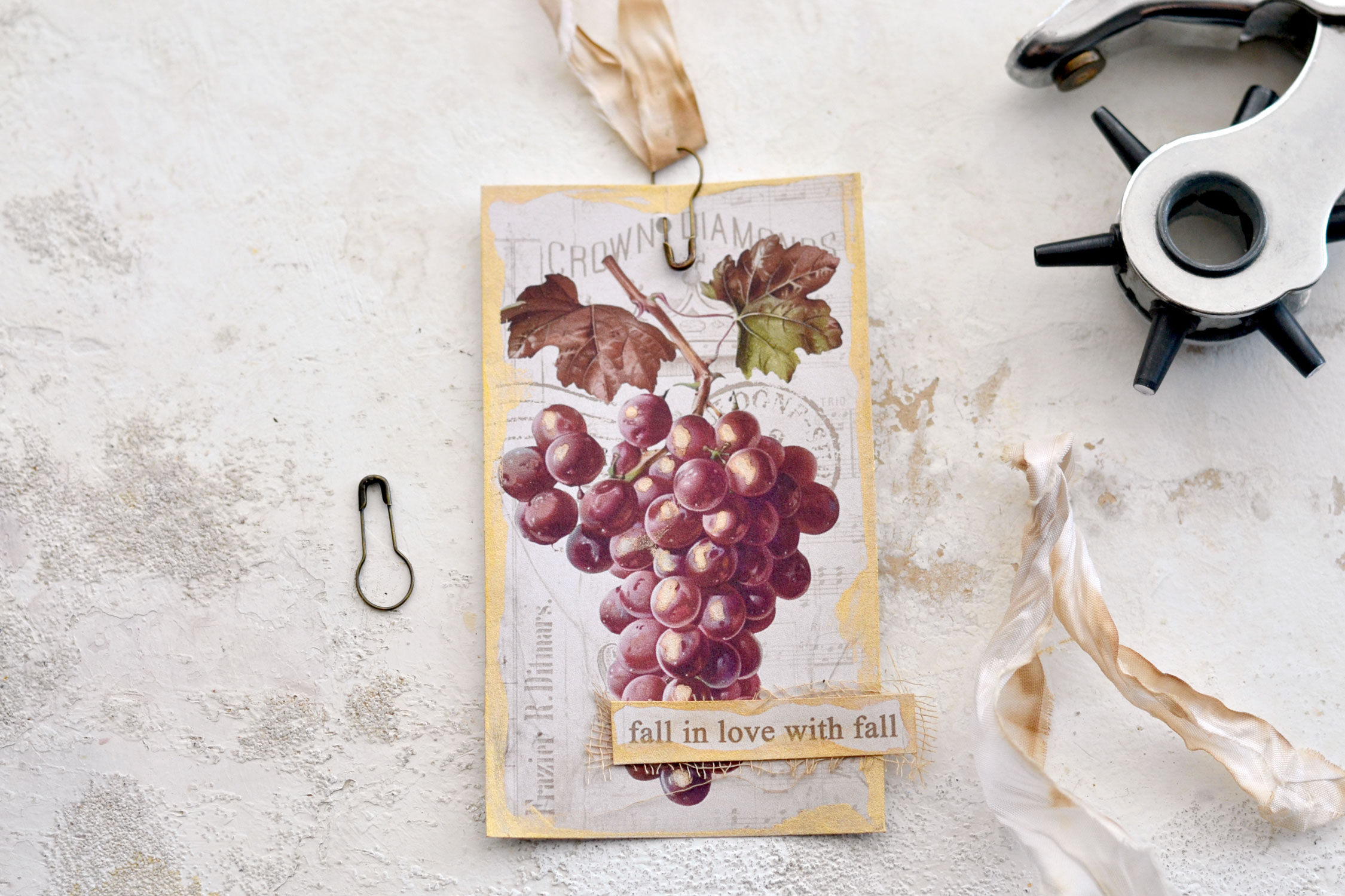
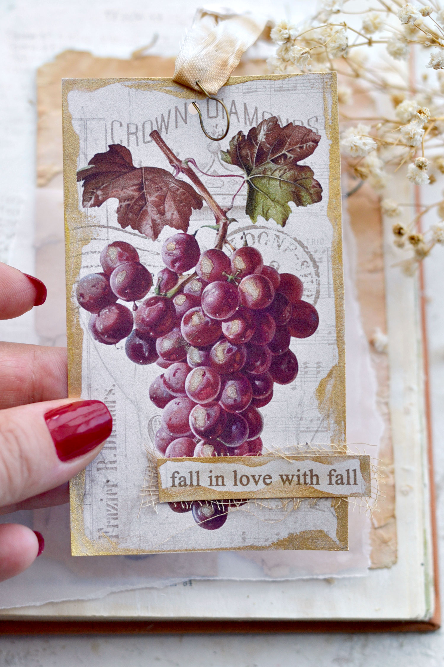
As an extra step, you can use a lighter gold to add some highlights to your harvested fruits! Try to observe and determine where the light falls in each image, then use the tip of a round brush and some gold to highlight those areas. You will notice that this red grape image has lighter areas on the left side of the berries that are smaller or larger, depending on the lighting. So you can use your brush to paint those areas, trying to follow their irregular shape and create an organic flow. The gold watercolor set from Kuretake that I’m using is my favorite because you get all these different shades of gold and you can adapt them to your needs. I initially wanted to use the first color from the set, which is more like a pearlescent white, but I was afraid that it might look like frost, which is colder and more appropriate for winter projects. My idea was to add the warmth of fall so I’ve decided to paint using the second color from the set which is a super light, but absolutely gorgeous gold.
You can add gold to some of the larger areas of the other fruits if you want, the idea is to enhance the areas where the light hits in each image without ruining its initial design.
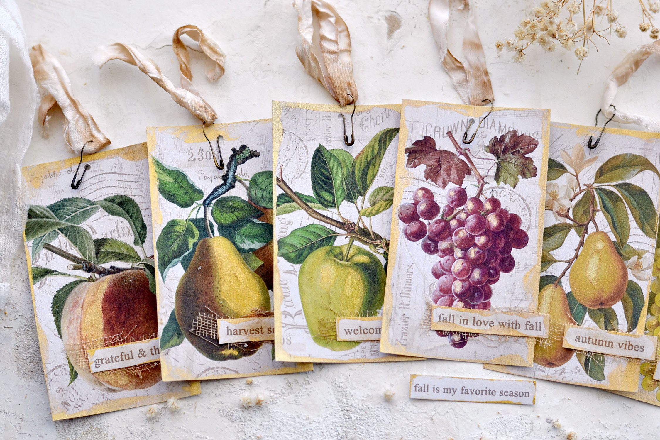
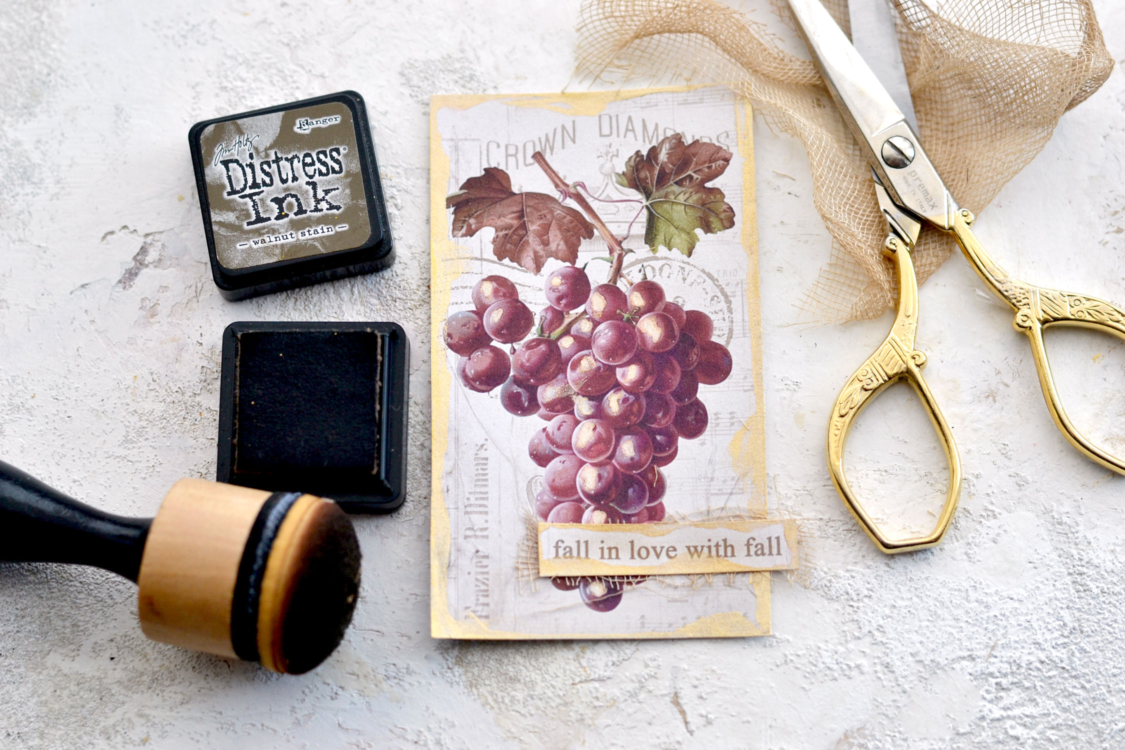
As for the fall sayings, you can decide to glue them in the middle of each tag or on the side, as I did. You can use some coffee-dyed gauze or cheesecloth underneath these small lovely cutouts to create a little bit of dimension.
If you feel like the tags could also use some more distressing on the edges, you can use your favorite brown to do that. I usually like to use the Walnut Stain Distress Ink from Ranger and a domed blending tool.
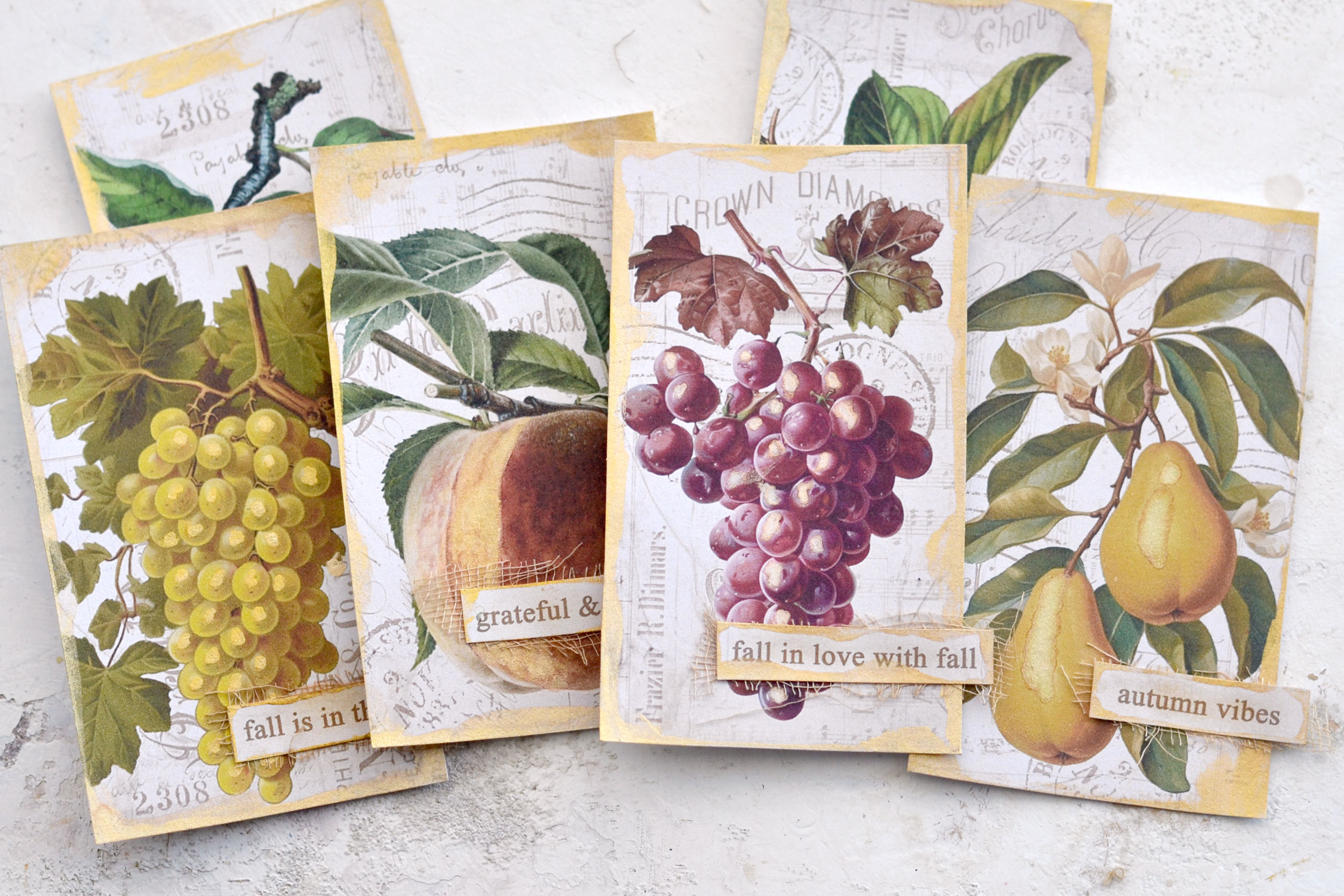
At this point, I thought these beauties would look amazing as cards too, so if you want, you can keep a few of them as they are!
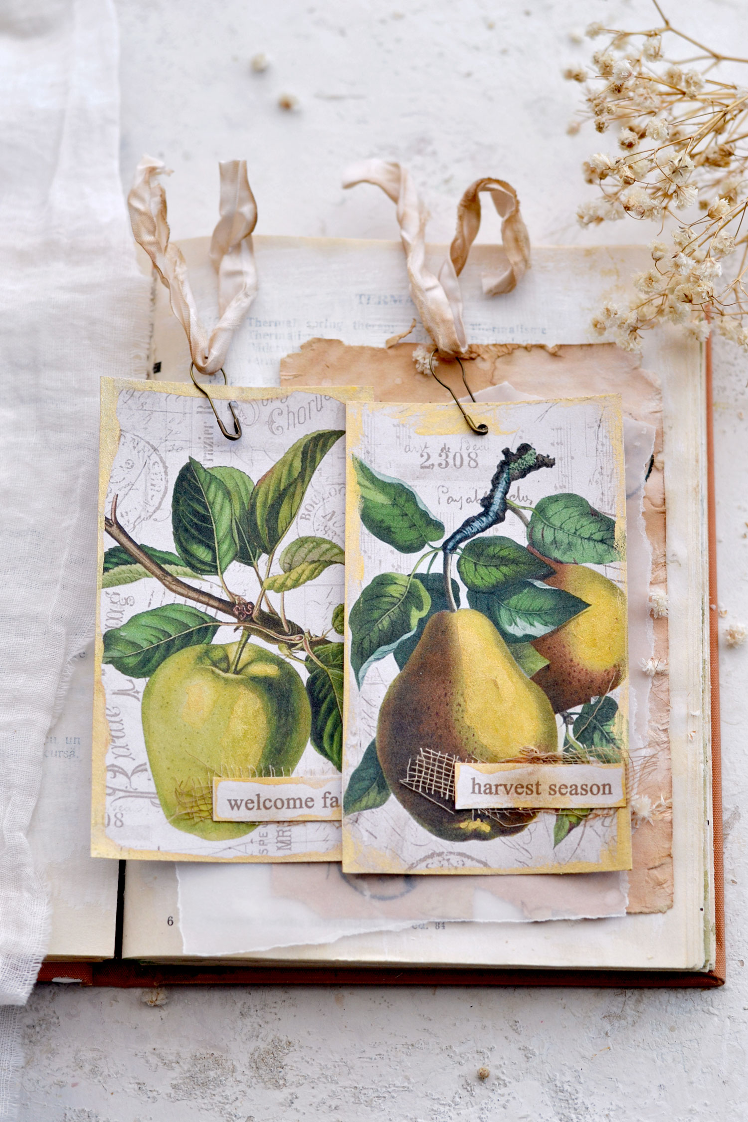
Or you can decide to turn them all into tags, the choice is all yours! I used small gourd pins and some crinkle ribbons that I previously dyed with coffee, to also imprint it with a vintage vibe.
I love using gourd pins to add crinkle ribbons to my tags, I feel these two add so much charm to any paper creation! The final pieces turned out absolutely amazing, don’t you think?
It’s great when you can create something so beautiful in a short time, you can mix and match these beauties as you want, the sky is the limit!
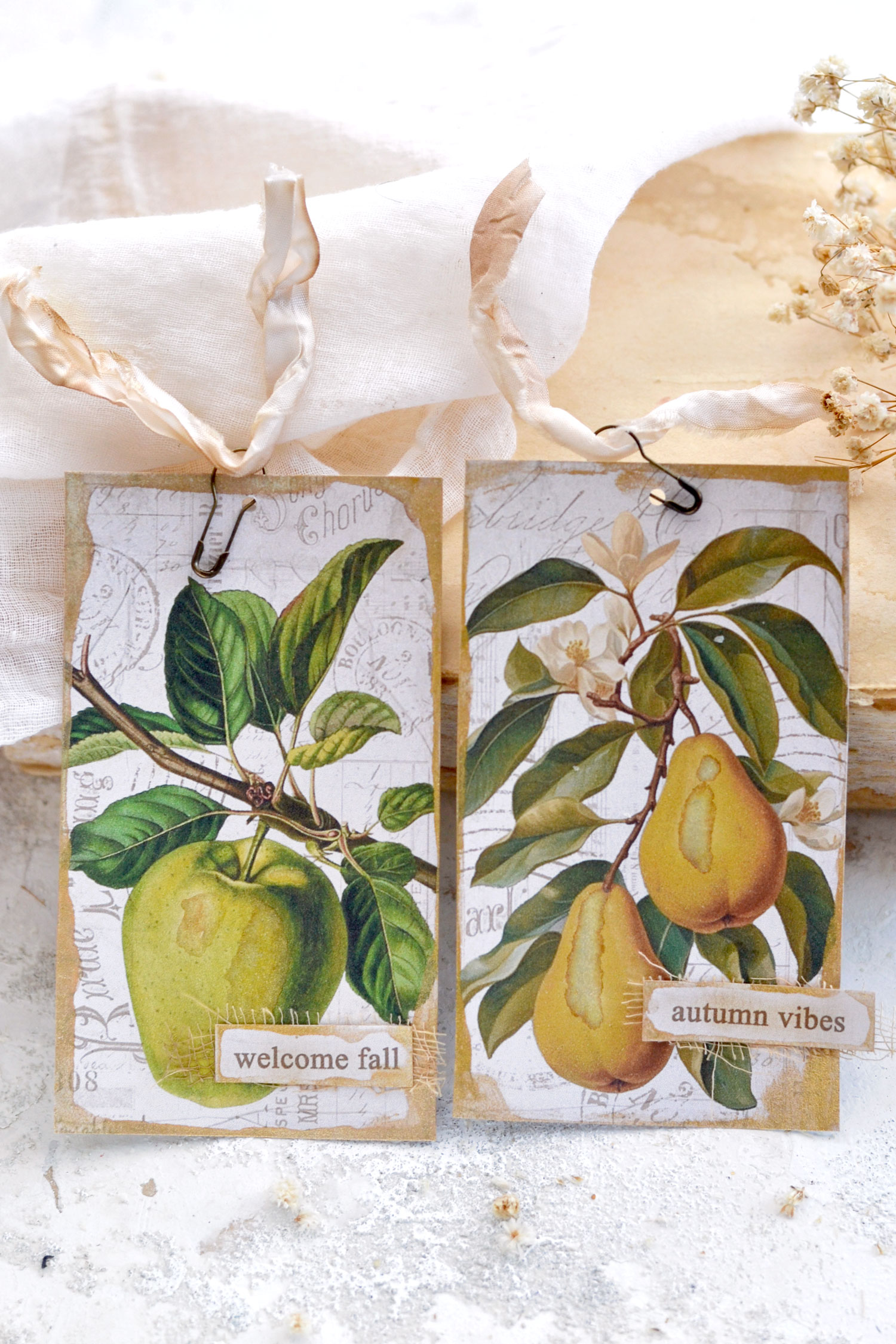
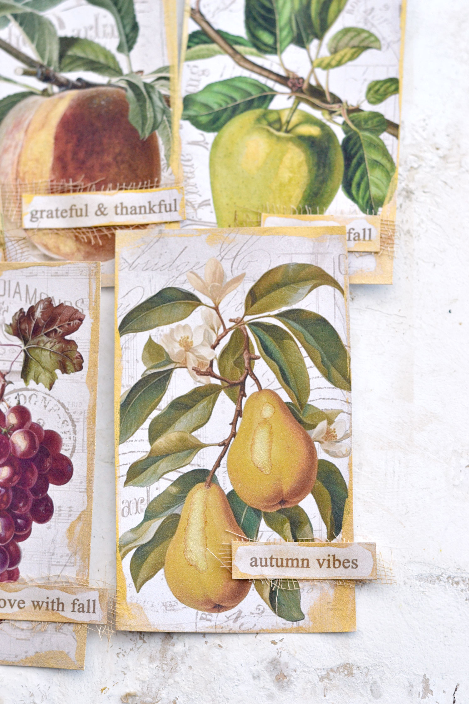
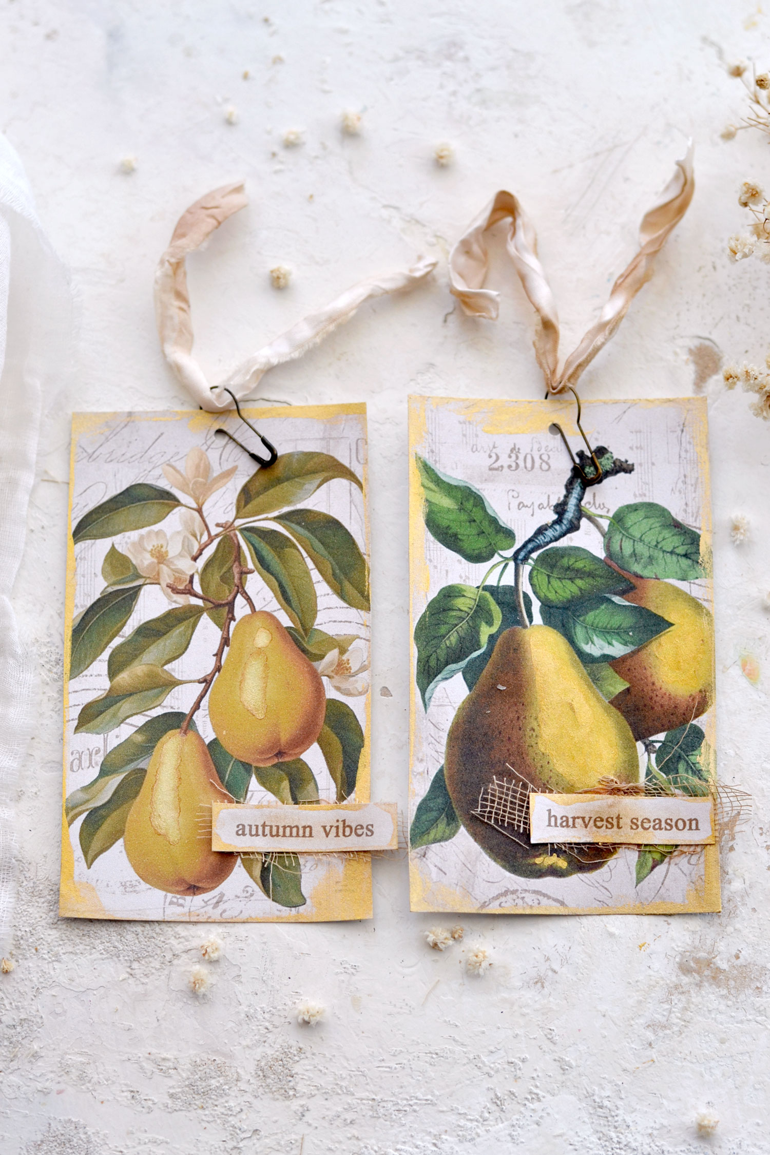
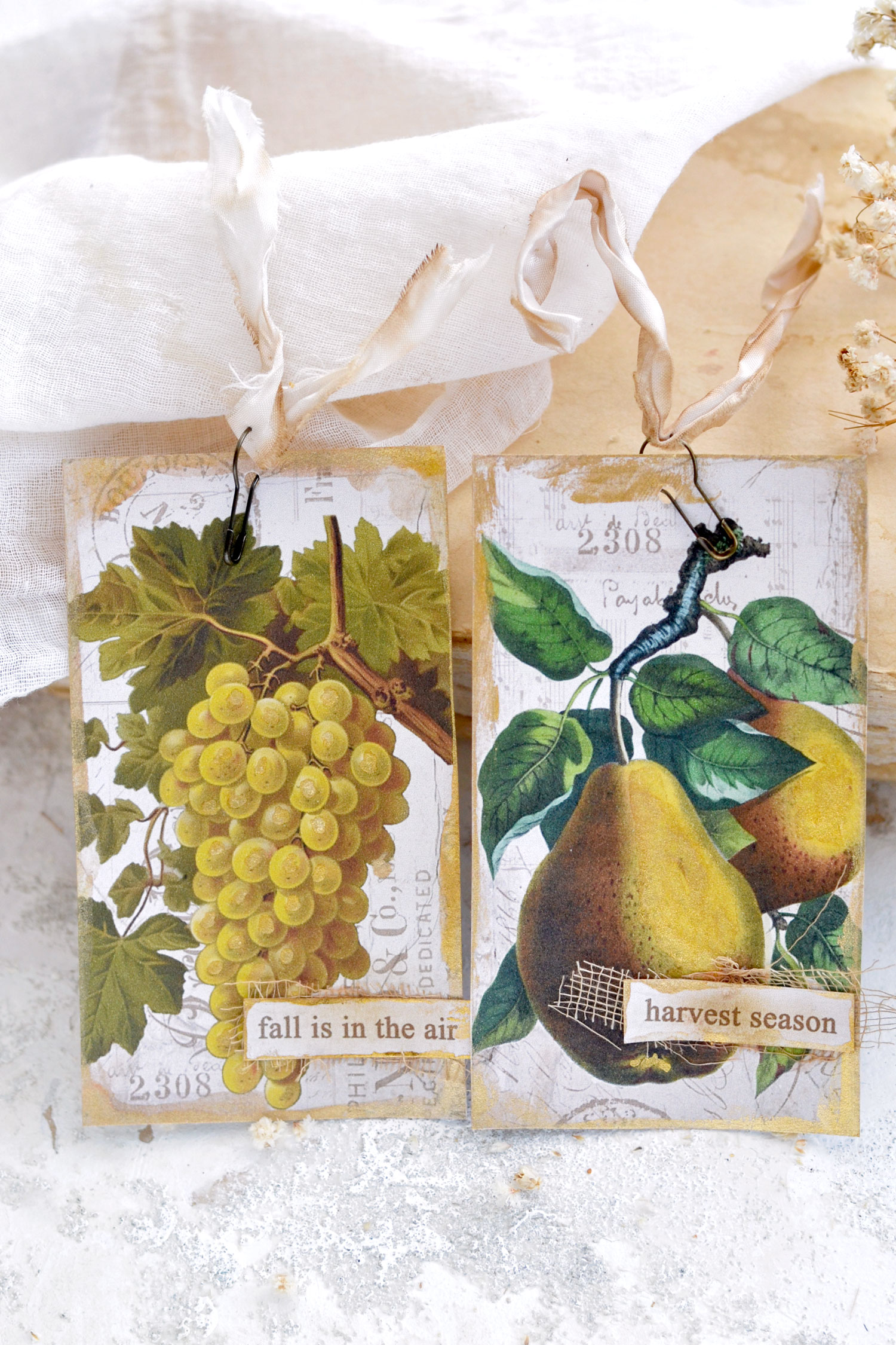
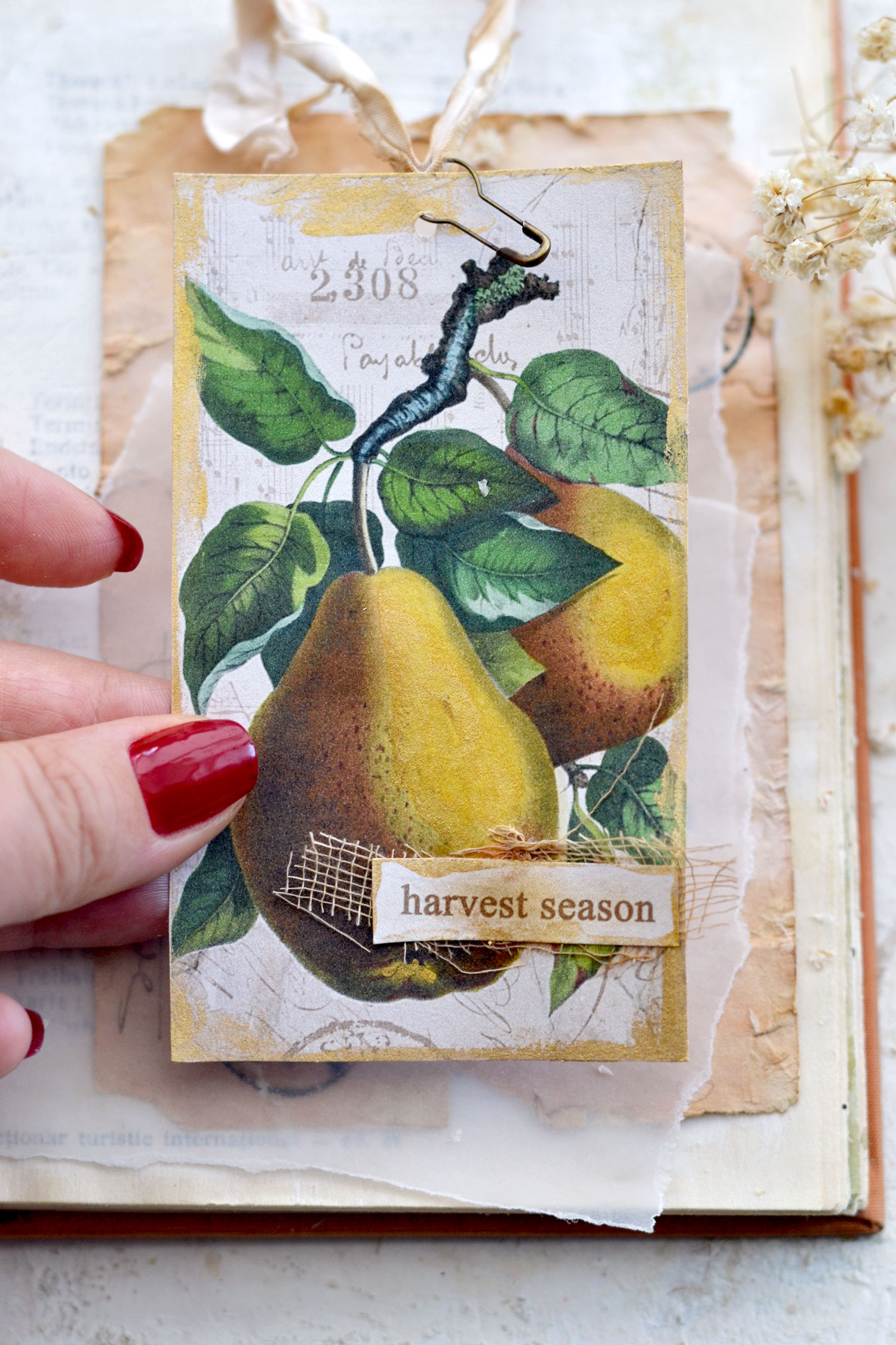
You can choose to use the two pear tags together, even though they don’t have the exact color scheme on the greens, they still look amazing together!
You can also choose to use the vintage yellow grape and the pear tags if you are envisioning a yellow color scheme for a warm-colored junk journal this year!
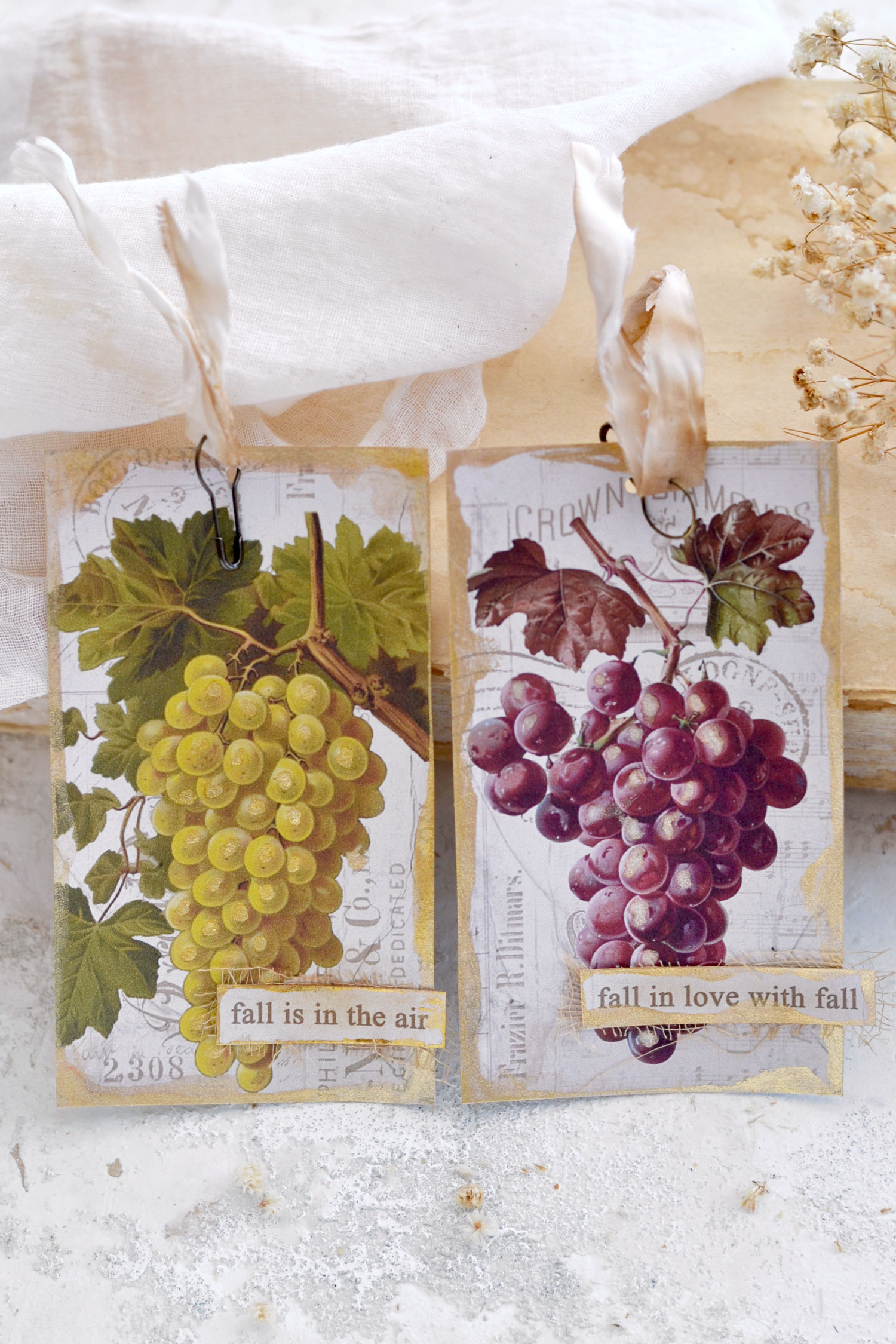
But of course, you can also switch things up and use these two different colored vintage grapes, can you believe how gorgeous these look?!
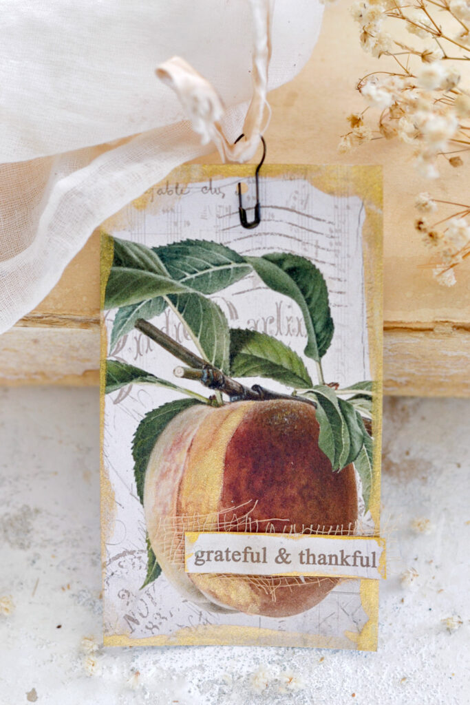
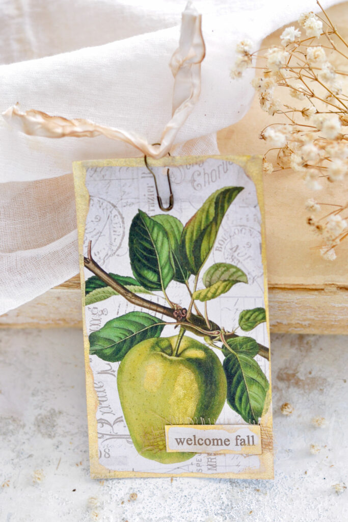
You could also pick one of these lovely peach and green apple with charming gold touches to use on their own.
Or take the apple and pair it with this yellow pear! I think that it might be the vintage ephemera background that does such an amazing job of creating a cohesive look for all these images. They look really beautiful together!
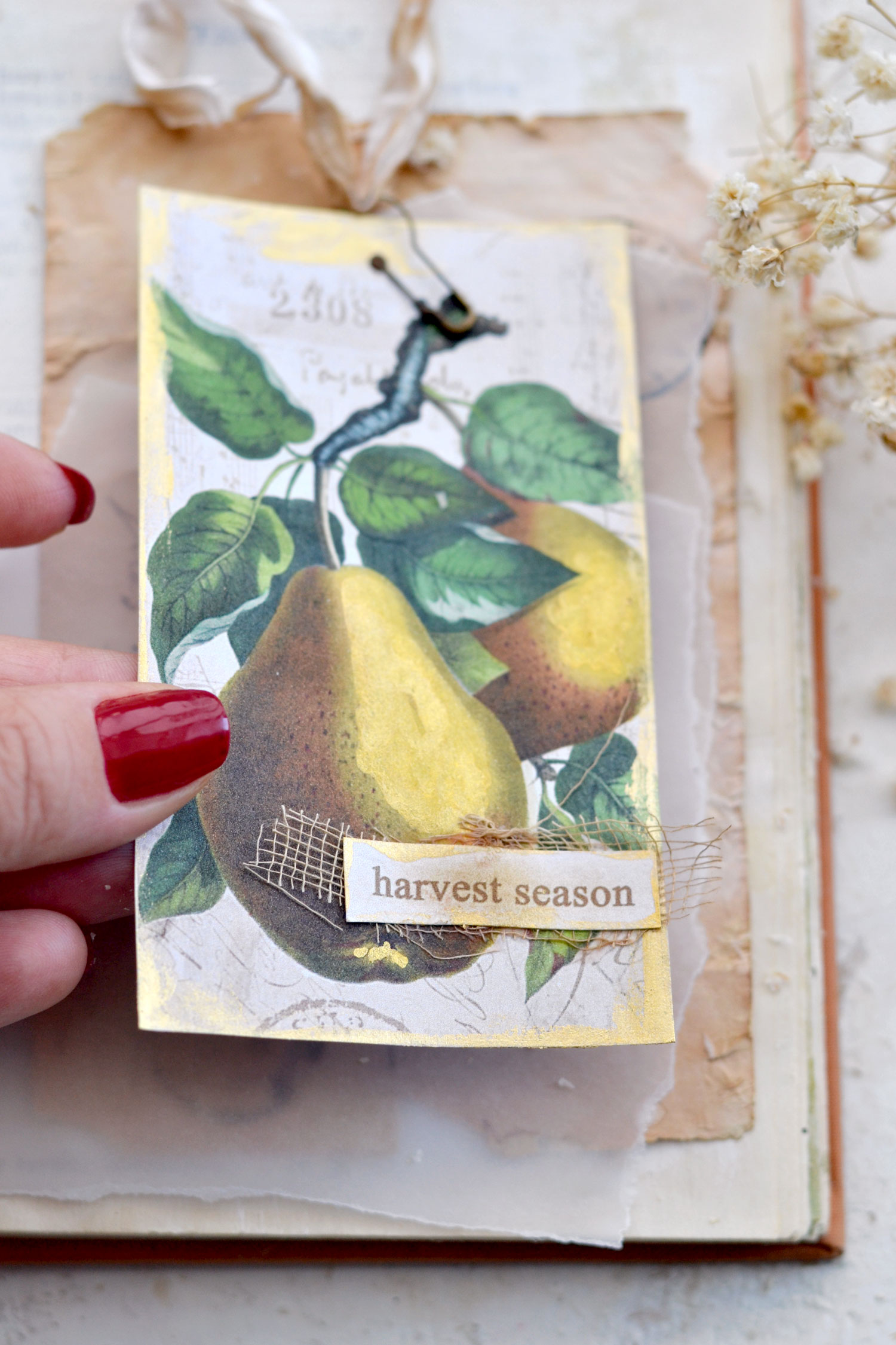
If you are not convinced about adding gold to these beauties, I want to show you what a difference a little bit of gold can make! Below you can see the pear image to which I added the largest amount of gold paint as a highlight. If you look at this image from the front you might not be able to see the gold too much.
But when you tilt the tag, you can definitely see the shimmer in all its glory! I love adding gold watercolors to paper creation because of this subtle-in-the-front, super-shimmery-when-you-tilt-the-paper effect, it’s like a nice surprise that just waits for you there!
This red purple-ish vintage grape image turned out to be my favorite! I’m not sure if it’s the color or the fact that it stands out from the harvest fruit crowd, but I love it!
I hope you will also love this project and decide to give it a try! Have some of these beauties ready for fall, they can be included in so many DIY or other creative projects! For now, I’m just using them as mini signs in my bookshelves along with vintage books, I feel they are so calming and inviting, simply perfect to help us transition to the new season!
Happy crafting,
Diana | by Dreams Factory



Christine says
Beautiful tags and images, thank you I really love these.
Karen Watson says
Thanks for your kind comment Christine!