DIY Junk Journal Watercolor Swatches
Hello Graphics Fairy friends! I’m Diana from Dreams Factory and I’m happy to be here again to share another DIY project with you! Today we are experimenting with watercolors as I will show you how to make some beautiful DIY Watercolor Swatches. These lovely paper bits can be used as embellishments for your Junk Journals and other paper crafts! You will have so much fun with this project and you can then include the finished pieces as lovely decorative pieces to complement your DIY creations.
I usually love using watercolors for their transparency, but also because they are so much fun and vibrant! You can also try this project with highly diluted acrylic paint, gouaches, markers, soft pastels, colored distress inks, watercolor pencils and even regular pencils, the sky is the limit!
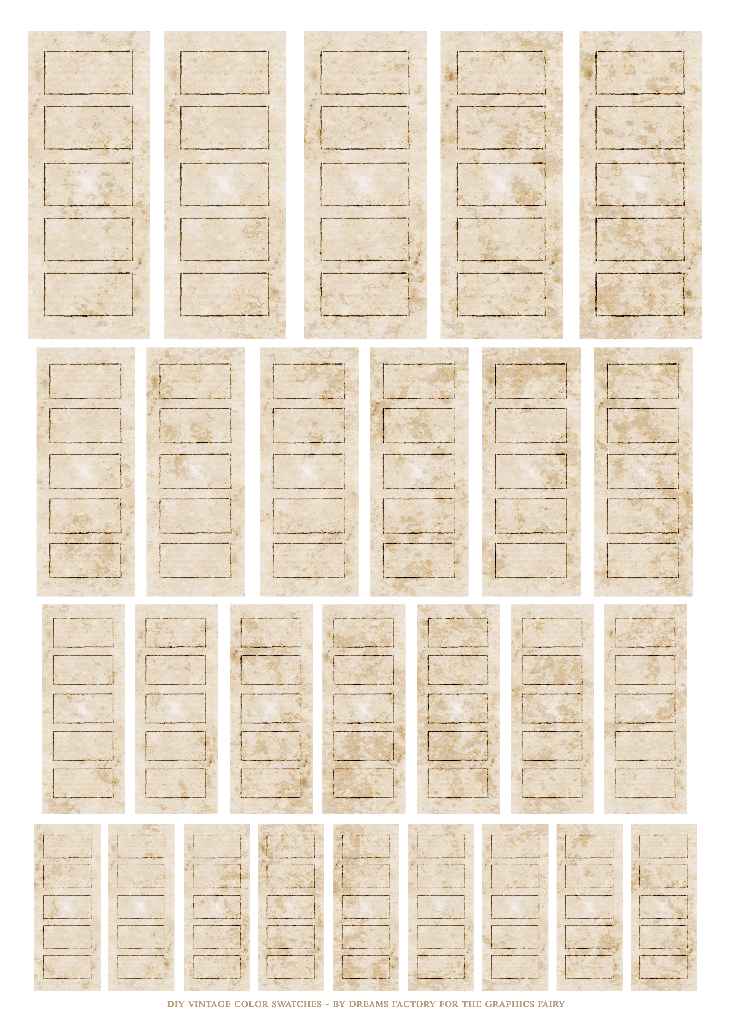
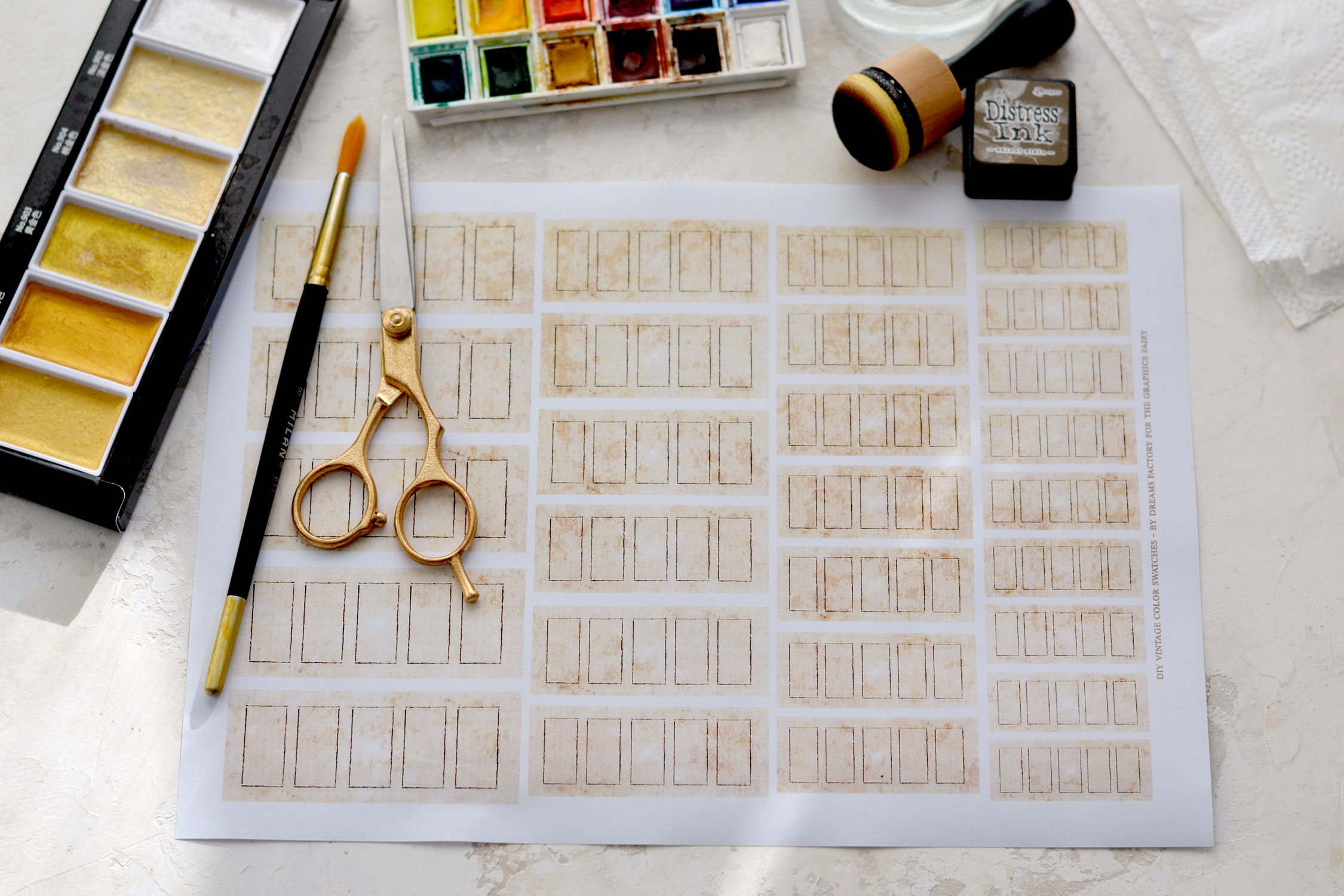
I designed the vintage color swatches in several different sizes, you’ll have 27 beauties just waiting to be discovered! If you want to make more, you can print them as many times as you want! The swatches already have a built-in vintage vibe, because of their shape, background and lovely stained appearance, but you can further distress them if you prefer.
Free Printable Swatches:
—-> Click HERE to Download the Full Size Printable PDF <—-
Supply List for DIY Junk Journal Watercolor Swatches:
- white cardstock paper or regular paper or sticker paper
- home printer
- scissors
- mini distress inks
- blending tool with foams
- watercolors (I used the Winsor & Newton Cotman pocket box watercolors), you can also use highly diluted acrylic paint or even pearlescent watercolors like Kuretake Gansai Tambi Starry Colors
- brushes
- recycled jars for water
- silicon mat, a plastic sheet or a non-absorbent material to protect your working surface
- paper towels
- spray water bottle
Step by Step Tutorial:
You can use regular paper, cardstock or even sticker paper to print the swatches, but because we will be using a lot of water, it’s important to use a laserjet printer. If you don’t own a laserjet printer, you can ask a friend who has one to print them for you or you can take them to a copy center.
If you have some lightweight watercolor paper that can be used for printing, you can also use that, it will give them even more of a watercolor-y vibe.
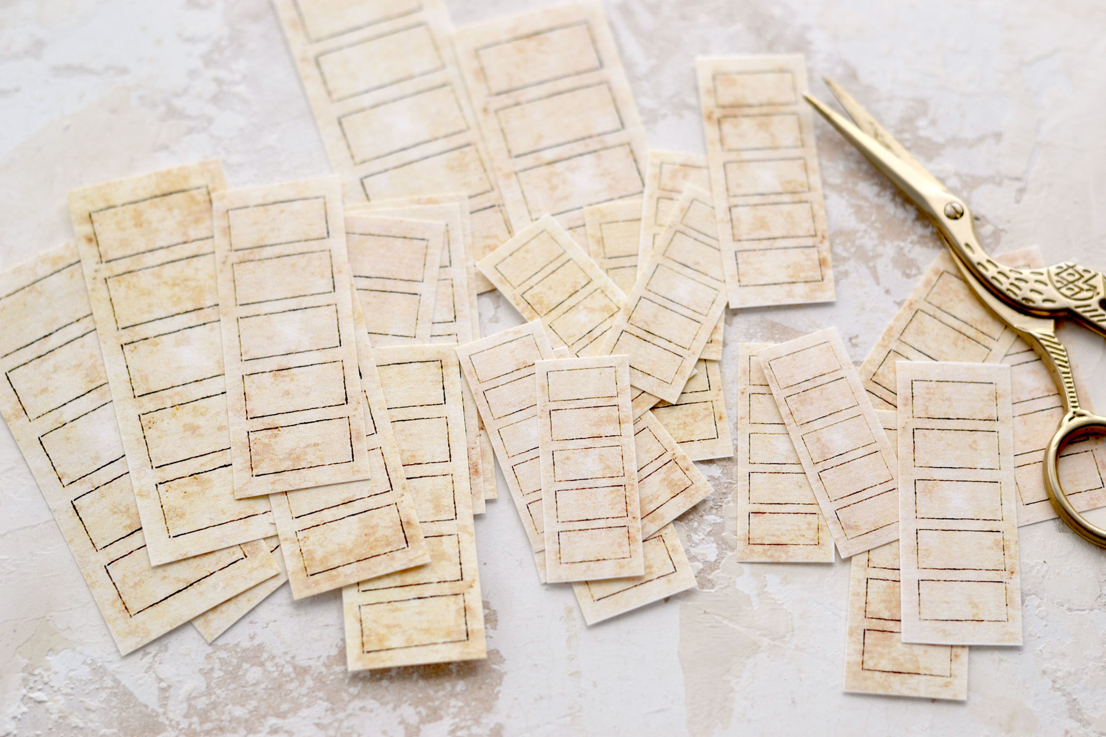
I used white cardstock paper to print my swatches and then I used my scissors to cut each of these beauties out.
I have a lovely white mat from Ikea that is non-absorbant so I usually like to use it for projects that involve using lots of water. You can also use a silicon mat, a plastic sheet or a non-absorbent material to protect your working surface.
Start by using a small spray bottle and spritz some water on your watercolors to wake them up first and make them ready for painting. Then, to keep the paper from warping too much, you can also spray some water on your working surface or on the back of each swatch before actually arranging them on your table. Don’t add too much water, you only need to make your paper temporarily ‘stick’ to your table and water can help you achieve that while you paint.
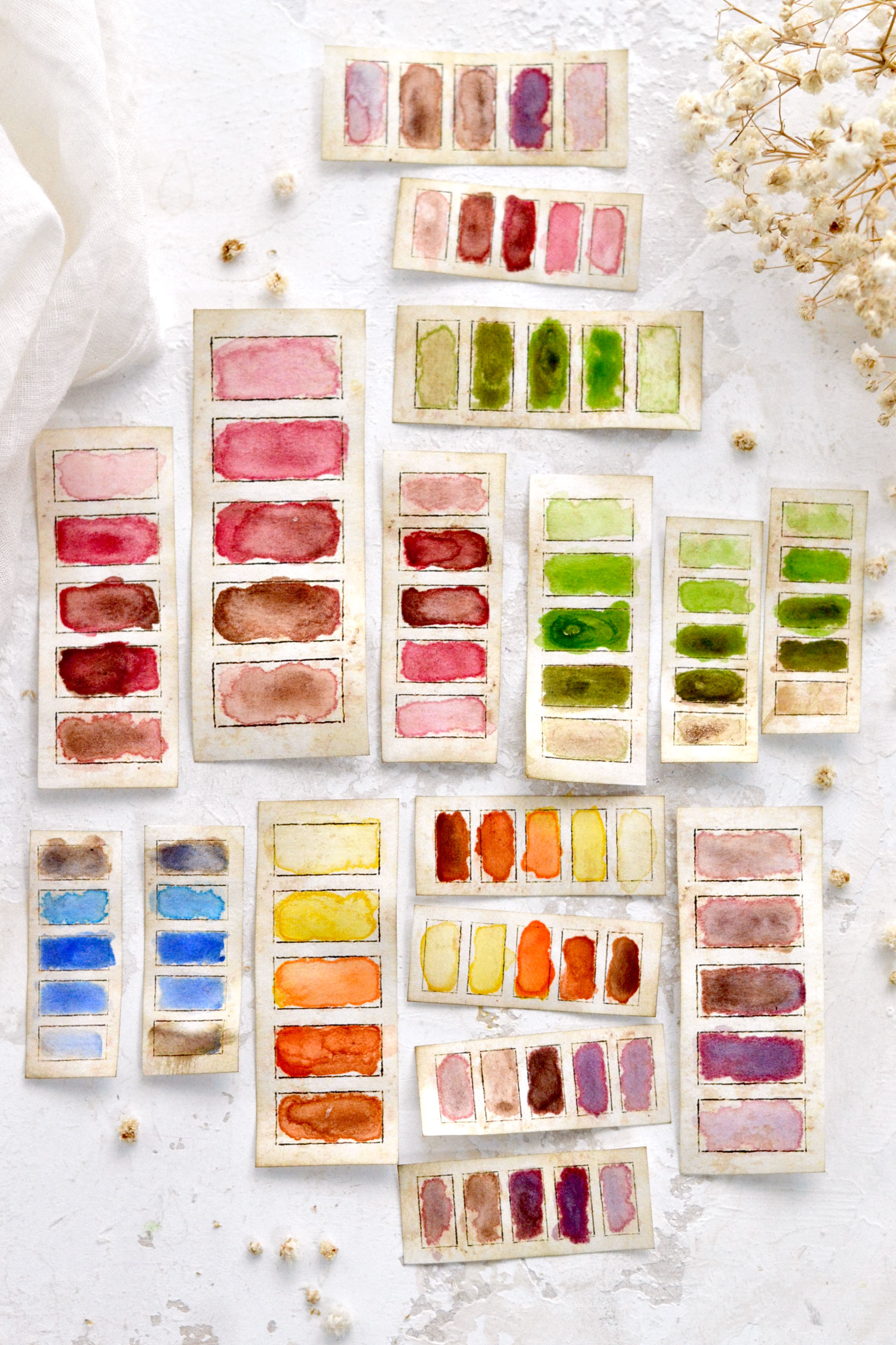
As for choosing the colors, just let your inspiration for the moment guide you through! I worked in batches and created 5 different sized swatches for each color scheme, I thought it would be fun to have them grouped like this for when in need. I mostly used one or two colors for one batch to create different shades from light to dark to which I added a brown like Burnt Umber or Burnt Sienna to make a few darker variations.
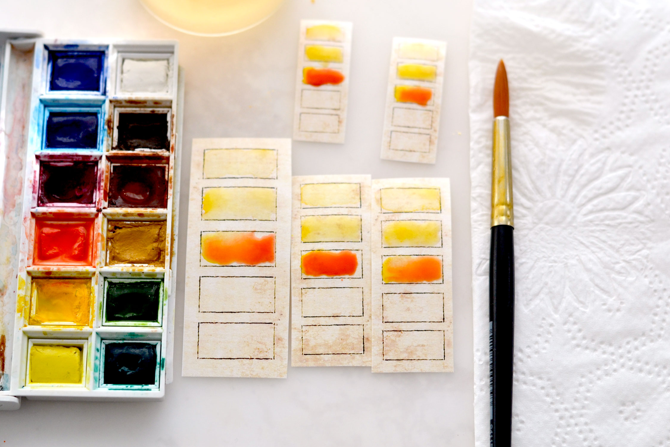
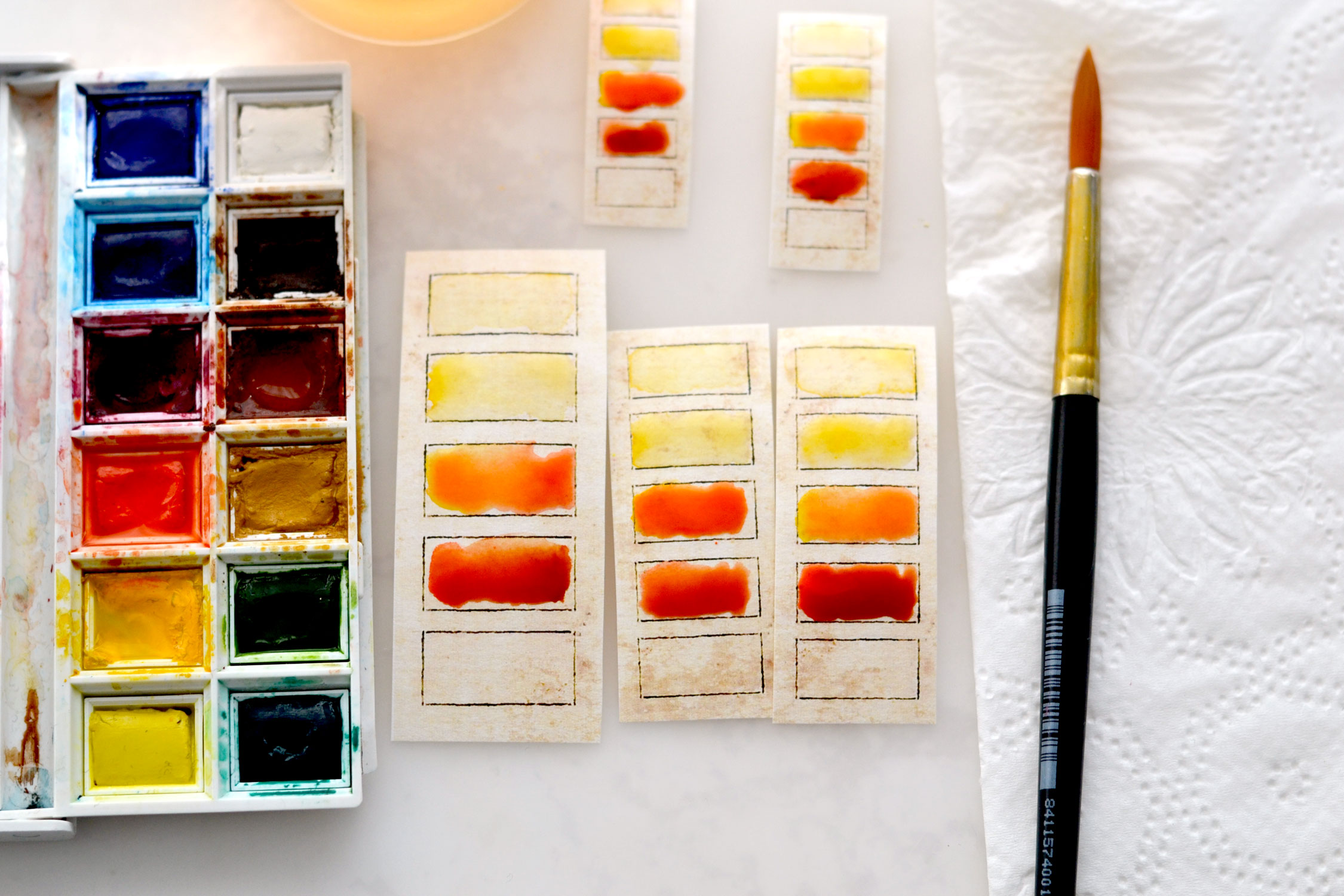
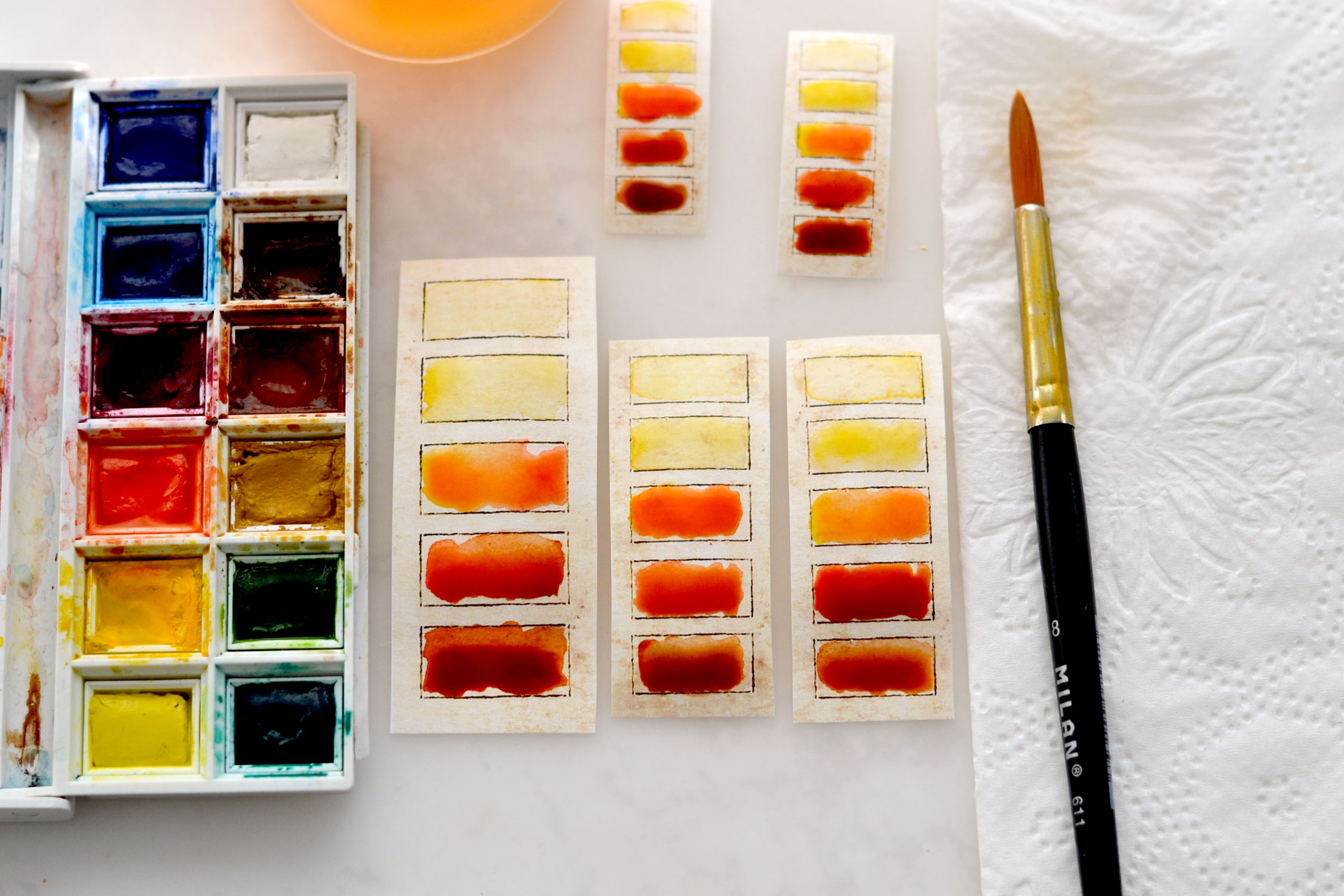
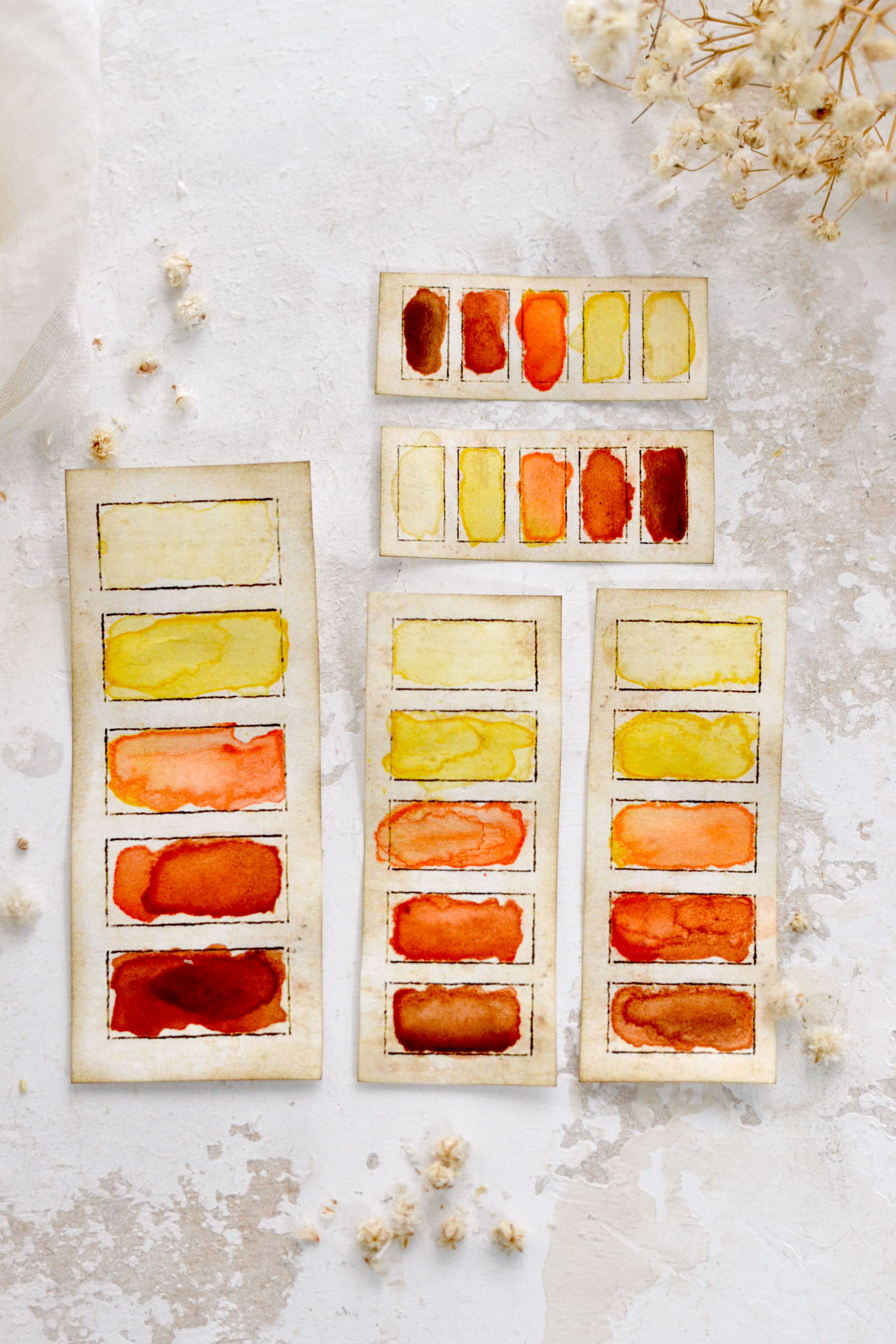
The first batch was a mix of yellow (Cadmium Yellow), orange (Cadmium Red) and brown (Burnt Sienna). I started with a light wash of water and a tiny bit of yellow in the 1st box. In the 2nd box, I picked up more yellow from my watercolor palette to create a slightly darker shade. In the 3rd box, I mixed some more of that yellow with a little bit of orange.
In the 4th box, I painted a mix of a more loaded brush with orange and a tiny bit of brown.
And finally, in the 5th box, I added orange with even more brown to create a darker shade.
This will create a lovely gradient effect that beautifully goes from light to dark!
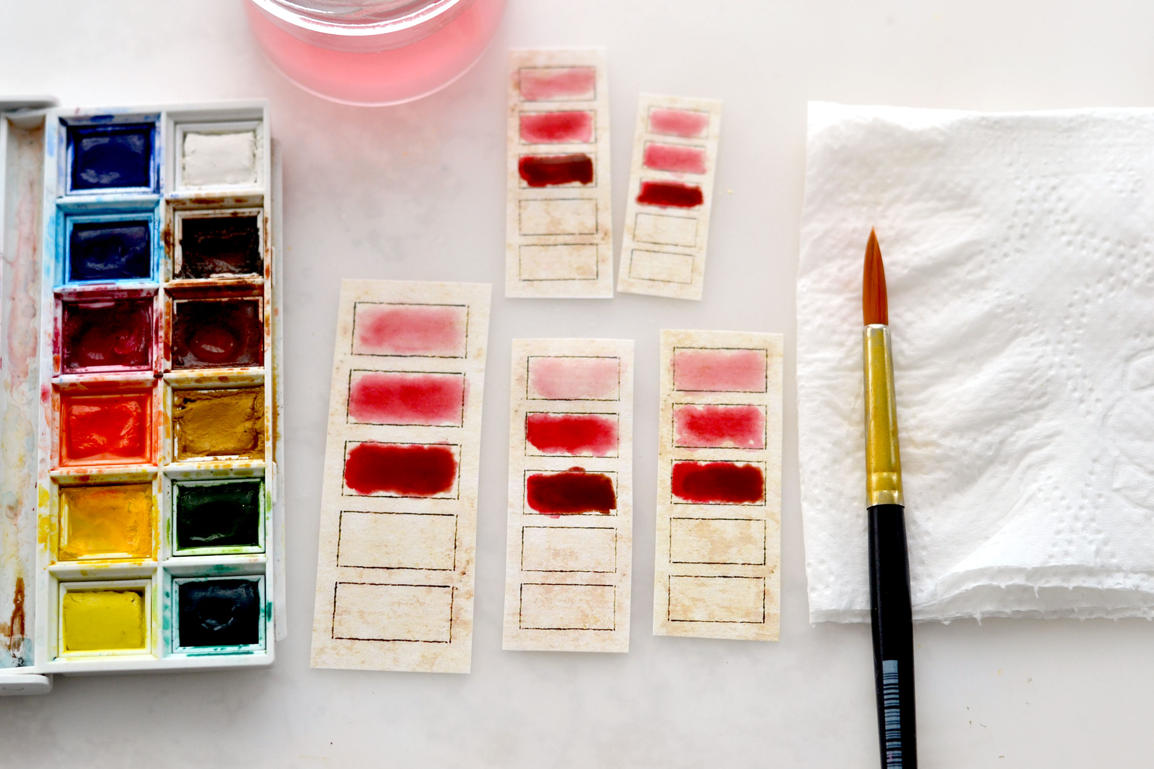
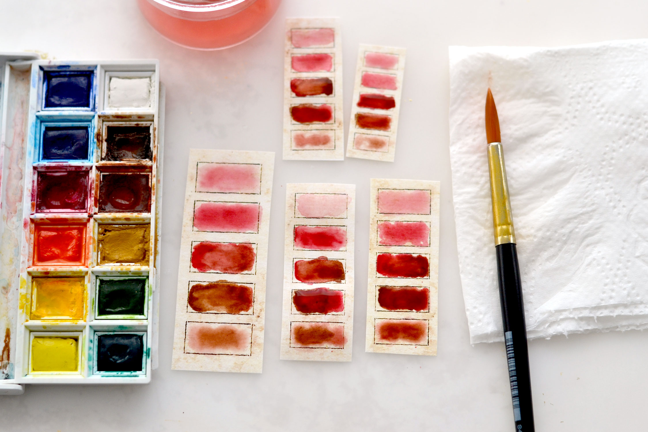
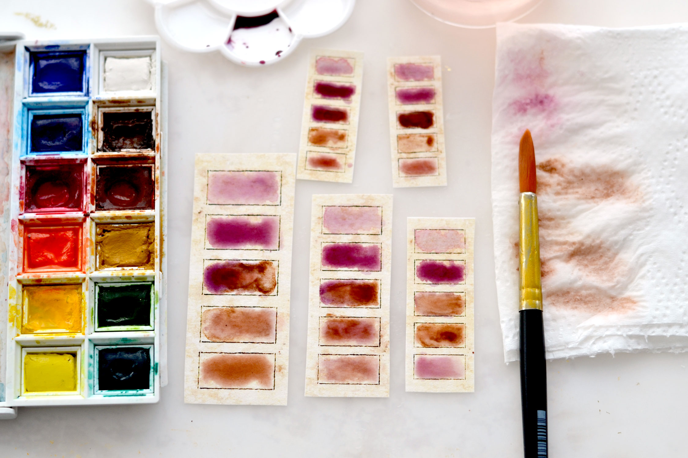
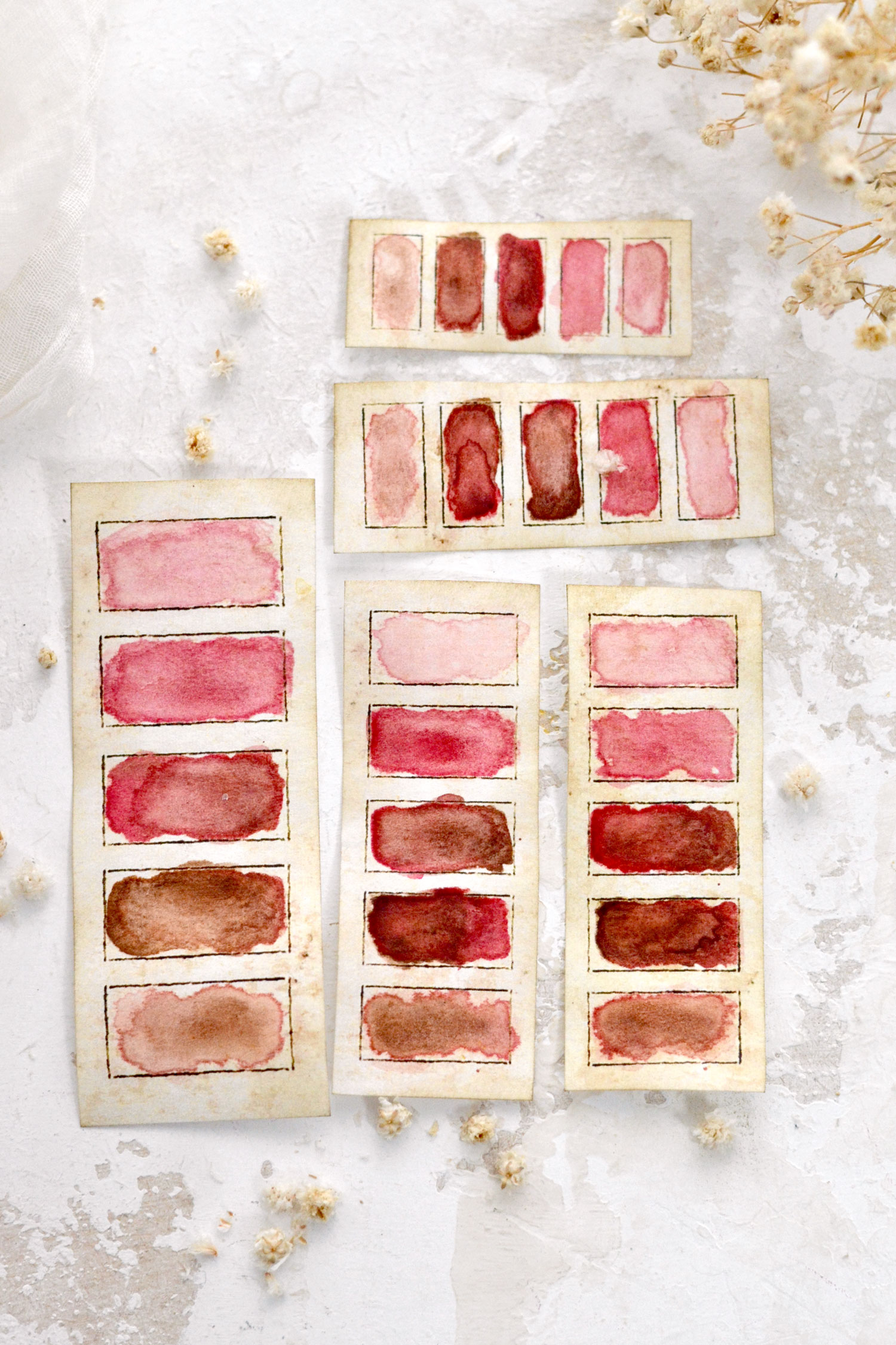
For the second batch, the pink one, I only used one color (Alizarin Crimson) to which I added some brown (Burnt Umber) in the last two boxes.
I started with a light wash of water and gradually added different shades of the main color to the first two boxes, plus a tiny bit of brown to the 3rd.
In the 4th box, I mixed the initial color with some more brown. You can create even more of a darker shade with some more brown in the last box, but you can also try something different like picking up some color from your previously painted darker boxes. So this time, instead of creating a darker shade in the last box, I used my Watercolor Paintbrush to lift some paint from boxes 3 and 4 and only used that, and a little bit of water to paint it.
So far, for all these variations I mixed the colors directly on the paper.
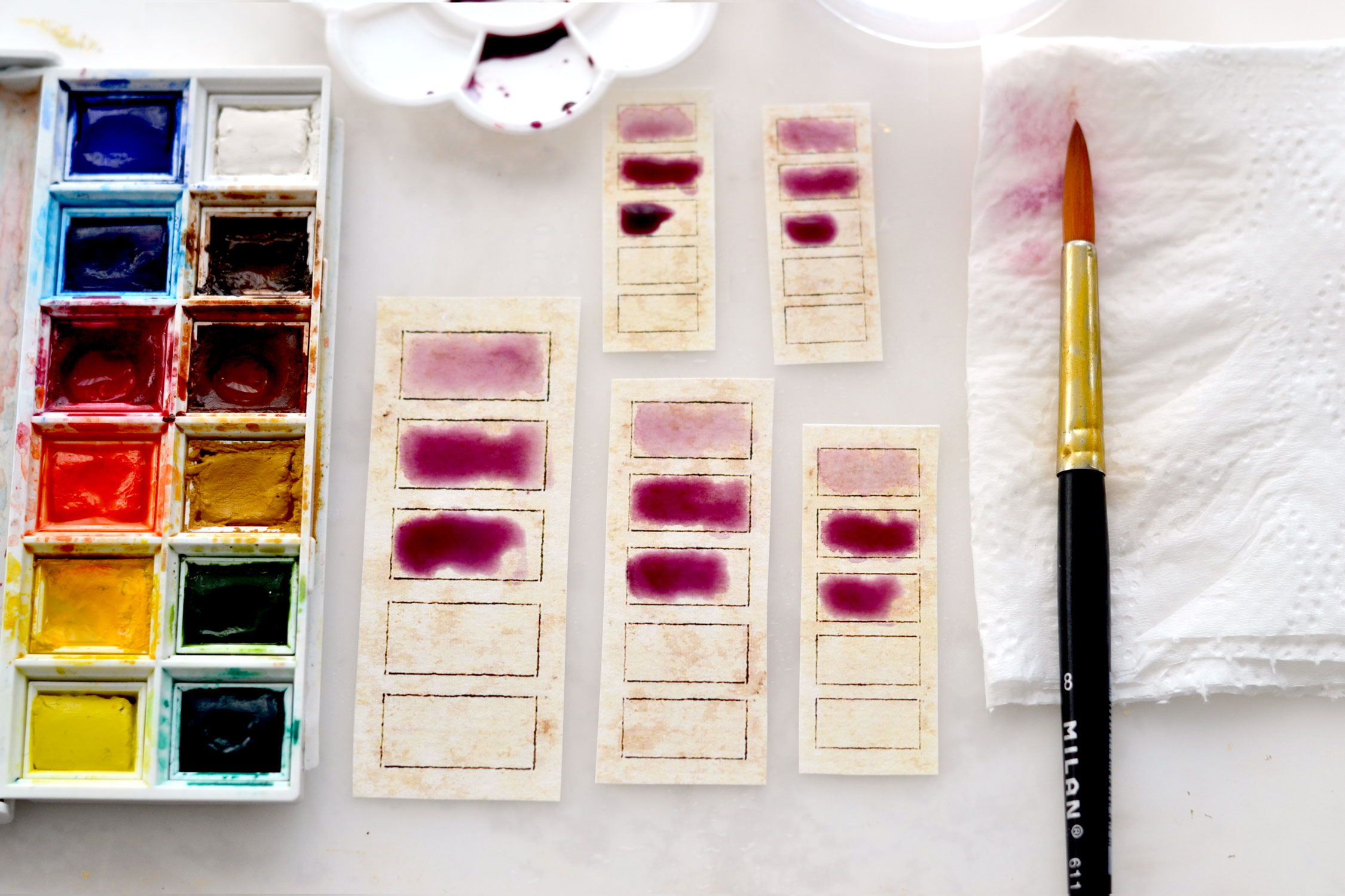
For the next color combo, I first mixed some red (Alizarin Crimson) and blue (Intense Blue) on a small palette before painting, to create a lovely purple. I followed the same steps just like before for the first three boxes, using water to gradient that ombre effect.
I started adding brown to the 3rd and 4th boxes and created a light wash with brown and purple in the last box.
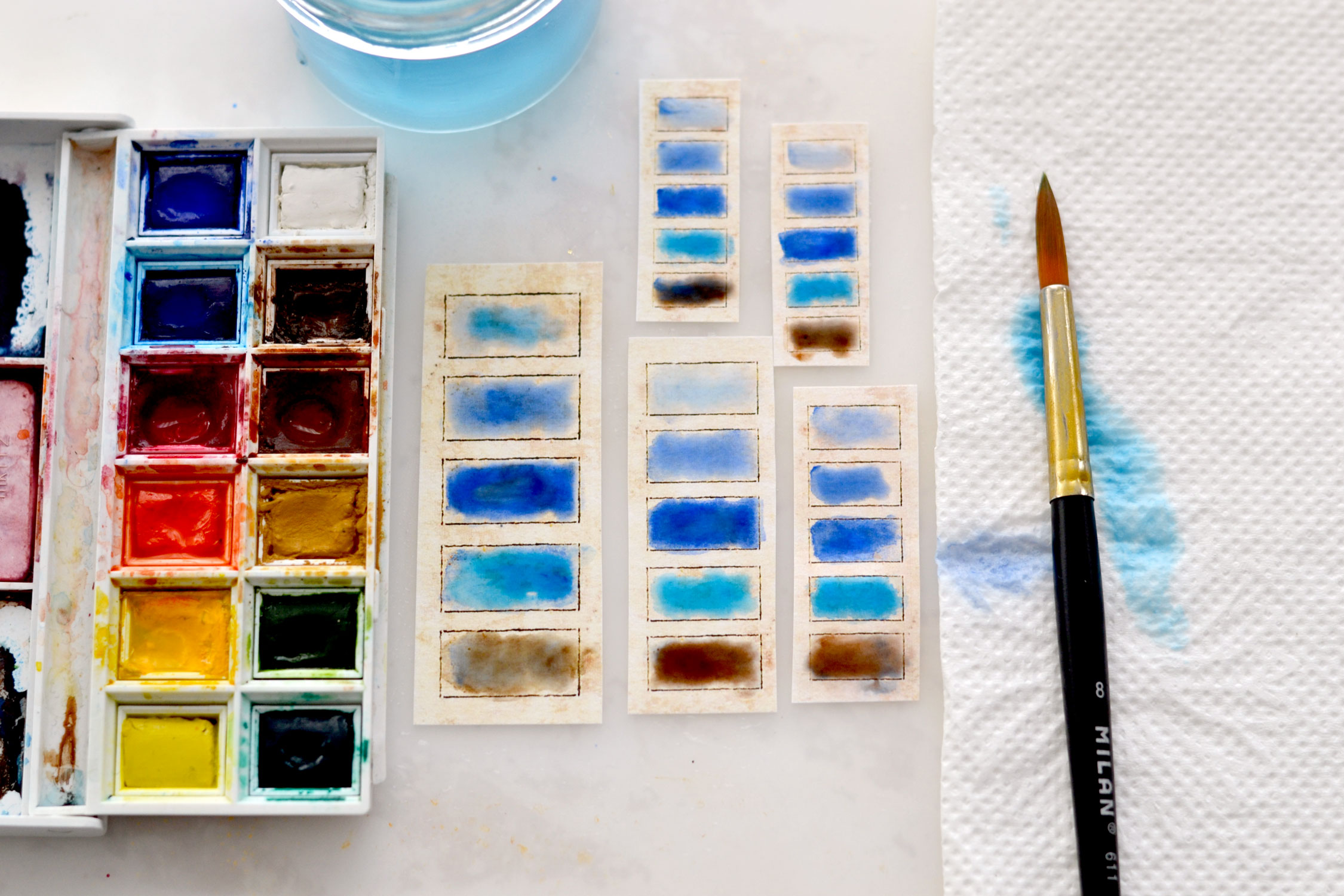
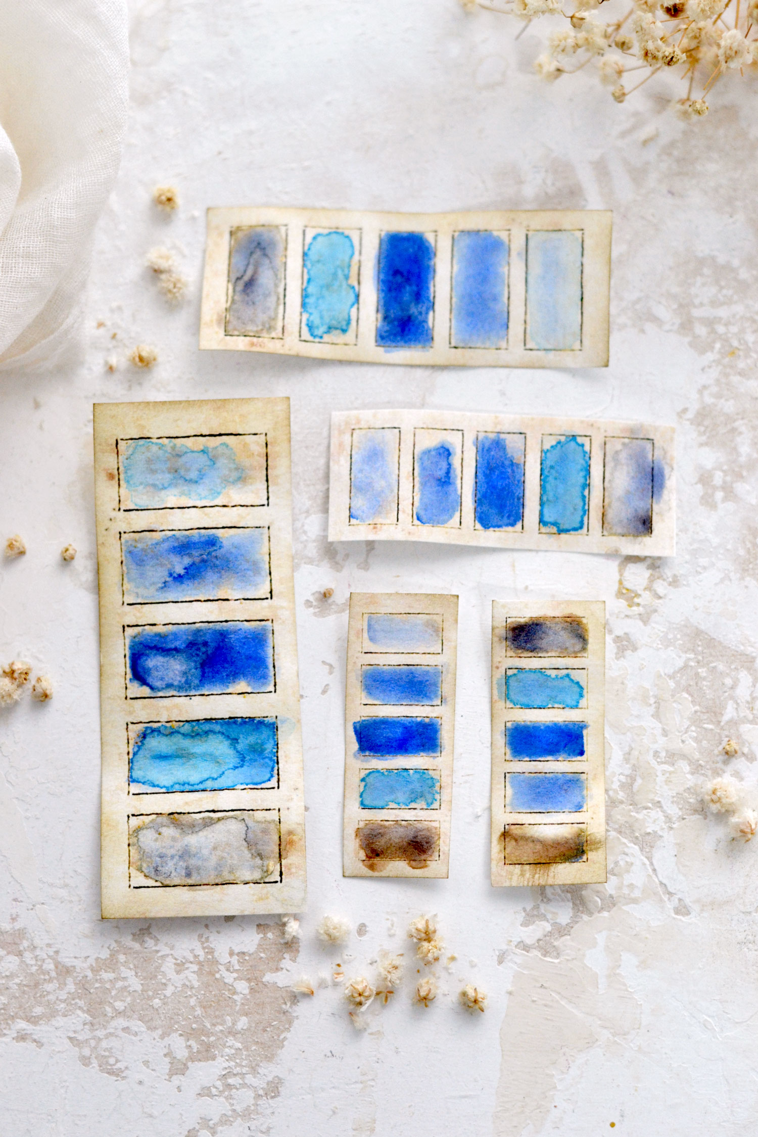
Here I used two shades of blue (Ultramarine and Intense Blue) and played around with adding some brown (Burnt Umber) only to the last box. You can actually paint the last box completely brown if you prefer or add a small amount of the main color – this will imprint even more of a vintage vibe to your lovely swatches.
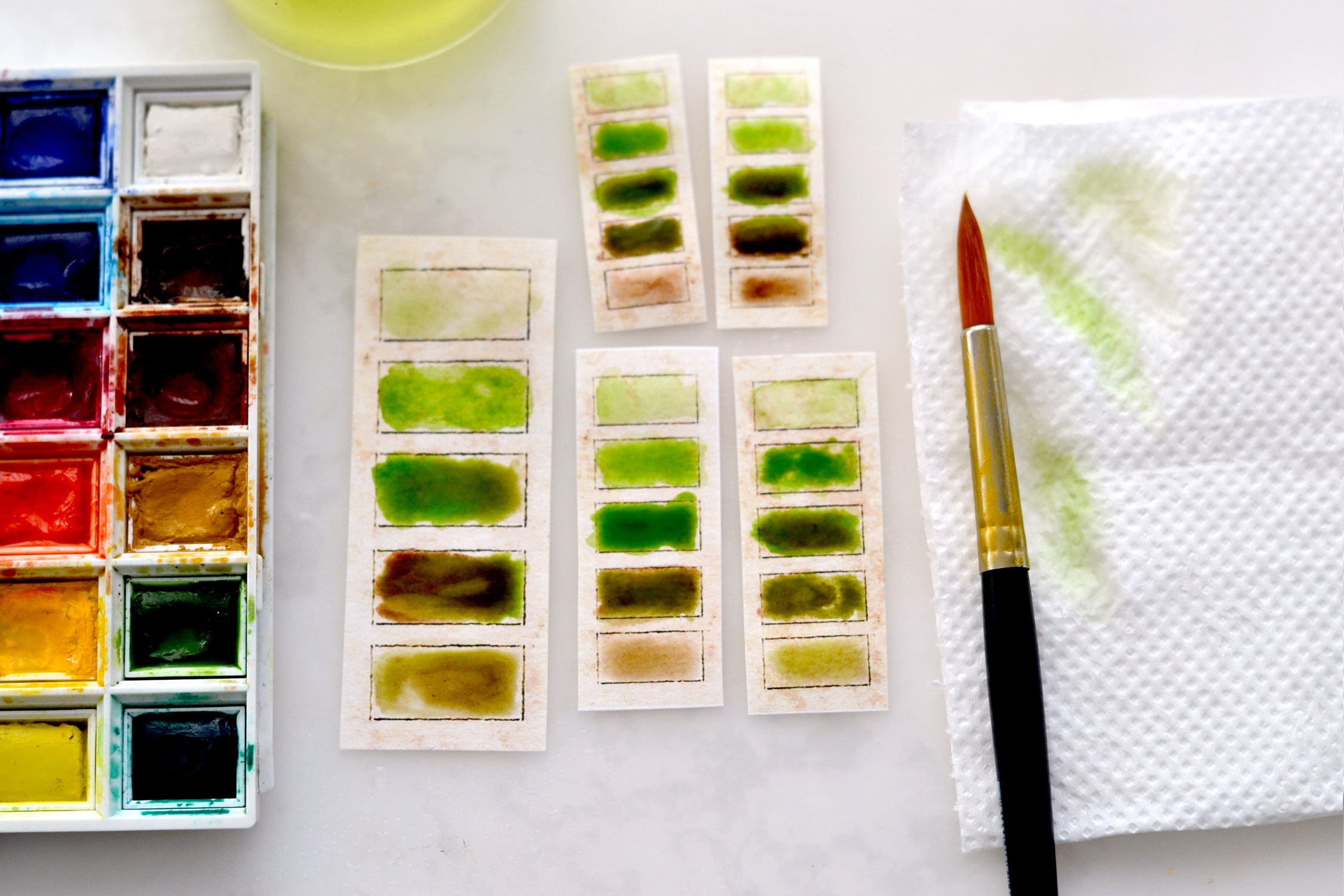
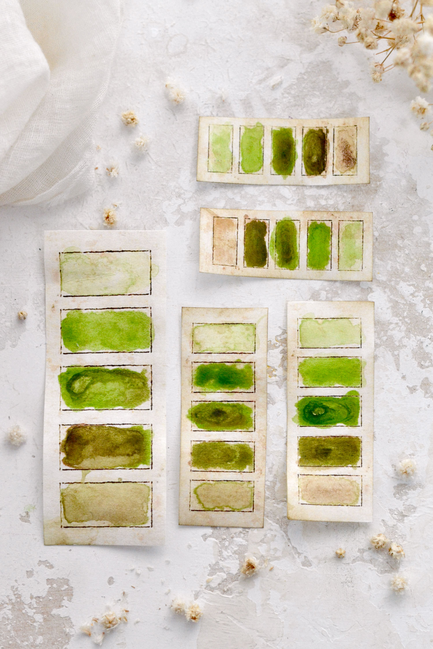
For the last color combo, I used green (Sap Green) and brown (Burnt Umber) and played around with these two colors adding more or less water, just like before.
And finally, let your beautiful color swatches dry completely before using them. The paper will warp a little bit while the paint dries, if you want, you can place them between the pages of a book to flatten them – just make sure they are completely dry first.
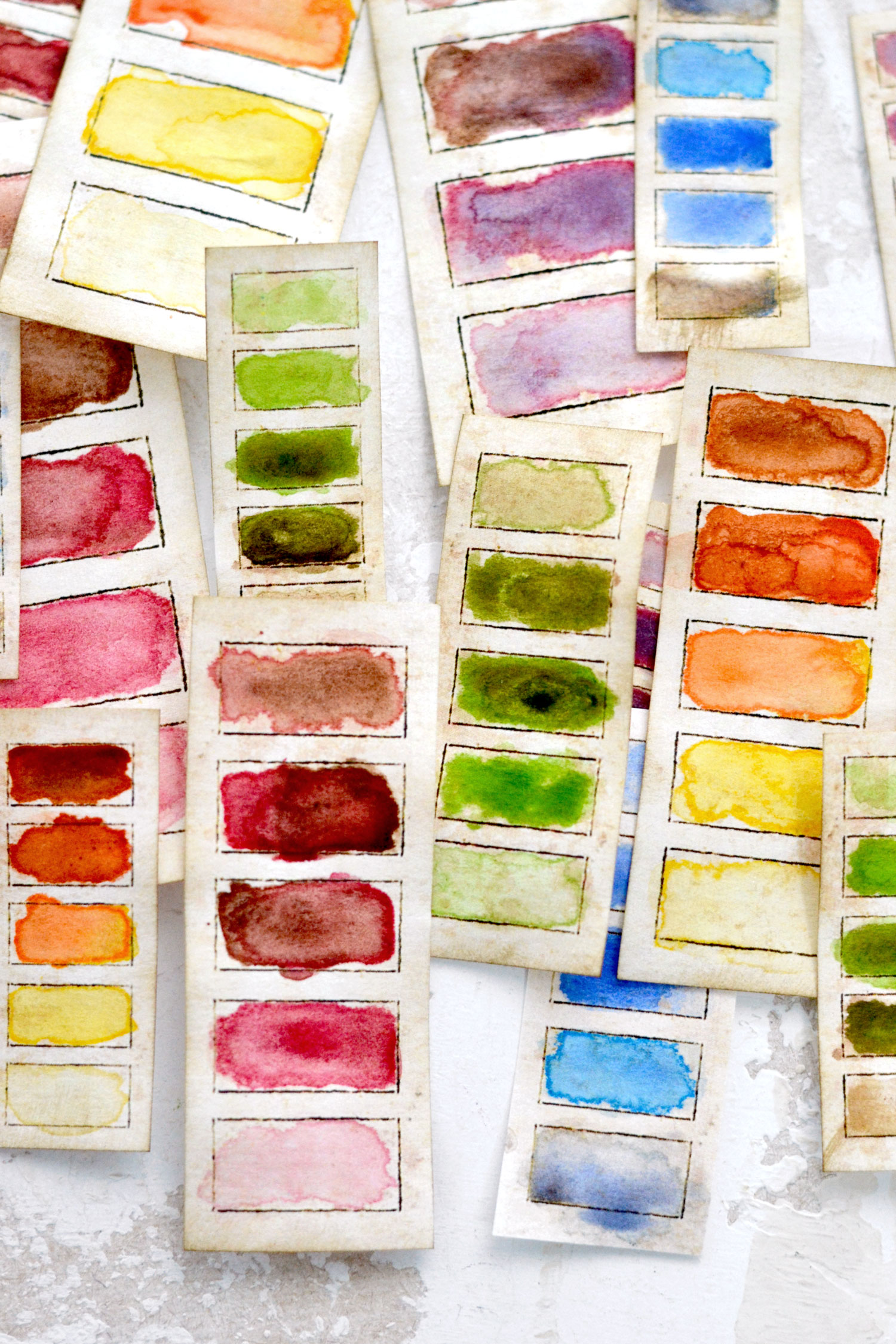
Depending on how much water and paint you use for your experiments, you will be left with absolutely gorgeous watercolor effects. I guess this sort of unpredictability is one of my favorite things with watercolor paint because you can create truly unique, quite organic effects. You can use the finished swatches both on the vertical and the horizontal.
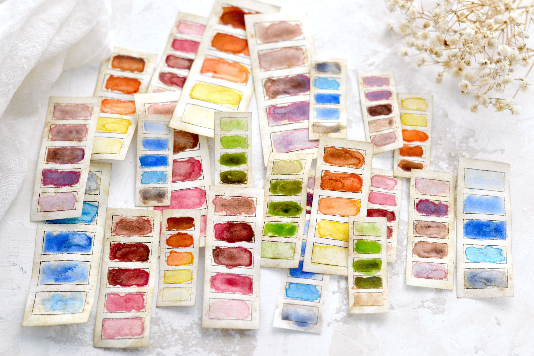
As you can see, even though we used the same colors to create a specific batch, each final vintage swatch is different, and is one more beautiful than the other!
This yellow-orange-brown color scheme can be included in all sorts of sunset or sunflower-themed summery projects. It can also be used for fall-related projects with rusty leaves, pumpkins or other specific yellow-orangey images.
The pink color scheme can be used with Valentine’s projects or any other pink-themed projects that you can think of, they will instantly complement and beautify pink or red flower-themed journals, tags or other mixed-media creations.
The purple color scheme can be used for summery projects with all sorts of beautiful purple or even pink flowers. I’m envisioning them as embellishments for a lavender-themed junk journal with coordinating lavender field images and why not, even some dried lavender flowers! 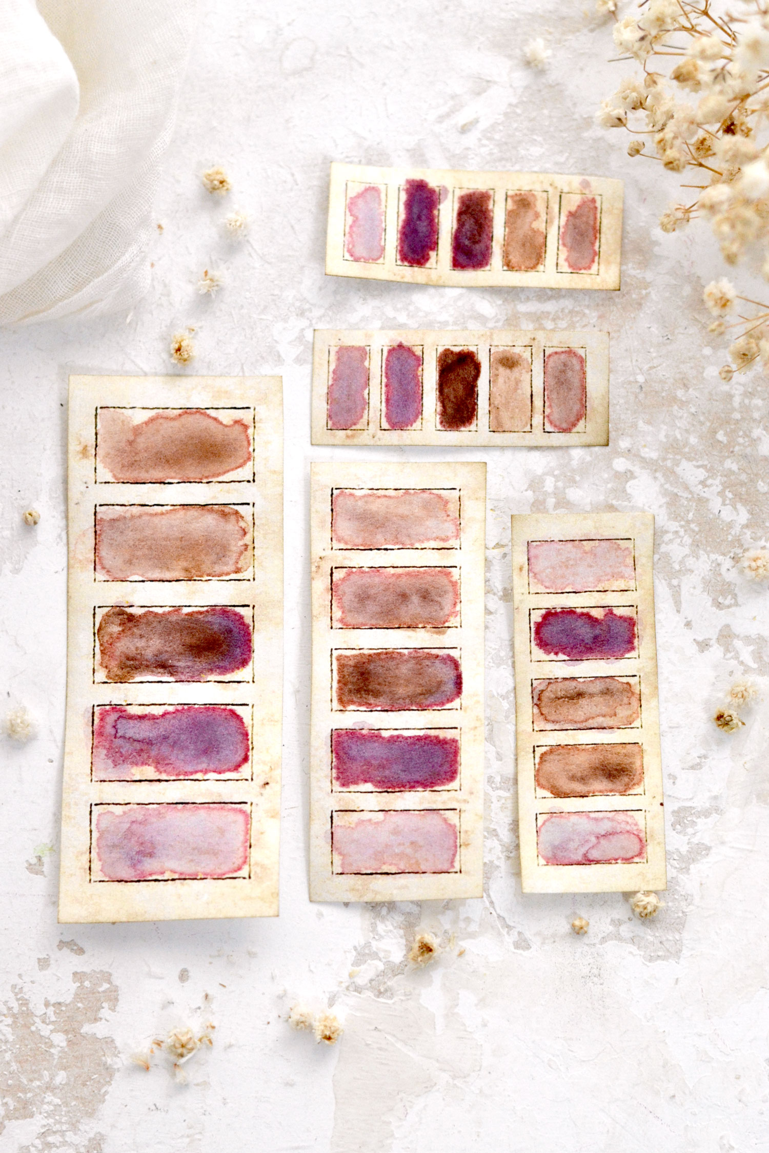
The blue color scheme swatches can be used with summer projects that involve sandy beaches and white waves, but of course, can be used with blue flowers, butterflies, French ephemera invoices or any other blueish images.
And lastly, our green color scheme swatches with a vintage vibe that can be used in all sorts of green projects, but even on those that are more on the neutral side of things. I feel like these green watercolor swatches are the most universal ones! They would complement any green-themed or neutral projects and junk journals, the herbalist in you might appreciate an earthy green batch the most.
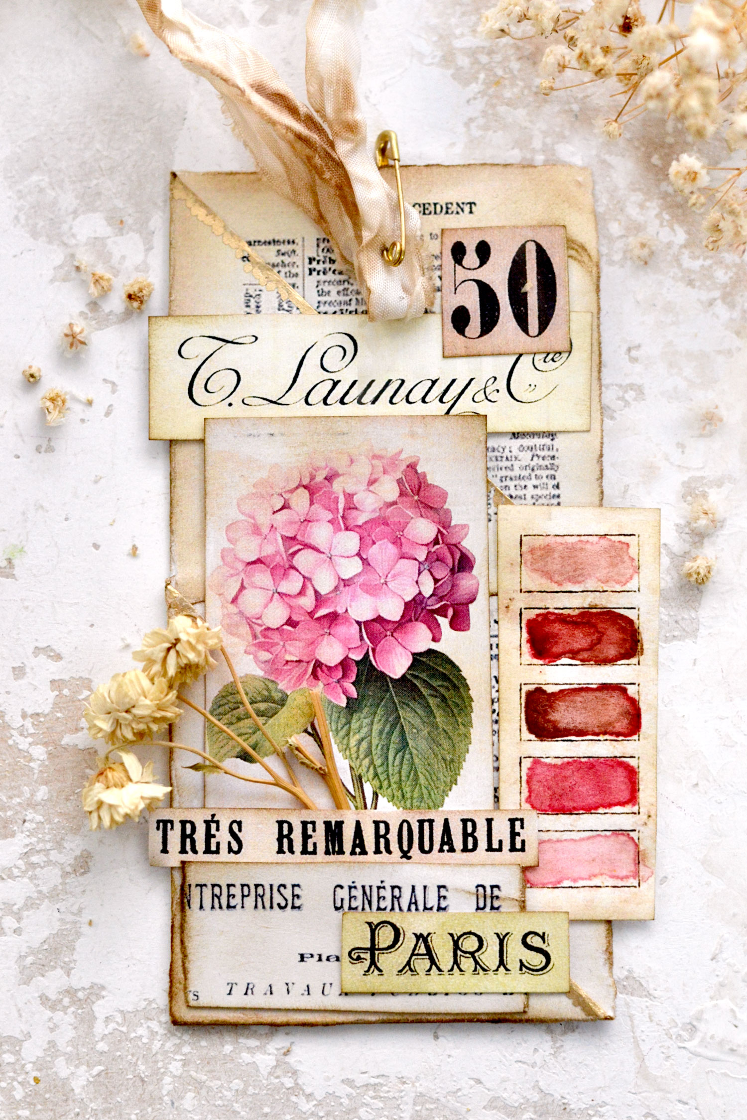
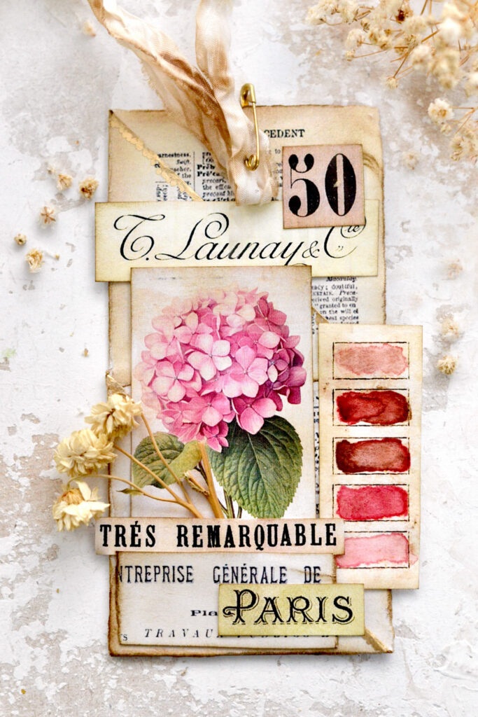
Just to give you a few ideas, I played around and created some beautiful vintage French tags. Here we have a gorgeous pink hydrangea with one of our amazing vintage pink swatches.
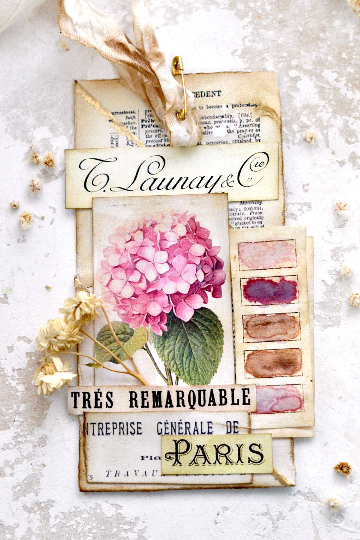
I even used the same tag with a purple swatch, just so you can see how it completely changes its overall vibe. You almost feel like the flower is also changing colors, just by adding a different color swatch!
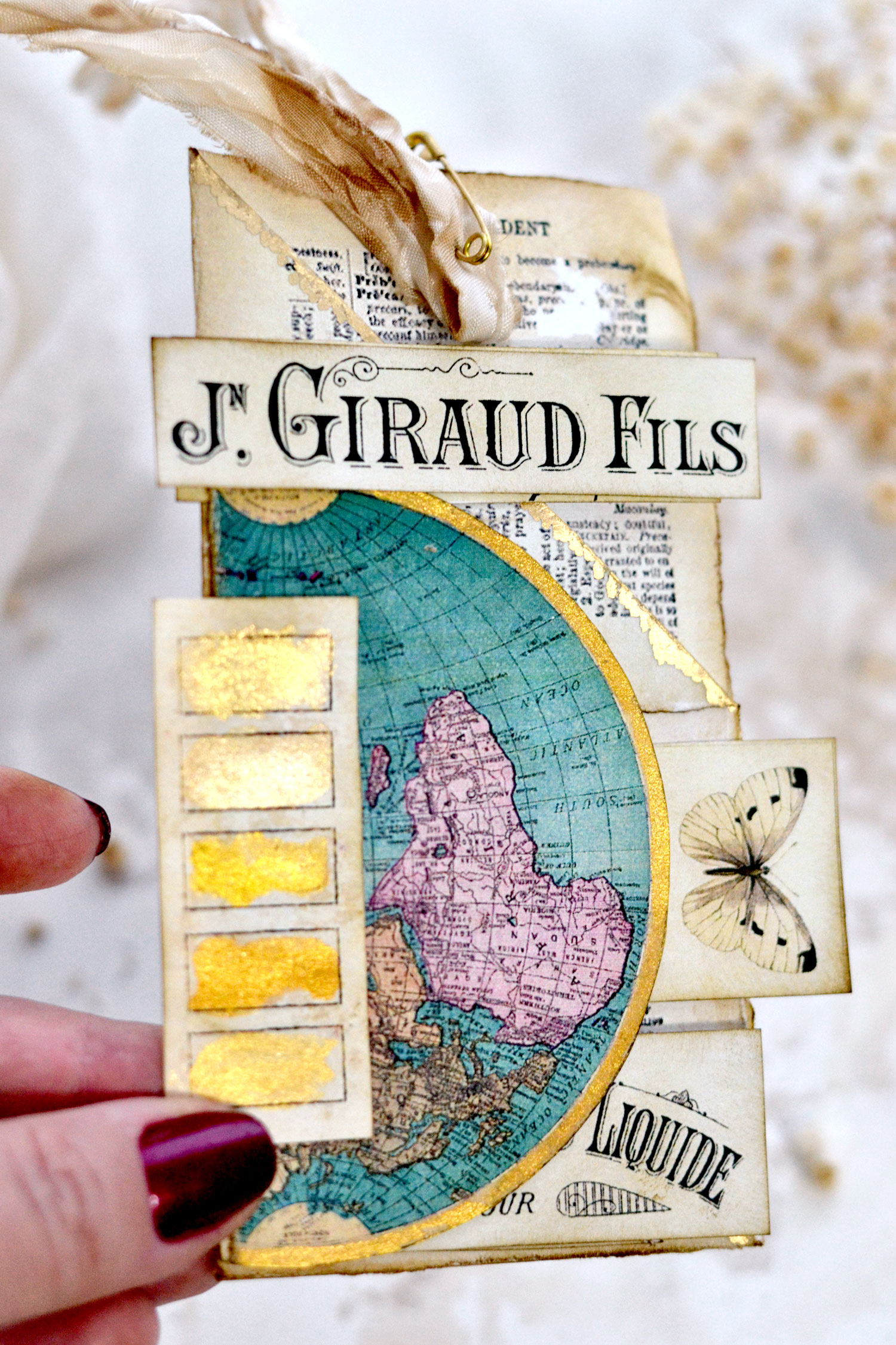
You can even create some gold watercolor swatches using your favorite paint – I used the beautiful Kuretake Gansai Tambi watercolors which I absolutely adore! The box already comes in different shades of gold, so you don’t have to mix the colors, you can just use them as they are! The vintage gold swatches are quite universal too!
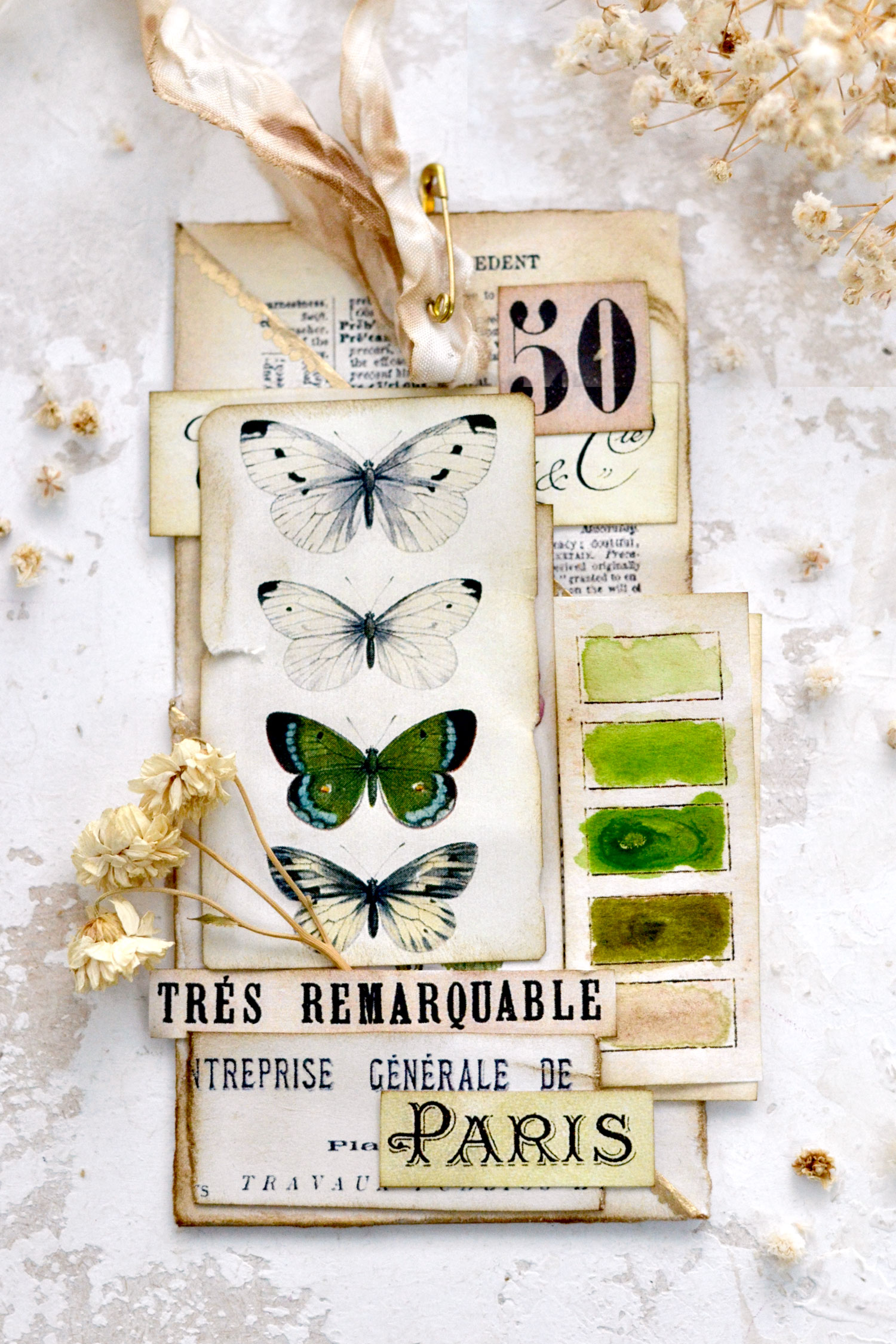
And here is the last book page tag with cream and green butterflies, gorgeously complemented by one of our earthy green watercolor swatches! A match made in Heaven, don’t you think?
I enjoyed this whole experiment so much that I think I’ll make a few more batches to have them ready for when in need! I would say that the secret to making the perfect vintage color swatches is to try to make these PERFECT for you! I wanted my final swatches to have a handmade feel, so I intentionally used perfectly imperfect brush strokes to fill in the boxes. Add the vintage swatches to embellish color-coordinated junk journal pages or turn them into colorful tabs, use them to add pops of color to cards or tags and any other DIY or mixed-media projects that you can think of.
Experiment with all the colors that you love, you will be over the moon with your final swatches, and you will be amazed at how fun this whole process actually is!
 You might also like my Watercolor Stickers Project HERE.
Happy crafting,
Diana / Dreams Factory


Tom says
WOW… Love the color swatches. Are there instructions for the tags somewhere?
Karen Watson says
I’m glad you liked them Tom! Diana has done lots of posts on creating tags on the site, if you do a search, in the search bar, you should be able to find some of them. Here is a link to her most recent one https://thegraphicsfairy.com/book-page-tags/