How to Make the Color Burgundy
Hello to all my Graphics Fairy friends – it’s Rebecca back to share How to Make the Color Burgundy with you! You will find that burgundy is a ‘cool’ color that is very popular. It moved squarely into the spotlight when Pantone chose a Burgundy shade as the 2015 Color of the Year… named Marsala. As far as I can tell, there are around 40 different hues, or shades of Burgundy hair dye. In this super easy tutorial, I am going to teach you how to make some different Burgundy hues by mixing acrylic paints together. There will be simple recipes for you to follow as well as a fun look into this rich color. Plus there are Printable Color Charts for you!
The Color is Burgundy
The color of burgundy originated from a luscious red wine, which is named after the Burgundy wine region of France. The use of the word burgundy in English as a color originated in 1881. Burgundy is often known as a somewhat mysterious color that tends to ‘draw you in.’ It is commonly used by royalty and the wealthy. A few examples of popular uses for this color includes lipsticks, bed sheets, pillow cases, the walls of homes, and even hair colors.
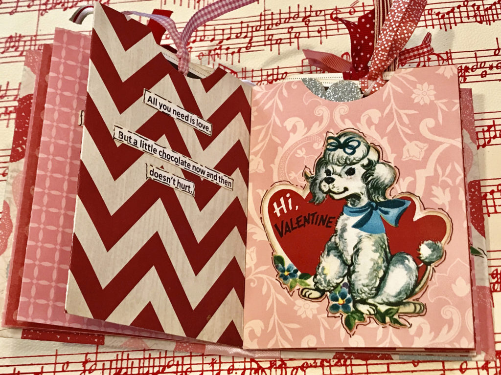
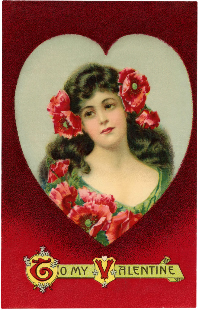
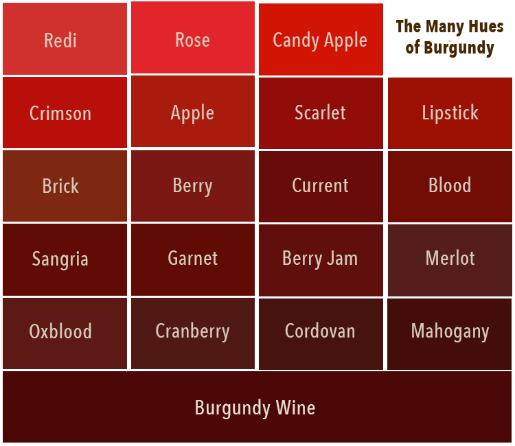
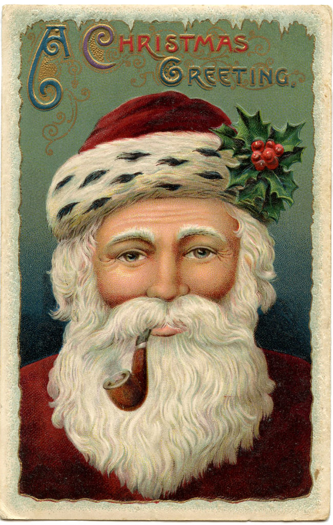
There are quite a few tones, shades, and hues of the color burgundy. Before we learn how to create burgundy, a simple color theory refresher lesson is in order! Burgundy refers to a variety of different colors or hues – dark crimson, claret, oxblood, mahogany, merlot, cranberry, wine, dark red, purple red, cordovan, etc. Almost every one of these colors is in the Valentine above.
Is Burgundy Red?
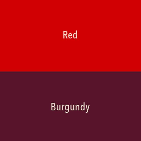
It sure is. But it can also be considered a shade of brown. In color psychology, burgundy is considered a less serious color than true red. It doesn’t evoke energy like true red does, but it has power and elegance. Burgundy contains both red and purple. Although it is a deep, rich, and sophisticated color, it is basically a reddish brown with purple undertones. Compared to red, the name itself brings up a more luxurious feeling of a fine wine from France. Anything French works for us! Burgundy is a good foundational color as well as an accent color when painting.
Is Burgundy the Same Color as Maroon?
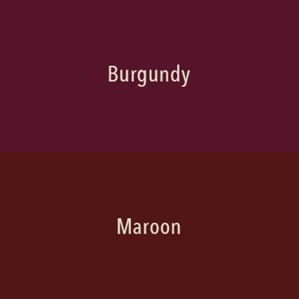
There is much confusion and a little disagreement around the lush color burgundy. Many people believe that it is the same color as maroon… OH MY NO!!! It is not at all the same even though it is in the same color family. Burgundy is a cool color mix of red and blue with purple undertones. Maroon is a mixture of red and brown making it a warm tone. There is a very slight noticeable difference as you can see in the color swatches below. If you know about hex colors, maroon is #80000 and burgundy is #80020. In the RGB scale maroon is 128 Red, 0 Green, and 0 Blue. Burgundy is 128 Red, 0 Green, and 32 Blue. Slight… but noticeable [and important] to artists!
The Color Theory of Burgundy
Let’s review at some common terms I will be using throughout this tutorial. These important terms apply to all colors.
- Hue is the actual color at 100% saturation. An original hue is known as a pure pigment or a pure color. There are some main hues:
- Primary Colors – Red, Yellow, and Blue. You cannot create or mix a primary color. However, you can use the primary colors to make other colors by mixing them together. The amount of primary color used in the mix determines a color’s hue.
- Secondary Colors are the three hues created by mixing two primary colors together in equal amounts. These are Orange (mix of red and yellow), Green (mix of yellow and blue), and Violet/Purple (mix of blue and red).
- Tertiary Colors are the combination of a primary hue with a secondary color. These are Blue-green, Blue-violet, Red-orange, Red-violet, Yellow-orange, and Yellow-green.
- Neutral Colors are achromatic, meaning they have no dominant hue. These are Black, Gray, and White.
- Saturation: Saturation is essentially a color’s intensity, represented by its brightness or vibrancy.
- Color Value: This represents the amount of light or darkness in a shade. It is particularly applicable to burgundy to help us differentiate between the various shades, such as crimson, mahogany, merlot.
- Tint: A pure pigment with white paint added. This is used to lighten the paint.
- Shade: A pure pigment with black color added. This is used to darken the paint.
- Tone: A pure pigment with gray (a combination of white and black) added. This is used to make the paint more dull in appearance. Gray is considered 0% saturation.
What Colors Go with Burgundy
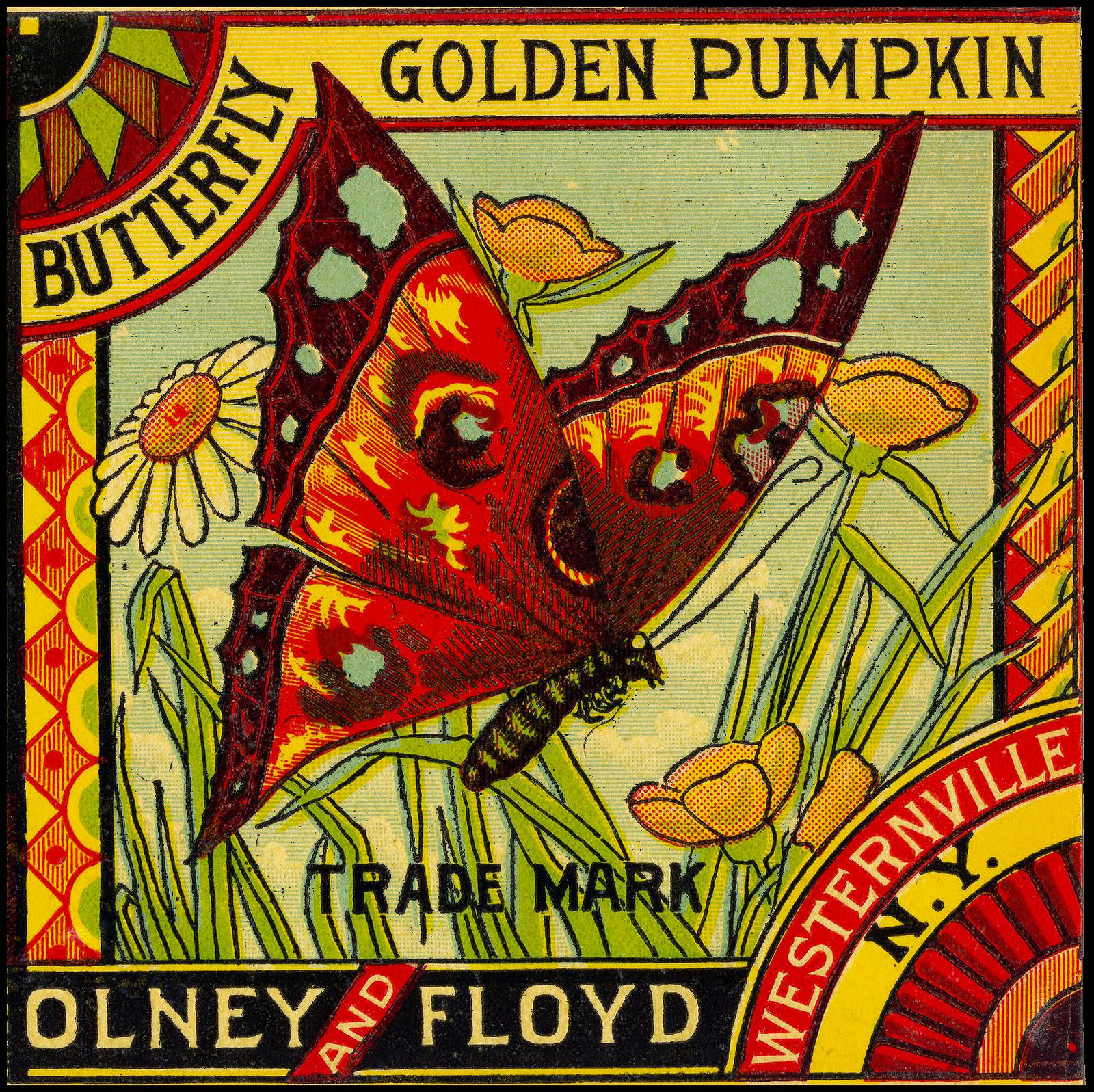
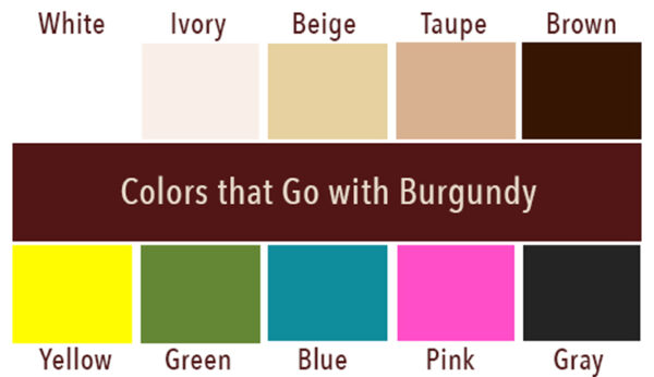
Burgundy is actually a pretty versatile color. Just about every color goes with it as you can see in the Butterfly Label above. It pairs beautifully with shades of gray or lighter neutrals such as white, ivory, warm browns, beige, and taupe. We adore monochromatic color schemes at TGF. There are many shades of these similar burgundy hues to choose from.
Shades of green, pinks, dark reds, golden yellow, navy blue, and teal are some other splendid combinations. Turquoise and Burgundy is a favorite color combo of mine. The most common colors that go well with burgundy are:
- Beige: Burgundy and beige is a classic color combo. Beige adds the warmth as burgundy adds the pop.
- Yellow/Gold: Yellow adds a superb vibrance when used with burgundy. Gold lends an elegance. Sunshine yellow is a good option.
- Green: All shades of dark and light green work quite well with burgundy. These combinations are pleasing to the eye since they are among the dominant colors in nature, such as in vineyards.
- Blue: The contrasting colors of blue and burgundy work well together, especially the shades of pale blue, medium blue, and turquoise. Bright shades of blue can be fun to use.
- Pink: With its happy look and feel, pink goes well with burgundy. A great pairing is blush with warm undertones.
- Black/White/Gray: Black adds drama to burgundy. White gives burgundy a chrispness. Burgundy makes gray come to life.
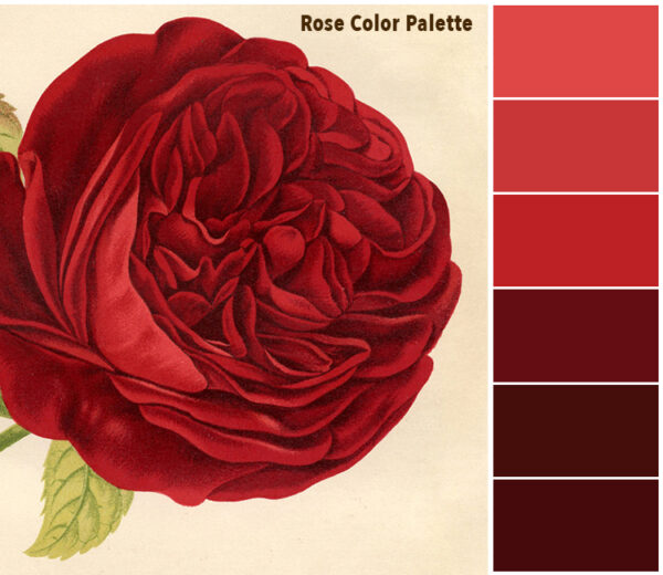
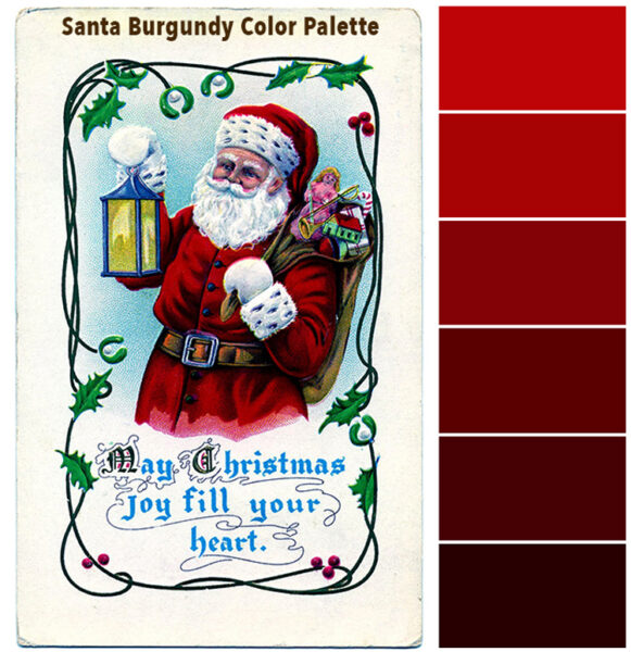
Below I have created two monocromatic color chip palettes from two yummy TGF images. You can actually use the beautiful colors in these palettes to make quick color choices for your art.
Color Mixing Recipes to Create the Color Burgundy
Here are my tried and true color combination Recipes for making a Burgundy:
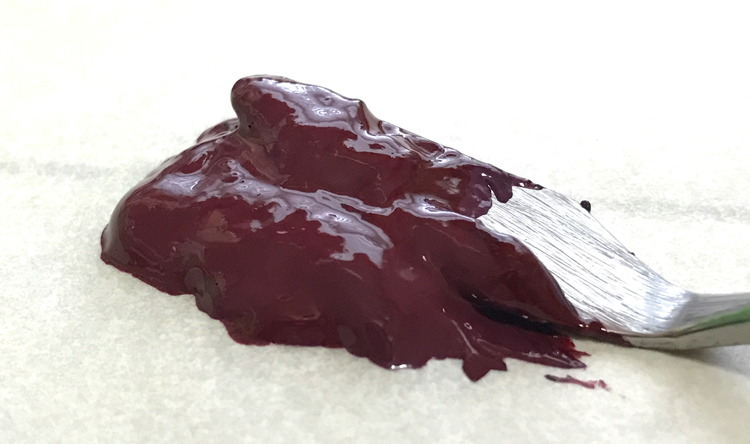
Considered a deep reddish-brown with a purplish undertone or dark red-purple color, these are the colors make burgundy. The purple undertone of burgundy results from a certain combination of red and blue. But we will not use ‘equal’ amounts of those base colors, which is how you create purple. Hmmmmm….
We will create two versions of the color burgundy. Then we will modify the mixtures to create different variations. You will see how easy it is to mix colors, and then you will learn how to adapt them for what you need. That is the magic of color mixing. A dash of this or a pinch of that is how you adjust and mix colors. We will use warm reds and dark blues, as they work best in this case. The cooler blue colors produce more of a purple shade. A tiny bit of black is ideal for darkening the color, if you like.
Please Note that the colors will look different on your digital screen depending upon how it is calibrated. I have created a set of Printable Color Charts for you to use in your experiments. Download the PDF HERE! Please Note: Colors may look different on your printout for many reasons… mostly your printer and ink levels.
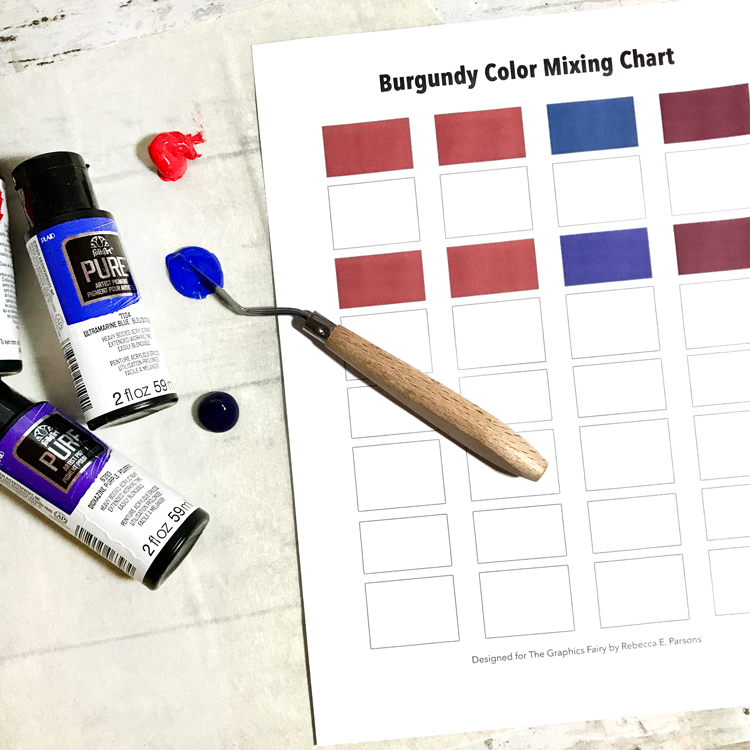
I will be using Cadmium Red and Ultramarine Blue acrylic paints for this tutorial. Use a palette knife to create your mixtures on a palette or foam plate. Most color mixing is by eye, but you can measure if you feel inclined. Differing amounts modify the results. If you add too much of one color, it will turn out to be a completely different hue.
- To create the color burgundy, mix two parts Cadmium Red with one part Ultramarine Blue together using a palette knife. NOTE: See the top rows of the chart below.
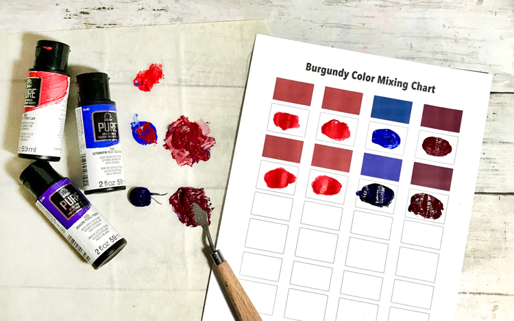
- The next way to create the color burgundy is to blend two parts Cadmium Red with one part Dioxazine Violet (Purple) together using a palette knife. See the mixes in the chart above.
- Here is a challenge for you. Let’s modify the burgundy colors you created with the above recipes. Always add just a tiny amount of new color. Remember, differing amounts modify the results. Make sure that you record all our color experiments and combinations so you can repeat the mix in the future.
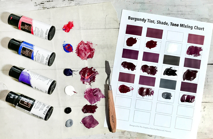
- Mix 1 part White into 2 parts of the first mixture to lighten the burgundy. This is known as a Vivid Burgundy, Claret, or Merlot tint.
- Mix 1 part Black into 2 parts of the second mixture to darken the burgundy shade. This is known as Old Burgundy or Mahogany. Remember you cannot fix the paint if it becomes too dark.
- Mix 1 part Gray into 1 part of the first mixture and 1 part of the second mixture to create a more Maroon tone or a Bruised Burgundy.
Isn’t this fun? I encourage you to experiment by adding differing amounts of any color to modify the hue of your burgundy paint. Make sure you record your recipe when you get the exact shade you want. Congrats… You are now a color mixing guru!! YAY!
I hope you enjoyed our easy tutorial on “How to Make the Color Burgundy!” I had so much fun that I think I will grab a paintbrush and start playing with these colors now. You might also like How to Make the Color Brown HERE and How to Make the Color Black HERE.
When I am not creating for TGF, I also create Photoshop Elements tutorials and craft project videos over on The Graphics Fairy Premium Membership site. You can find even more of my books, art, and whimsical shenanigans on my website – The Bookery.
May joy be with you all,
Rebecca


Sue W says
Such an interesting article Rebecca. Would love to learn more about colour theory.
Read this on my phone, now want to get it on the computer and check out Brown.
Thank you.
Karen Watson says
So glad you enjoyed the Burgundy post Sue, I hope you enjoy Rebecca’s Brown article too!