How to Make the Color Black
Hello to all my Graphics Fairy friends – it’s Rebecca here to share How to Make the Color Black with you! Black is an elegant, sophisticated color… or is it? In this super easy tutorial, I will teach you how to make four Black color mixes using various acrylic paints. There will be simple recipes for you to follow as well as a fun look into this rich color. Plus there are Printable Color Charts for you to use to mix your own deep, dark black paint shades!
Is Black a Color?
Is black really a color? In scientific terms, black is actually not a color at all. Black is what results when a complete lack of visible light exists. Hmmmm? Black is essentially the ‘absence of color’. But we don’t want to get too ‘techy’ here. Black is in the same category as white and grey in that these colors have no hue. This category of colors is known as achromatic. Since pure black is not really a color, there is no complementary color for it. For there to be a complementary color, there must be an undertone such as blue or brown, allowing for a complementary color to be determined based on the undertone applied. That’s enough scientific info for now.
The Color Black
Although black technically is not a color, most people think of it as one. For this tutorial we will call it a color to avoid confusion. The color black was one of the first colors that was used in art. Cave paintings at Lascaux Cave in France depict animal images in black such as bulls, which were created by prehistoric humans. Charcoal and burnt bones were initially used by these early artisans, followed by ground manganese oxide powder. The powder produced a darker pigment. Ancient Egyptians, Greeks, and Romans valued the color black as well. INTERESTING FACT: Black was considered a representation of fertility in Egypt since it was the same color as the very rich soil of the Nile river.
The Color Theory of Black
Color Theory is related to colors and how they work together in combinations. A Color Wheel displays a circle of colors that you can create through combinations of primary, secondary and all other colors in between. Like white, black is not included on the regular color wheel, but is sometimes placed on the side or the back to demonstrate shades, tones, and value. Let’s review at some common terms I will be using throughout this tutorial. These important terms apply to all colors.
- Hue is the actual color at 100% saturation. An original hue is known as a pure pigment or a pure color. There are some main hues:
- Primary Colors – Red, Yellow, and Blue. You cannot create or mix a primary color. However, you can use the primary colors to make other colors by mixing them together. The amount of primary color used in the mix determines a color’s hue.
- Secondary Colors are the three hues created by mixing two primary colors together in equal amounts. These are Orange (mix of red and yellow), Green (mix of yellow and blue), and Violet/Purple (mix of blue and red).
- Tertiary Colors are the combination of a primary hue with a secondary color. These are Blue-green, Blue-violet, Red-orange, Red-violet, Yellow-orange, and Yellow-green.
- Neutral Colors are achromatic, meaning they have no dominant hue. These are Black, Gray, and White.
- Saturation: Saturation is essentially a color’s intensity, represented by its brightness or vibrancy.
- Color Value: This represents the amount of light or darkness in a shade. It is particularly applicable to burgundy to help us differentiate between the various shades, such as crimson, mahogany, merlot.
- Tint: A pure pigment with white paint added. This is used to lighten the paint.
- Shade: A pure pigment with black color added. This is used to darken the paint.
- Tone: A pure pigment with gray (a combination of white and black) added. This is used to make the paint more dull in appearance. Gray is considered 0% saturation.
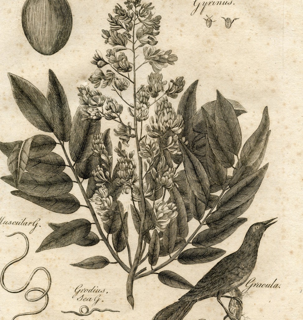
Click HERE for the Full Size Printable PDF of the Gracula Bird with Plant
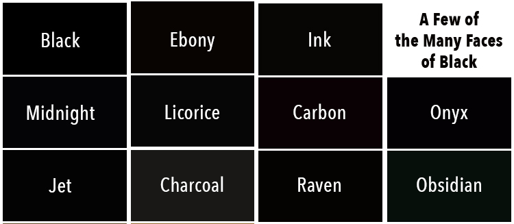
In color theory, a shade is referred to as a pure color mixed with another. This makes the color chromatic, meaning that it has a hue and colorfulness, also known as saturation. Lighter shades (warm colors) of black can be produced with colors like yellows or light reds. These often have a brownish tint. Darker shades (cool colors) of black require adding colors like blues or greens. Even though they may look the same, there are differences in the several examples of the ‘created’ shades of black below:
Psychological Color Theory
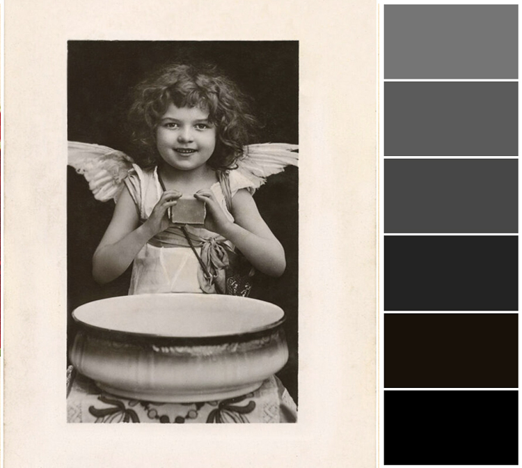
There are several association people make with black. These associations are referred to as Psychological Color Theory. During the Middle Ages, black was representative of evil and darkness. Black has historically been connected with grief and sadness in many cultures and is of course often worn at funerals. Conversely, it is also commonly associated with elegance, formality, and sophistication, such as with black-tie events and weddings. Let’s look at some positive and negative associations of black, which make it unique. You can see shades of black from this old Angel Girl photo below.
Positive
- Elegance
- Power
- Prestige
- Sophistication
- Authority
- Formality
Negative
- Death
- Anger
- Fear
- The Occult
- Evil
- Sadness
What Colors Go with Black
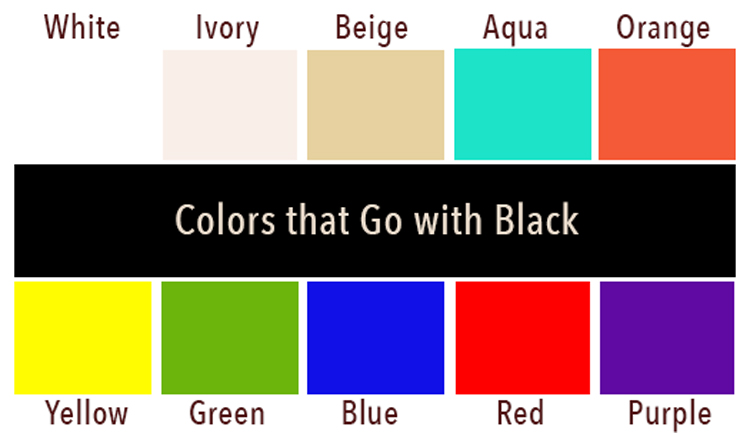
Artists often use black for contrast and depth. Black and white used together offers an ideal opportunity for contrast. Almost any color looks good with black. Some color combinations that work well together with examples are:
- Black and Yellow – Great for interior designs and fashion. Yellow stands out next to black making for an exciting contrast.
- Black and Green – Considered a soothing combination that is great for bathrooms. Olive and Emerald greens are especially popular.
- Black and Blue – Blue is considered to have a calming effect. A good example is a painting of the night sky with these two. A black sofa with blue cushions. Black and blue pottery.)
- Black and Red/Pink (This combination produces a dynamic powerful or moody look. Many shades of red work well including pink.
- Black and Purple (Considered a sophisticated combination that is splendid for modern interior design.)
- Black and Orange – Candlelight at night. Halloween
- Black and Aqua – Considered a soothing, calm combination. Sophisticated.
- White
- Ivory
- Beige/Taupe
Color Mixing Recipes to Create the Color Black
We will create four versions of the color black. You will see how easy it is to mix these different shades. We will use warm reds and cool blue, as they work best in this case. We will be using the following colors for our mixing practice. I have used Golden Artist Colors, but you can use what you have on hand. You may need a dash of this or a pinch of that to adjust your colors. That is the magic of color mixing.
I will be using the following colors in this tutorial. These are fluid acrylics by Golden Artist Colors.
-
- Ultramarine Blue
- Primary Yellow
- Quinacridone Crimson (dark red)
- Pyrrole Red Light (orange)
- Junkins Green
- Quinacridone Violet (reddish purple)
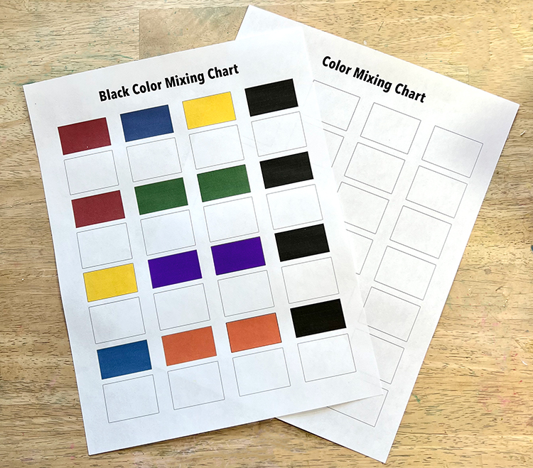
Please Note that the colors will look different on your digital screen depending upon how it is calibrated. I have created a set of Printable Color Charts for you to use in your experiments. Download the PDF HERE!Please Note: Colors may look different on your printout for many reasons… mostly your printer and ink levels.
Producing a black paint color is actually quite simple. It only requires combining of the three primary colors of red, blue, and yellow in equal amounts. You can experiment on a sketch pad by putting on a dab of the three paints and mixing the colors together with a paintbrush or palette knife. Adding lighter shades of reds and blues results in a lighter (warmer) color, whereas darker reds and blues produces a darker (cooler) color black. Remember a tiny bit of black is ideal for darkening the color, if you like.
Black can also be created, however, by utilizing one primary color with one secondary color. An example of this is the mixing of red and green paint, since red is a primary color and green is a combination of the two other primary ones, which are blue and yellow. Green thus becomes the secondary color in this example. It is essential that the primary and secondary colors are a dark color to achieve a black result. Light colors will result in nothing but ‘mud.’ Black pigments and dyes are a mixture of other pigments that develop only the appearance of black since there is no true black color. The goal is to achieve a combination that reflects the least amount of light possible.
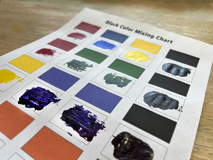
Here are my tried and true color combination Recipes for making Black:
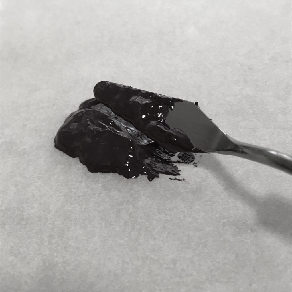
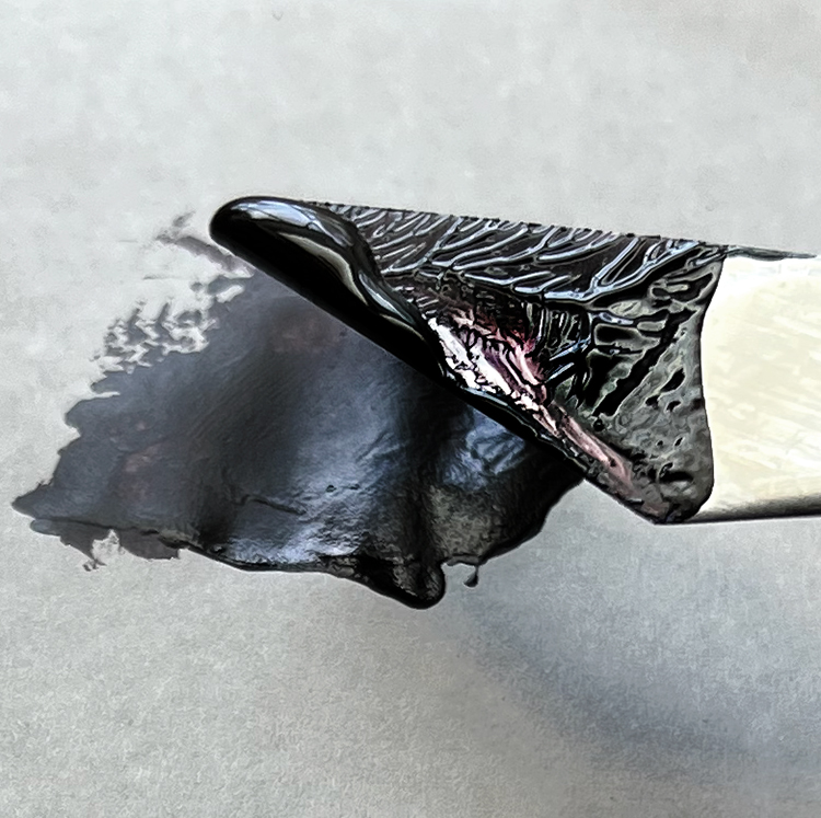
Use a palette knife to create your mixtures on a palette or foam plate. Most color mixing is by eye, but you can measure if you feel inclined. Differing amounts modify the results. If you add too much of one color, it will turn out to be a completely different hue.
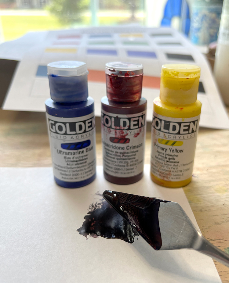
- To create the color black, mix equal parts of Ultramarine Blue, Primary Yellow, and Quinacridone Crimson using a palette knife. This color combo makes a very dark shade of black. This deep black color is probably the darkest one of the bunch.
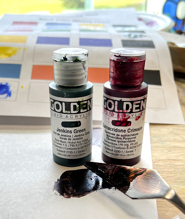
- The next way to create a rich black color is to blend one part Quinacridone Crimson with two parts Jenkins Green together using a palette knife. It creates a nice black.
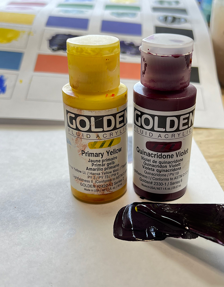
- The next way to create the color black is to blend one part Primary Yellow with two parts Quinacridone Violet together using a palette knife. This mix creates a rich, warm black.
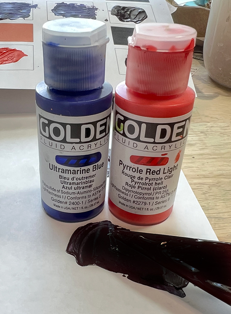
- The final way to create the color black is to blend one part Ultramarine Blue with two parts Pyrrole Red Light (orange) together using a palette knife. It creates a coolish black.
Isn’t this fun? Congrats… You are now a color mixing guru!! YAY!
To experiment further, add a tiny amount of any color to the mixes. Remember, differing amounts modify the results. Make sure that you record all your color experiments and combinations on the blank Color Mixing Chart so you can repeat the mix in the future. You might also like How to Make the Color Brown HERE and How to Make the Color Burgundy HERE!
I hope you enjoyed learning how to make your own black paint. When I am not creating for TGF, I also create Photoshop Elements tutorials and craft project videos over on The Graphics Fairy Premium Membership site. You can find even more of my books, art, and whimsical shenanigans on my website – The Bookery.
May joy be with you all,
Rebecca



Ruth Bryant says
Thank you. This is superb. Rebecca made making black so straight forward. I had wondered why when I bleached black fabric the undertones that were revealed could have different colors.
Karen Watson says
I’m glad you found it useful Ruth!
Mina says
Thank you for this!! Much appreciated
Karen Watson says
Thank you Mina, I’m glad you found it useful!