How to Make the Color Brown
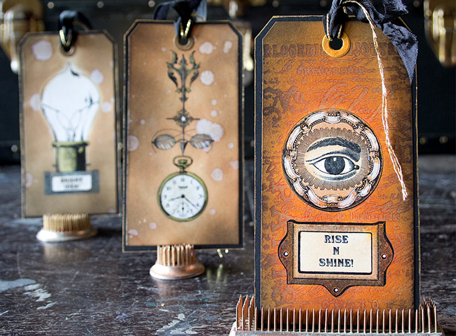
Hello my sweet Graphics Fairy friends – it’s Rebecca here to show you How to Make the Color Brown! Whether Coffee, Caramel, Walnut, Chocolate, Khaki, Tan or Sepia… Don’t we just love the aged yumminess of the many shades of the color Brown? It is a delightful way to add a Vintage feel to any paper project! In this super easy tutorial, I am going to teach you how to make several different Brown hues by mixing acrylic paints together. There will be simple recipes for you to follow as well as a fun look into this chocolaty Fall tone. Plus there are Printable Color Charts for you!
 I will even walk you through the different types of Brown Distressed Inks that Tim Holtz offers. Let’s get started!
The Unique Color Brown
The color of brown is quite unique for several reasons. You will not find it listed on the color spectrum or included on the color wheel. Brown does not fall into the category of a tertiary or intermediate color, nor is it a neutral color. Some consider brown a desaturated, darker shade of orange. Hmmmmm? Brown is considered to be a Composite color, simply meaning that it is formulated by mixing colors together, which can be done in several different ways. I will show you those ways below.
The Color Theory of Brown
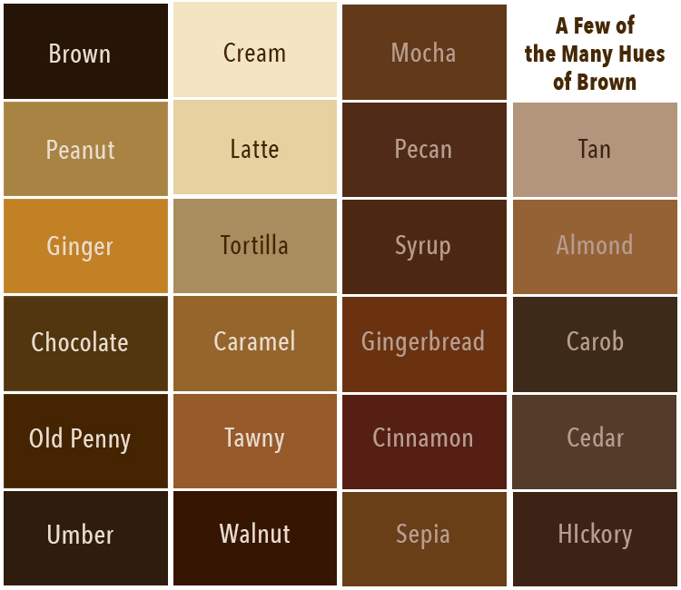
There are hundreds of tones, shades, and hues of the color brown. Before we dive into creating some browns, a simple color theory refresher lesson is in order to understand brown or any color! Brown refers to a variety of different colors or hues. Let’s look at some common terms I will be using throughout this tutorial. These important terms apply to all colors.
- Hue is the actual color at 100% saturation. An original hue is known as a pure pigment or a pure color. There are some main hues:
- Primary Colors – Red, Yellow, and Blue. You cannot create or mix a primary color. However, you can use the primary colors to make other colors by mixing them together. The amount of primary color used in the mix determines a color’s hue.
- Secondary Colors are the three hues created by mixing two primary colors together in equal amounts. These are Orange (mix of red and yellow), Green (mix of yellow and blue), and Violet/Purple (mix of blue and red).
- Tertiary Colors are the combination of a primary hue with a secondary color. These are Blue-green, Blue-violet, Red-orange, Red-violet, Yellow-orange, and Yellow-green.
- Neutral Colors are achromatic, meaning they have no dominant hue. These are Black, Gray, and White.
- Saturation: Saturation is essentially a color’s intensity, represented by its brightness or vibrancy.
- Color Value: This represents the amount of light or darkness in a shade. It is particularly applicable to brown because it helps differentiate between the various shades such as chestnut, chocolate, or mocha. TEE HEE!!
- Tint: A pure pigment with white paint added. This is used to lighten the paint.
- Shade: A pure pigment with black color added. This is used to darken the paint.
- Tone: A pure pigment with gray (a combination of white and black) added. This is used to make the paint more dull in appearance. Gray is considered 0% saturation.
Viewed typically as a sort of ‘dull’ color, brown does however serve an important purpose in art, design, and nature as do all colors. Additionally, it can be made brighter and more pleasing to the eye by simply adding more of the same colors that were originally blended together to create it. I promise you will understand this better after our exercises below.
What Colors Go with Brown
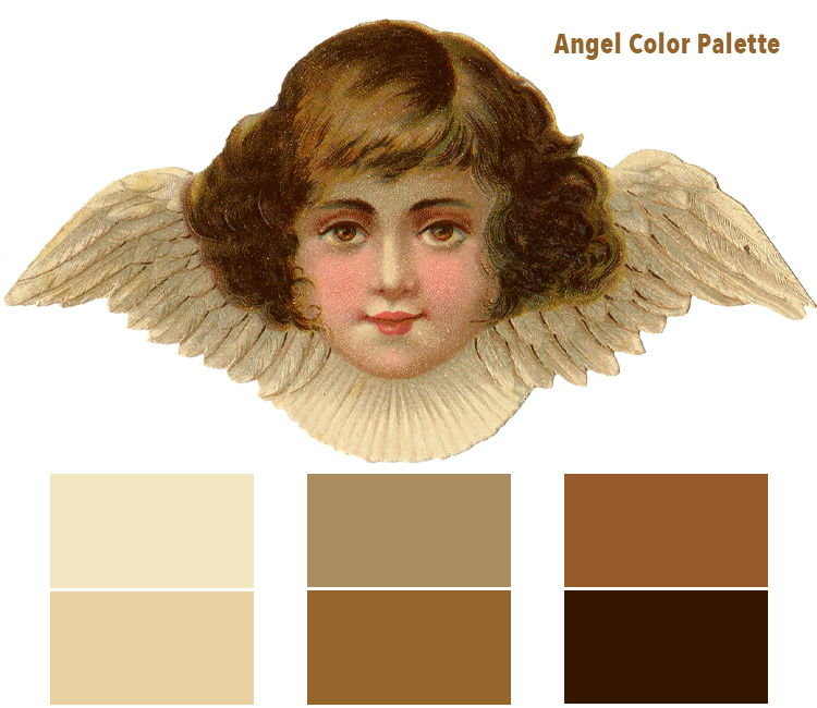
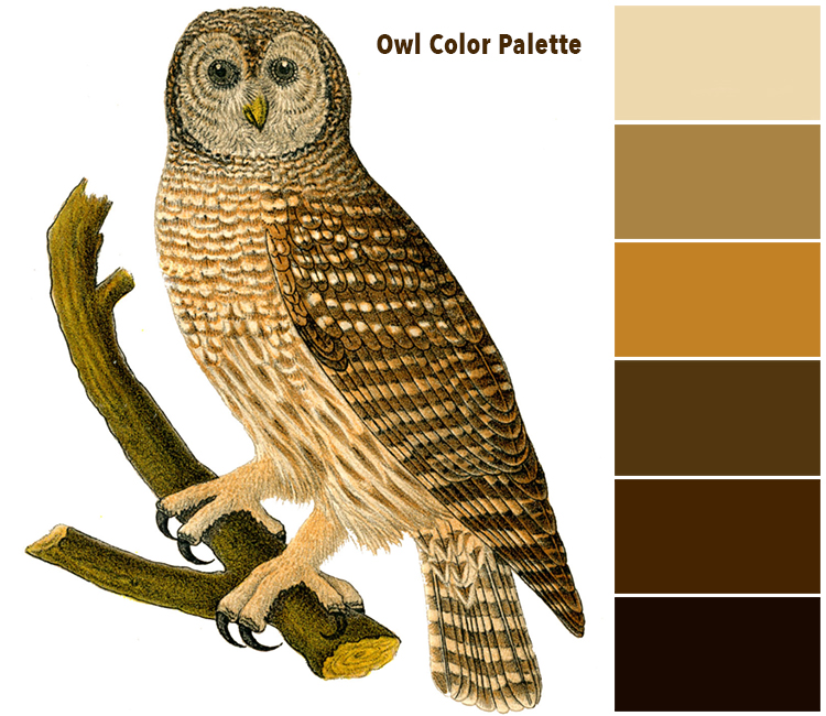
Brown makes a good foundational color as well as an accent color when painting. Many different colors actually work very well with it. The key is to go with similar shades, such as a warm or cool shade of brown combined with warm or cool tones of the paired color(s). Here at TGF we adore monochromatic color schemes. There are of course many shades of these similar hues to choose from, so it can be a bit tricky to find the best matches. Below I have created two color chip palettes from a couple of my favorite TGF images. You can actually use the beautiful colors in these palettes to make color choices for your art. How cool is that?
I just adore this little owl. The colors are perfect monochromatic browns.
The most common colors that go well with brown:
- Orange: Orange hues combined with brown is eye-pleasing as they mimic the beautiful colors of leaves in autumn. Copper and bright orange colors are two of the best choices.
- Yellow: Yellow adds a splendid vibrance to pair with the more plain, staid color of brown. Deep yellow ochre and Sunshine yellow are a couple of good options.
- Green: Shades of dark and light green work quite well with brown. These combinations are pleasing to the eye since they are among the dominant colors in nature, such as in forests.
- Blue: The contrasting colors of blue and brown can work well together, especially the shades of pale blue, medium blue, and turquoise. Bright shades of blue balance the neutral background produced by brown.
- Purple: Purple, with its moody look, goes well with brown. A great pairing is plum with red undertones.
Color Mixing Recipes to Create the Color Brown
If you have ever created the color of mud on your palette, or one that resembles a ‘muddy’ color, you have ventured into the color brown. When painting, brown is generally created ‘purposefully’ by mixing two or more Complementary Colors (colors opposite each other on the Color Wheel). Conversely, brown is often created ‘accidentally’ by mixing two or more Complementary Colors as well! OOPS! The accidental brown is known as making mud, which is generally not so desirable unless you are crushing on the color brown as we are today!
Here are my tried and true Recipes for making a Brown Shade – Mud:
We will first create two versions of a true brown color. Then we will modify the mixtures to create different variations as different colors make brown. You will see how easy it is to mix colors, then adapting them for what you need. Please Note that the colors will look different on your digital screen depending upon how it is calibrated. I have created a set of Printable Color Charts for you to use in your experiments. Download the PDF HERE! Please Note: Colors may look different on your printout for many reasons… mostly your printer and ink levels. We begin with the three Primary Colors.
- The most common way to create the color brown is to mix equal amounts of all three primary colors of Red, Yellow, and Blue together using a palette knife. NOTE: Blending equal amounts of each primary color is imperative. If you add too much of one color, it will turn out differently. See the top rows of the chart below.
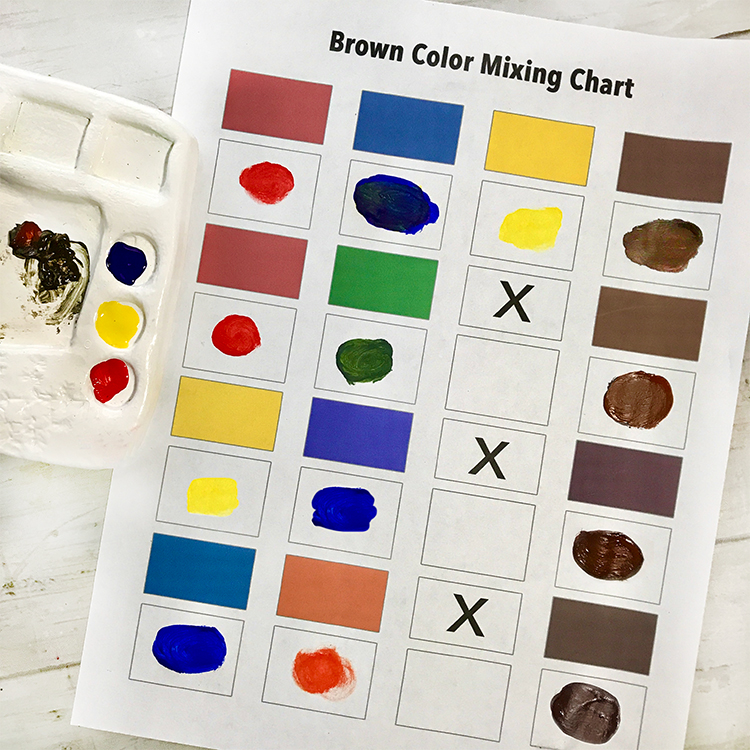
- The next most common way to create the color brown is to blend a Primary color with its Complementary color. A complementary color is the combination of the other two primary colors mixed together. Equal amounts of the primary and complementary colors blended together creates a true brown color, whereas differing amounts modify the results. Use a palette knife to create your mixtures. Most color mixing is by eye, but you can measure if you feel inclined. See the mixes in the chart above.
- Mix 1 part Red with 1 part Green (blue and yellow mixed together)
- Mix 1 part Yellow with 1 part Purple (red and blue mixed together)
- Mix 1 part Blue with 1 part Orange (red and yellow mixed together)
There are light and dark browns, warm and cool ones, those with more of a reddish, bluish, or greenish look, etc. The options are virtually endless. Let’s modify the browns you created with the above recipes.
Light Brown Colors
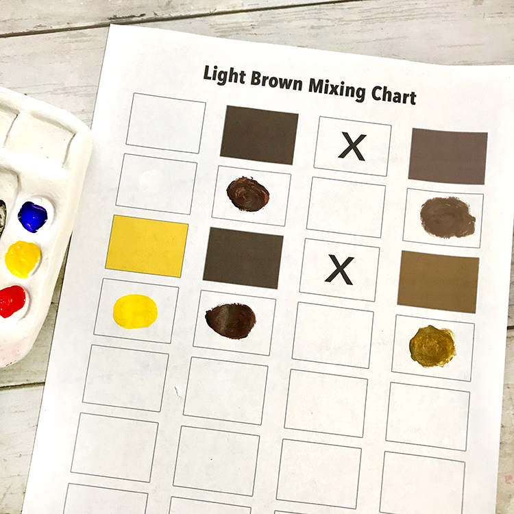
- We will make two tints of Brown. Add White or Yellow to your brown for a lighter color.
Dark Brown Color
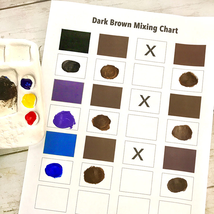
- We will create three shades of darker brown. Add Black, Purple or Dark Blue to your brown for a darker color.
Warmer Browns
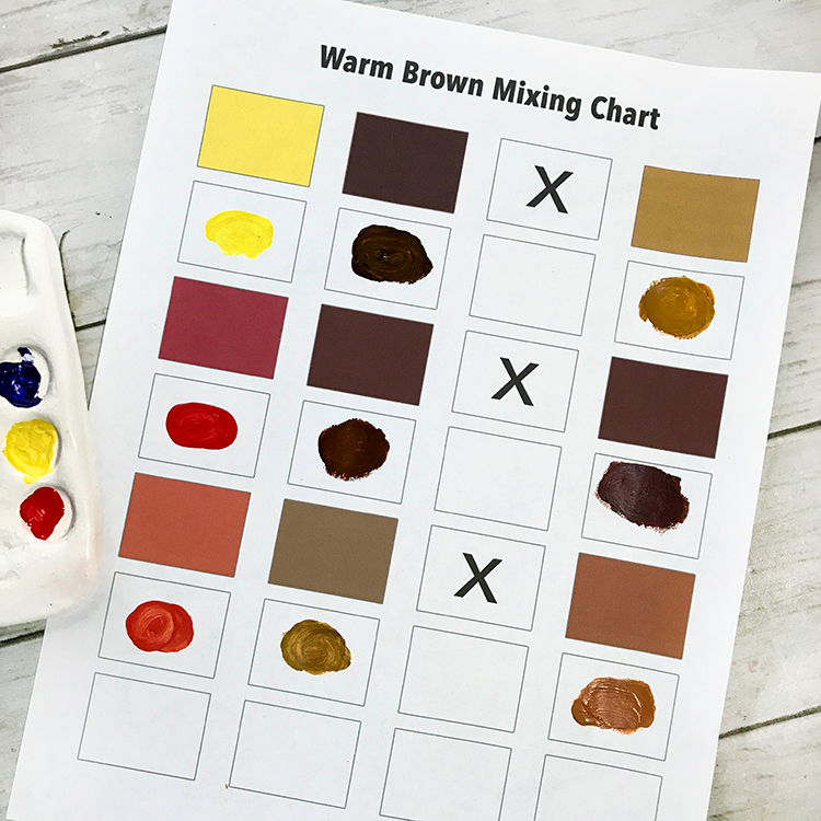
- We will create three different natural warmth browns. Add Yellow, Red, or Orange for a warm brown color.
Cooler Browns
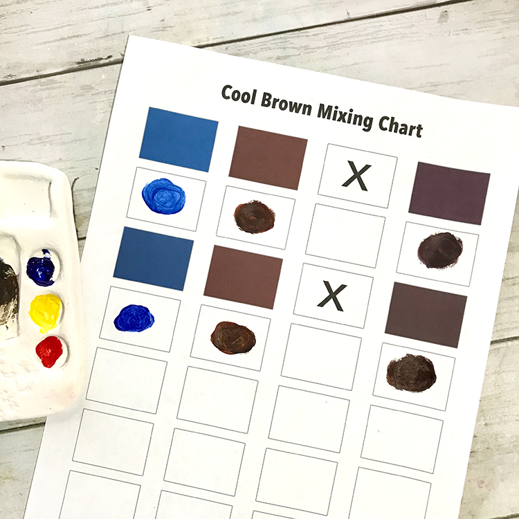
- We will create two versions of cool browns. Add Medium Blue or Dark Blue to your brown for a cooler color.
Isn’t this fun? Please experiment by adding differing amounts of the colors to modify the hue of your brown paint. Make sure you record your recipe when you get the exact shade of brown you want. You will never look at brown the same way again! WINK
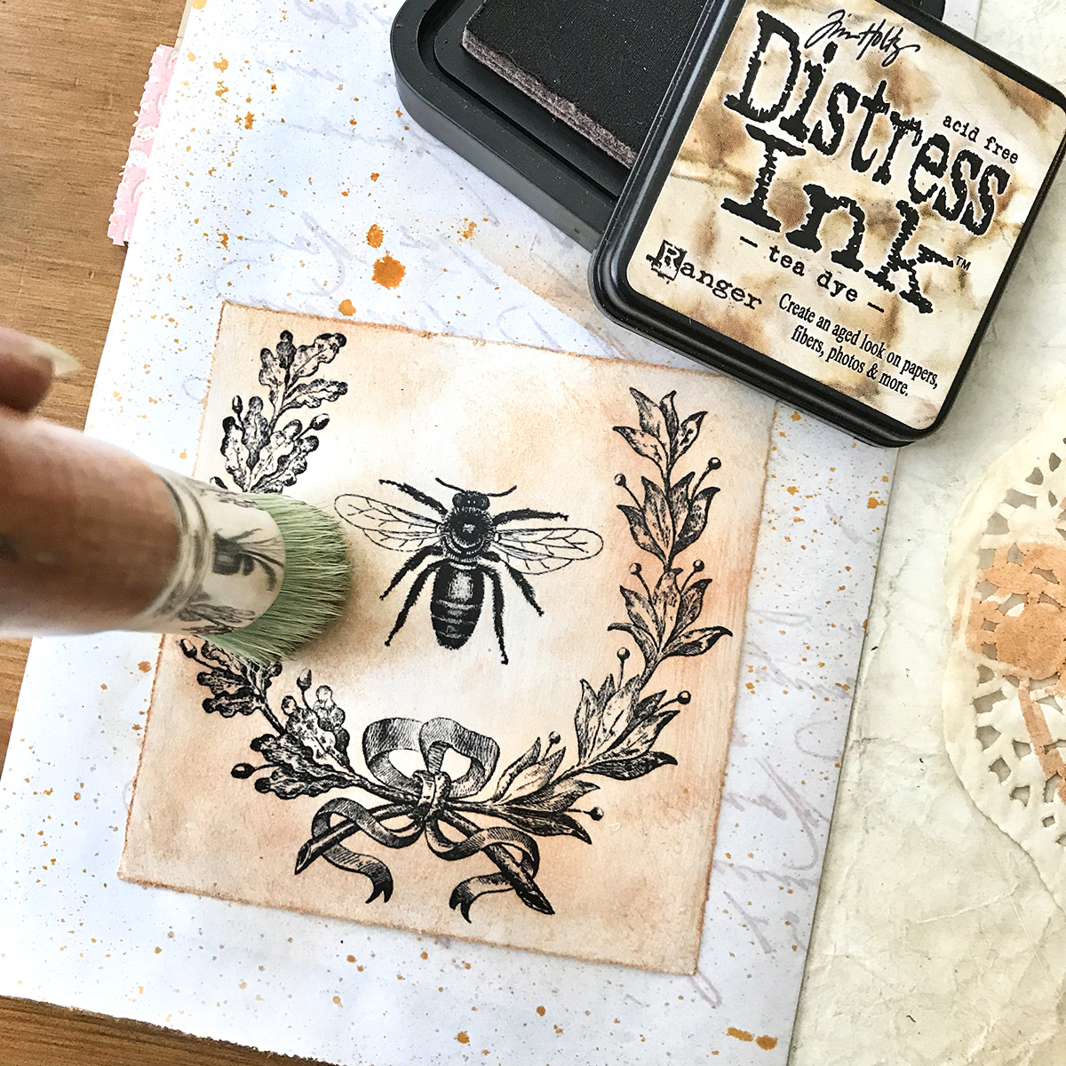
Different Types of Brown Distressed Inks
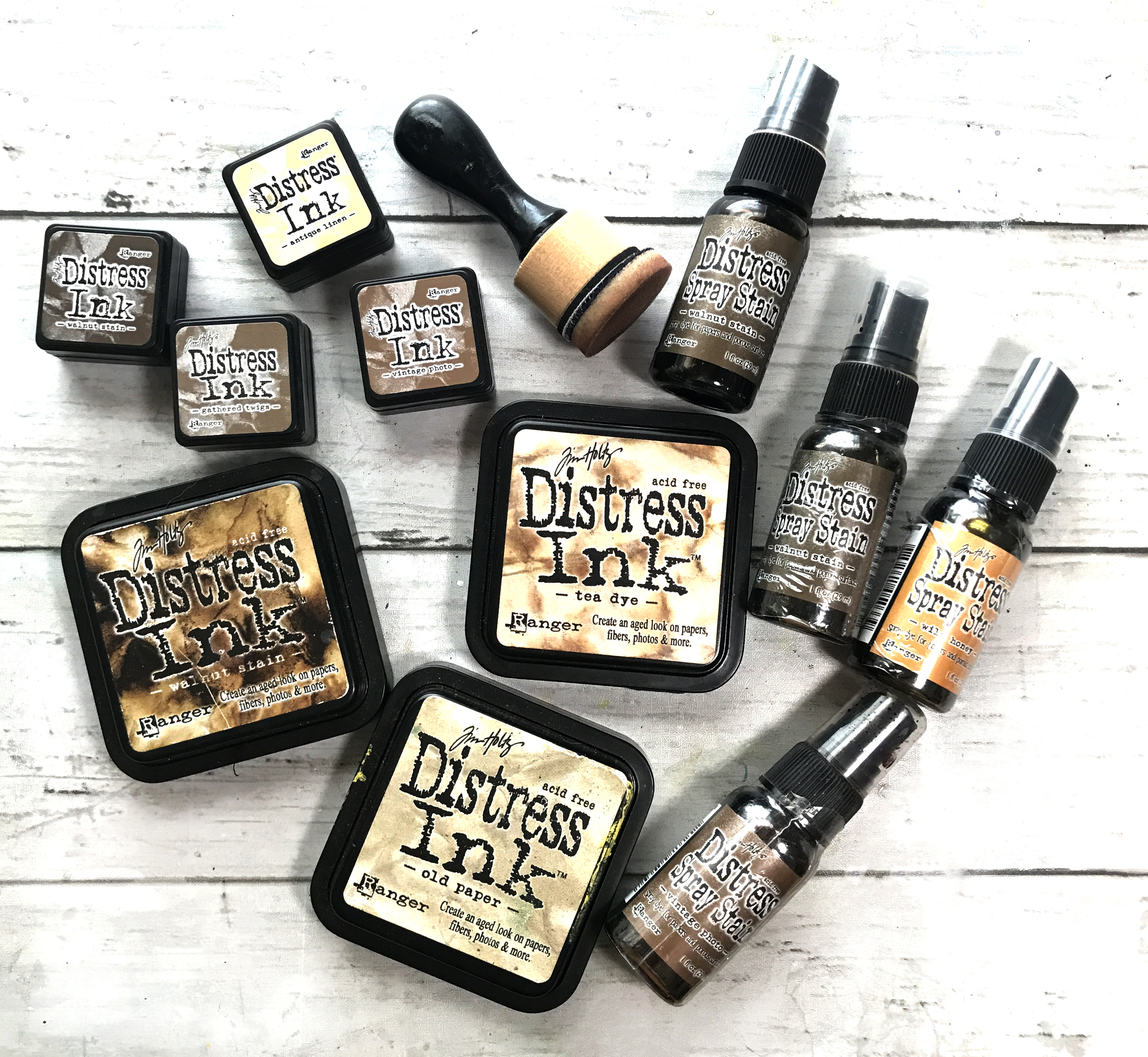
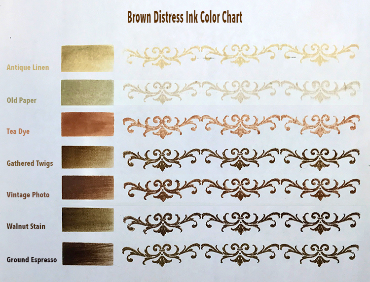
We all have a love affair with Tim Holtz Distressed Inks by Ranger. We especially adore the brown Distress Inks. These water-based dye inks are perfect for the vintage, stained, aged effect we love to use on our Graphics Fairy images. So many uses with our junk journals, altered books, handmade cards, scrapbook pages, and our beloved paper craft projects. I have created a little color chart of several favorite hues of Brown Distress Inks for you. There are other DI Browns as well – Pumice Stone, Frayed Burlap, Brushed Corduroy.
Brown as a Way to Add a Vintage Feel to a Project
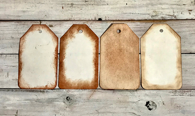
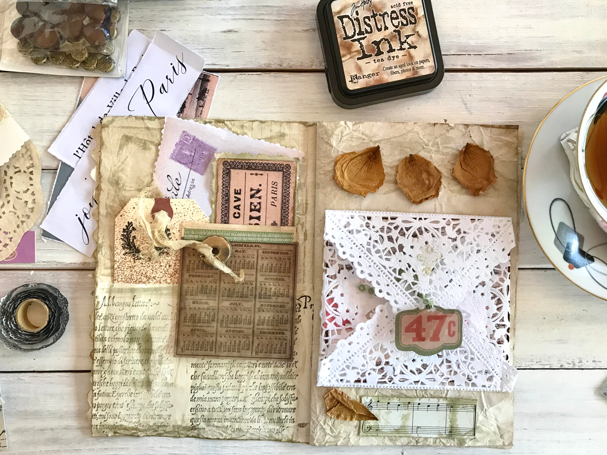
Now that you know how to mix up some good old brown paint, you can use it to age and give that Vintage Look to the Graphics Fairy images you use in your projects. You can create some distressed papers, age the edges of images, and stain papers with a bunch of techniques. We have a variety of posts showing you how to age TGF images. You can check some of them them out to put your new skills to work: How to Age Paper Easily HERE and DIY Ephemera HERE
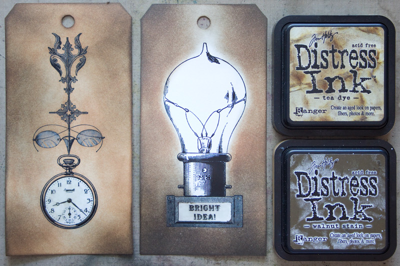
We also have several tutorials showing you how to use Distress Inks. You can find them: HERE, HERE, and HERE.
I hope you enjoyed our stroll through “How to Make the Color Brown!” Honestly, the different shades of brown have grown on me while writing this post. I think I will grab a paintbrush and start playing with them now.
When I am not creating for TGF, I also create Photoshop Elements tutorials and craft project videos over on The Graphics Fairy Premium Membership site. You can find even more of my books, art, and whimsical shenanigans on my website – The Bookery.
May joy be with you all,
Rebecca


Tracy says
This was very informative, thank you for sharing. I have never really thought about the different tones of brown, only in as far as the TH distress inks/oxides. I really think this is going to help with the vintage look in my crafts.
Thanks again.
Creative Blessings,
Tracy
Karen Watson says
I’m so glad you found Rebecca’s post helpful Tracy! Watch for more of these color posts soon.
Linda says
Thank you for this very interesting discussion and tutorial about the color brown.
Rebecca E. Parsons says
Hi Linda. I am so glad that you found this article interesting. I had a lot to say about the color brown!!! XO Rebecca
Tom says
WOW!!! That is one terrific educational tutorial! Thank you…
Rebecca E. Parsons says
Thank you so much Tom! I am so glad you found some useful information about the color brown!! Rebecca