House Tour of Family Room
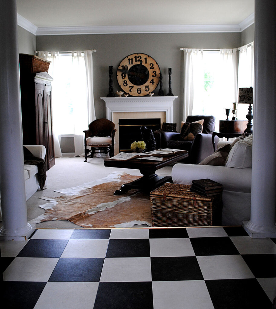
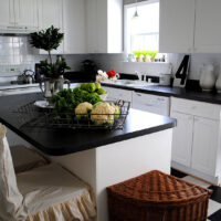
As promised, when I started this new blog, here are some photos of my home. Today I’m sharing my Family room. At one time this room was a bright fresh springy green, with pops of red. It was more of a cottage look. But I wanted something more sophisticated and neutral so I repainted this room, and the kitchen, with a nice taupe shade. The black and white floor leads into my kitchen. It’s kind of interesting in this photo, but I’m planning on switching it out for dark hardwood at some point.
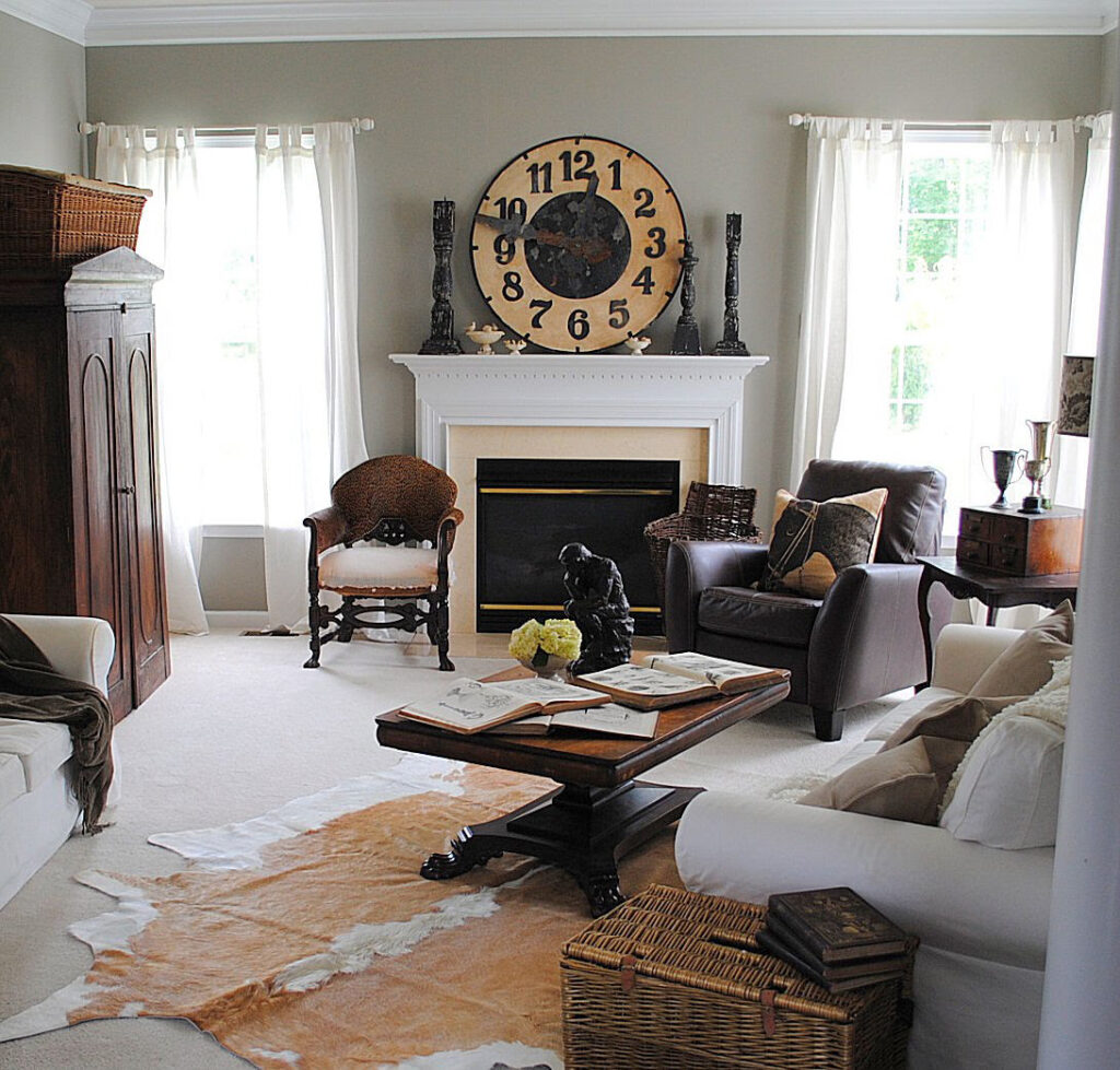
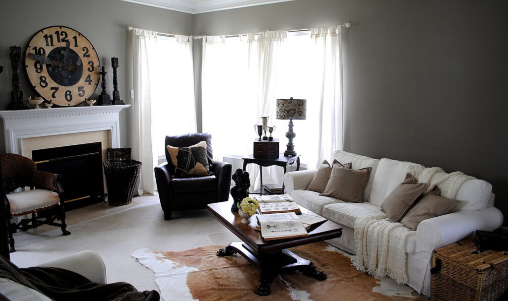
After painting the walls taupe, I purchased the white slip covered couches from Ikea. I removed all the old accessories and then I left it as a blank slate for awhile. I didn’t want it too cluttered, and I wanted to think about what should really go in the room. Then life got in the way and before I knew it, several months (maybe even a year? ugh!) had gone by and I still hadn’t really done anything with it. I showed some of the photos to two of my girlfriends, Amy who just happens to have been a stylist for Country Home Magazine, and Lisa who also has a great eye for design, and we hatched a plan to liven the place up a bit, and knock it all out in one day! Since we are all dealers at Old Lucketts Store, it was no problem to find great stuff. So the girls loaded up a van full of accessories, I made lunch, and we had a fun day playing with all the stuff in my house!
Amy wanted to keep the wall behind the couch blank, the mirror that had been there really wasn’t large enough. I’ve since replaced it with a huge mirror, that works just right in the space. I’ll show you that another day!
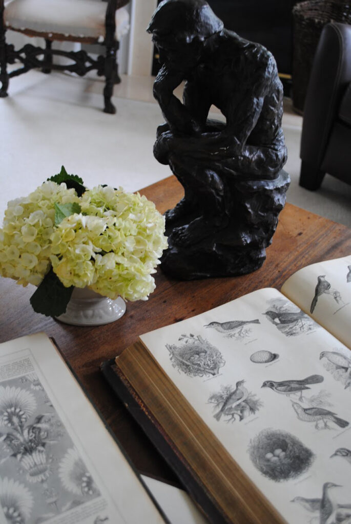
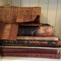
Here’s a peek at some of the books I use for The Graphics Fairy. The fresh flowers are part of Amy’s signature look, she’s all about the flowers!
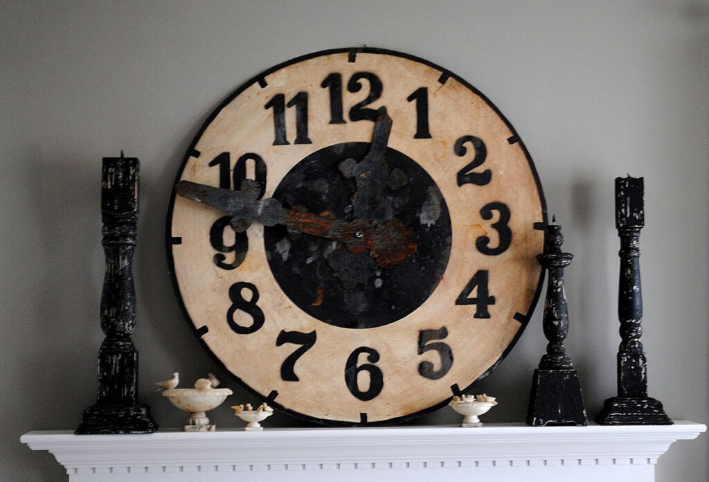
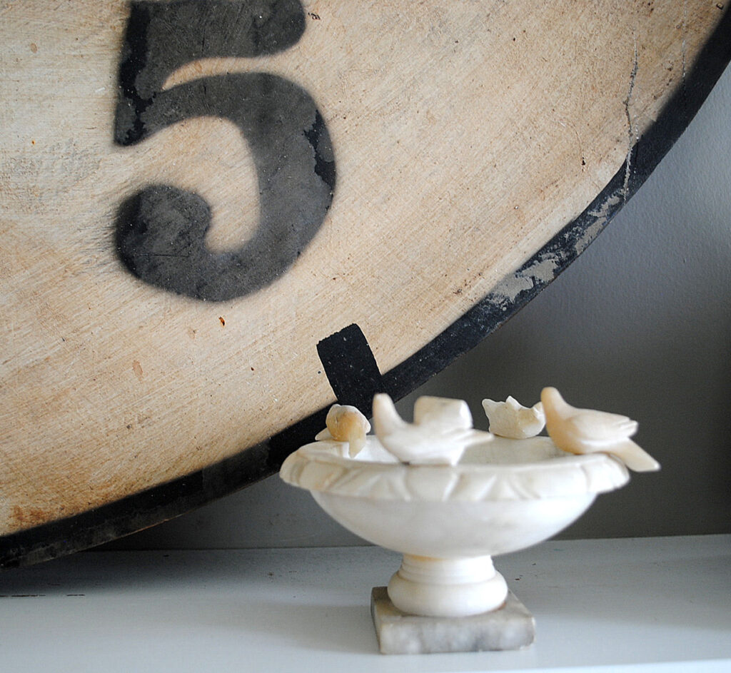
I think this clock is my favorite thing in the room, I love how well it works with my little collection of antique marble bird baths.
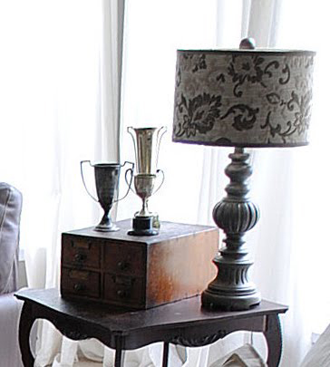
Okay wait… this lamp might be my favorite thing too. Alright … they are both my favorite things! The old file cabinet and trophy collection, were mine and the table too, I just pulled them in from other rooms.
Anyway, I’m so pleased with how it turned it out, and it was such a fun day too! Thank you so much Amy & Lisa for all your help!


gongyandsquish says
I love this room! I just painted my living room last year but this grey has me contemplating a re-do! I already have the white sofas,wood furniture and antiques…so maybe it will be a Graphics Fairy inspired room when all is said and done! Lol 🙂 Thanks for sharing!
alison says
it looks lovely…i adore all the distinctive bits and pieces you’ve got tucked around the room…and the cowhide rug…thanks for sharing!
Laura @ 52 FLEA says
Love the new look of your room. Love those awesome books too! Great to have talented girlfriends to lend a hand. Happy day!
🙂
The Painting Queen says
You girls did a wonderful makeover! The before and after shows how important scale is to a room for drama. That clock is the centerpiece for sure. We had one of those marble birdbaths growing up and with five kids they were always pulling the birds out!
Comeca Jones says
Love that rug its my purchase for our June Canton,Texas trip!Looks lovely Im saving your pics for a post after we move Total Inspiration!! I love it!I will certainly link back.
Anonymous says
Lovely just lovely ! The English creels are wonderful ~ I have several and always get comments ~
Ann says
love everything about it!! thanks for sharing!!
Donna says
I love everything, I must say even the black and white floor!! Inspired!
Mada says
You have a lovely living room, so warm and cosy… and the clock! The most gorgeous thing in the room, apart from the lamp of course 🙂
Jema♥Rose says
Such a beautiful room..!
: )
Hugs, Jenny
Jen T says
This is a stunning room! I love it..all the accessories are awesome too. JenT
Karen- The Graphics Fairy says
Thank you so much ladies! I like the floor in the pictures too, but if you saw it in real life you might change your mind. It’s vinyl, and it’s not holding up very well. It looks okay in this room, but in the kitchen it’s really getting worn. Four teenagers will do that to a floor!
Ruby Jean says
I love the Striking black and white floor…and those little bird baths are just simply adorable..
Kathy @ Creative Home Expressions says
I love your “after”, Karen! That must have been fun shopping for the new things to bring in. I love your black and white floor. I’m hoping to do one once we downsize, not sure where I would do it, but I love the look in a foyer hallway and kitchens.
mizdarlin says
I like your space very much, and the clock is the most ‘striking’ thing in the room, if you’ll pardon that regrettable pun (can’t help myself!)
Personally, love the uniqueness of the black and white floor between the living room and kitchen..everybody has hardwood, and it works so well with your colours..
Wish we had an Ikea on this Island, but nope…