House Tour of Family Room
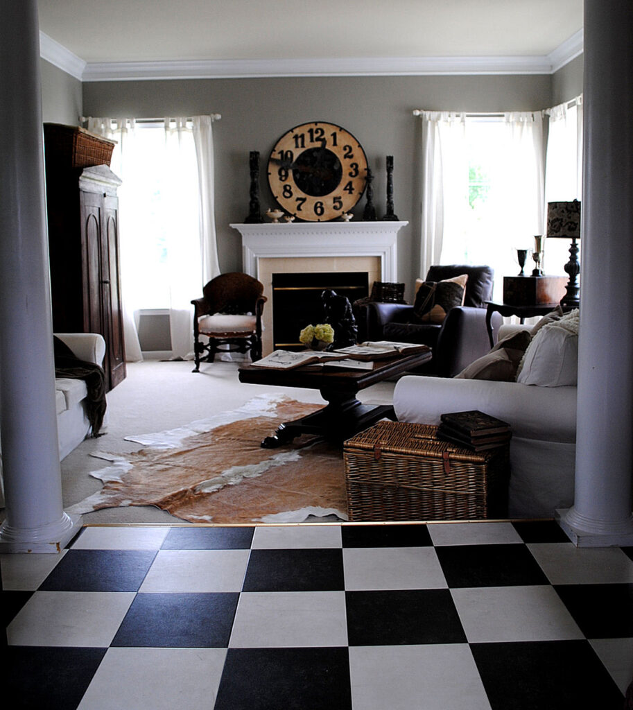
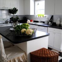
As promised, when I started this new blog, here are some photos of my home. Today I’m sharing my Family room. At one time this room was a bright fresh springy green, with pops of red. It was more of a cottage look. But I wanted something more sophisticated and neutral so I repainted this room, and the kitchen, with a nice taupe shade. The black and white floor leads into my kitchen. It’s kind of interesting in this photo, but I’m planning on switching it out for dark hardwood at some point.
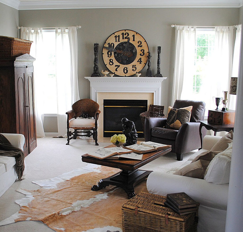
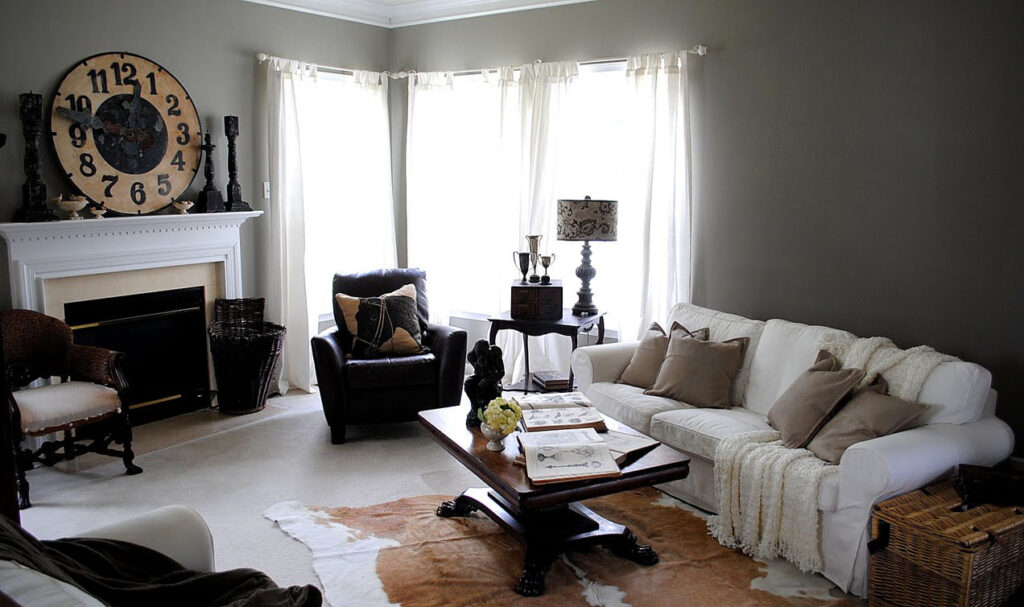
After painting the walls taupe, I purchased the white slip covered couches from Ikea. I removed all the old accessories and then I left it as a blank slate for awhile. I didn’t want it too cluttered, and I wanted to think about what should really go in the room. Then life got in the way and before I knew it, several months (maybe even a year? ugh!) had gone by and I still hadn’t really done anything with it. I showed some of the photos to two of my girlfriends, Amy who just happens to have been a stylist for Country Home Magazine, and Lisa who also has a great eye for design, and we hatched a plan to liven the place up a bit, and knock it all out in one day! Since we are all dealers at Old Lucketts Store, it was no problem to find great stuff. So the girls loaded up a van full of accessories, I made lunch, and we had a fun day playing with all the stuff in my house!
Amy wanted to keep the wall behind the couch blank, the mirror that had been there really wasn’t large enough. I’ve since replaced it with a huge mirror, that works just right in the space. I’ll show you that another day!
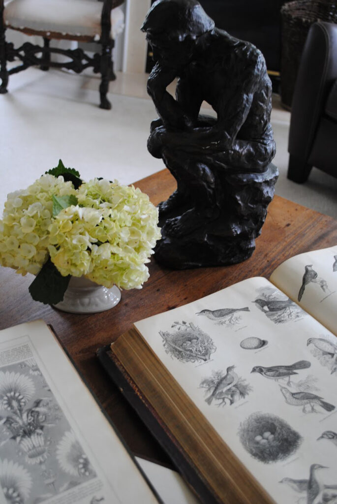
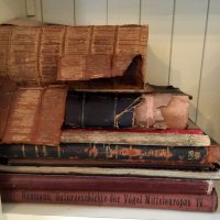
Here’s a peek at some of the books I use for The Graphics Fairy. The fresh flowers are part of Amy’s signature look, she’s all about the flowers!
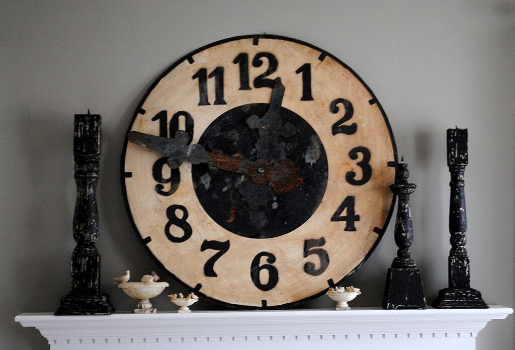
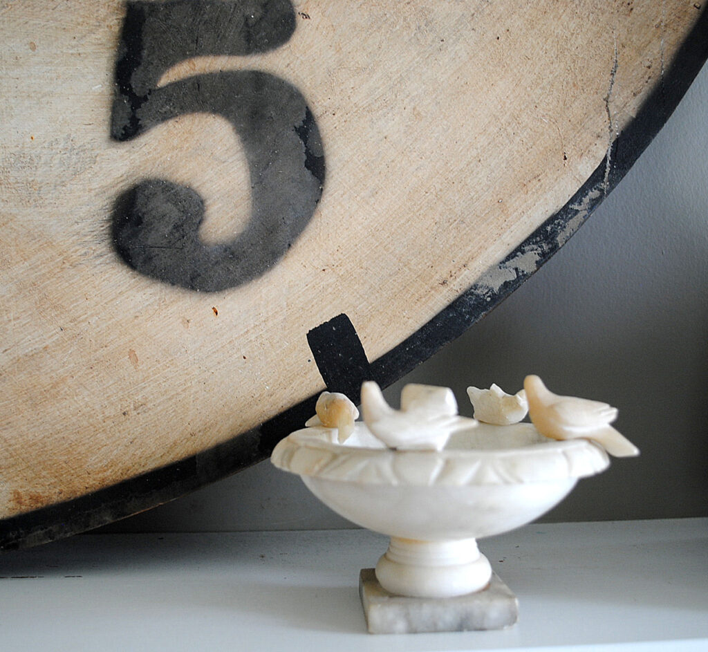
I think this clock is my favorite thing in the room, I love how well it works with my little collection of antique marble bird baths.
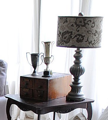
Okay wait… this lamp might be my favorite thing too. Alright … they are both my favorite things! The old file cabinet and trophy collection, were mine and the table too, I just pulled them in from other rooms.
Anyway, I’m so pleased with how it turned it out, and it was such a fun day too! Thank you so much Amy & Lisa for all your help!


One Cheap B*tch says
Wow! It’s stunning but I would expect nothing less from someone so creative as you are!
Jeanine
lafamigliadesignllc says
I love the feel of your LR! Love the baskets, the mix of different woods,
the slipcovers & the rug. Glad to find your new blog. What a fun project.
Monica
Karen- The Graphics Fairy says
Oops make that Tiny Elf, not Tin!!
Karen- The Graphics Fairy says
Gongyandsquish & Tin Elf,
Sisters? How fun! I think you both will really like this color. My friend Amy is something of a color genius and, although I picked it out, she was really taken with it.
gongyandsquish says
Thank you Karen! It’s quite possible that there will be 2 sisters in FL with Fawn Brindle walls! 🙂
tiny elf studio says
Karen, thanks so much, you’re a lifesaver.
P.S. My sister is gongyandsquish and she directed me to your fabulous site.
pink*cherub*moon says
Beautiful, Karen! Thank you so much for sharing!
Karen- The Graphics Fairy says
Tiny Elf,
It’s called Fawn Brindle by Sherwin Williams.
Gongyandsquish,
I’m calling it a taupe, but it leans more in the direction of gray than tan, as far as taupes go!
tiny elf studio says
I have tried 5 different samples of grey/taupe in my new house. None of them work – they range from prison cell block to lavende.
I love your paint color, do you remember the name/brand?
Karen says
The room is just beautiful. It’s warm, cozy and elegant at once, just gorgeous.
GeorgiaBabydoll says
Karen – you and your friends did a beautiful job. I love the clock, it’s perfect on the mantle. Also, the black and white tiles look spectacular, i’m not sure i’d change those out for dark hardwood. i think those are columns in the picture, if they are, then they look really nice against the black and white tile. Hugs! Pat
Kate says
It looks stunning…but also comfy, peaceful and homey…a room you can really live in as well as enjoy looking at!
gongyandsquish says
Oops…just re-read this post and the walls are taupe…not grey. Must be my monitor…but I have to say, grey still intrigues me!
Stitchfork says
Love your look! (and not spotting any oxyclean yellow at all!)
xo Cathy
the occasional pat says
I think your after pictures are lovely, sometimes it’s good to have a breathing space between putting things back as they were after re-decorating. We are in the middle of restoration and have used a slightly lighter colour than yours in our lounge using limewash and it also looks lovely. My rug is similar to yours so I am having a little preview as to what can be achieved!