Favorite Font Pairings
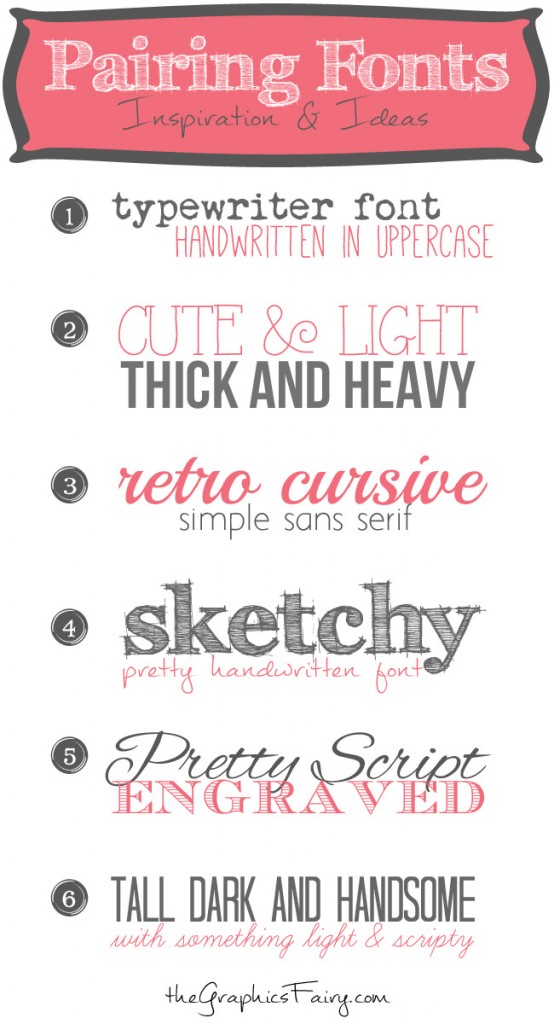
Over the last year, we’ve shared a bunch of fonts that we think go really well with graphics on this site. Today we’re sharing some ideas and tips for pairing fonts, and of course, we have several of our favorite font combos for you to download and try out on your projects too! At the end of the post, there are a few suggestions for pairing fonts, based on a lot of trial and error while working on my digital art projects.
1. My Underwood by Tension Type paired with Mathlete by Mattox
2. Always Here by Luedecke Design Font Co. paired with Bebas Neue by Dharma Type
3. Playball by TypeSETit paired with Aaargh by Tup Wanders
4. FFF Tusj by Magnus Cederholm paired with Mathilde by Lee Batchelor
5. Alex Brush by TypeSETit paired with Ecuyer DAX by Daxad
6. Tall Dark and Handsome by QuickStick Productions paired with Learning Curve Pro by Blue Vinyl Fonts
A FEW IDEAS FOR PAIRING FONTS
I honestly never really paid attention to how fonts went together. I thought you just picked a few you liked and typed them in. That was until I tried a few projects that used graphic backgrounds with lots of text layered on top. I’ve found that if fonts in a project don’t really go together or work together well, the issues stick out like a sore thumb. The composition of the text and images in your project can really suffer, and make everything just look “off”.
Here are a few things I’ve learned while pairing fonts:
1. Make sure one of the two fonts has a heavier line or stands out more, to act as a focal point. Otherwise, if your fonts have the same line width or general look, the nuances of the fonts will be lost since they look too much alike at first glance.
2. I like to mix fonts that are fundamentally different types of text — script with print fonts, chunky fonts with thinly lined fonts, casual with more formal fonts. I think when you juxtapose the different styles, it often just “works”.
3. Fonts work well if they’re from the same general era. While a thick script and thin printed font both in the retro 50’s style may work, mixing a retro 50’s font with an 1800’s classical looking serif font may just not work. Not every art deco font will work well with a typewriter style font. Be aware of the time periods and general styles the font was developed from.
4. Each font has its own personality. Only when you start working with them and comparing them side by side, will you see how the spacing, kerning, flourishes & serifs etc. are all a little different. Just look at typewriter fonts — they could all look very different in the same project. One could have a messier, informal look, like it was typed using an very old hand typewriter. One may be more or less condensed than the others between letters. One may be very clean, almost like a digital word processor’s version of type. All three of these will lend a different feel to a project.
5. Play around…I can’t stress that enough. If you have two fonts you really like and want to use together, you probably can make them work. Just create two text boxes with your chosen words. Then change the text sizes, colors, and move them around each other, playing with the placement & spacing. Try typing one of the words in all caps, or try all lowercase letters. You would be surprised at how text can look totally different with a few changes and rearrangement.
Thanks for stopping by today and we hope you can incorporate these new fonts and combinations in your craft projects! If you’d like to see more favorite fonts, check out our other font posts.
*A note about downloading, installing & using fonts: There are a lot of sites out there that offer free fonts. Some are set up mostly to display ads, and others take you to suspicious files & links. Even some legitimate sites run confusing ads that feature images that say “download”, when it’s for another product. While we don’t recommend one free font website over another, we have tried to link to the more straightforward sites to make finding the font easier for you. If you click on anything that looks like an application or .exe file, stop, it’s not what you want, and is probably malware. Don’t forget to follow the site’s specific directions to download and install the font. If you are a crafter and will be selling your work, please be sure to read any files or information that comes with the font. Some fonts have restrictions on the commercial use of a font for mass production quantities and on the sharing / redistribution of the font file itself.
Welcome, I’m so glad you’re here! Browse around to find thousands of Stock Images that you can use in your projects or designs! Need more info about my site? Try my FAQ page.


amos says
Very helpful! Thanks so much!
Karen Watson says
You’re welcome Amos!
BETH says
HI! I think your site is superb and your generosity overwhelming! I was trying to download your recommended “Pairing Fonts” where the #1 combo listed is Typewriter Font and Handwritten in Uppercase. However, when I scroll to download, the fonts linked don’t match the displayed font samples. Am I doing something wrong? Thanks for any comments!
Karen Watson says
Hi Beth, Hmm. I’ll have to ask Emily about that, she wrote this post, so I’m sorry I don’t have an answer for you right now!
Irene says
Hi Emily,
Can you tell me what font you used for “Pairing Fonts”? It seems a bit different from the ones in your list.
Thank you!
MichelleB says
Love these! Thank you for sharing this!
*S* says
I love these pairings! Now I need to find a way to use them. Thank you.
JoAnne says
Hi Karen, Thanks so much for all of the goodies you share every day. I love the font for thegraphicsfairy.com at the bootom of the list. Would you please tell me what font it is? Thanks again and Happy New Year!
Emily says
Hi JoAnne – that one is called Mathilde — you can find the link in the post under #4 —Emily
Cyndi says
I can’t tell you how helpful this post is (well, I guess I can tell you). I have a huge problem with mixing fonts. Thank you!
Cynthia says
Thank you! I will be checking-out the commercial-use fonts!
ElseT says
Really great post! I’m sure to use some of these fonts. You’ve offered terrific combos!
Marie@TheInteriorFrugalista says
These are great – thanks so much for sharing them with us!
Denise... On a Whim says
I love pairing fun fonts together, both for work and for my blog projects! Thanks for sharing your super-cute pairings!